Packaged instructions your agent loads: use the tokens, pick the right block, follow the rules.
1 skill
Agent kit
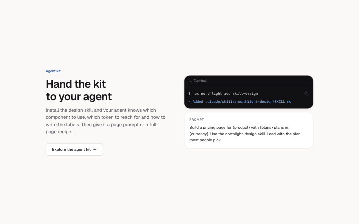
A design skill and page prompts. Your agent builds with Klarhimmel components, tokens and writing rules instead of guessing.
npx shadcn add @klarhimmel/skill-design✓ Added .claude/skills/klarhimmel-design/SKILL.md
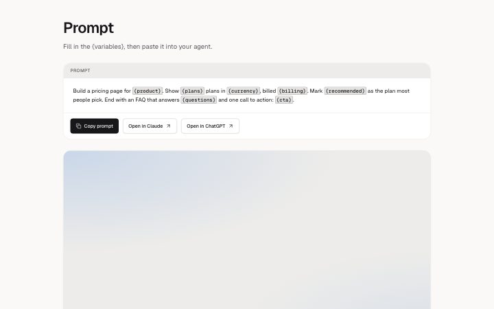
Prompt
Use the klarhimmel-design skill. Build a pricing page for {product} with three plans. Lead with the plan most people pick, then answer the questions people ask before they buy.
How it works
One command adds a Markdown file to your project. Your agent reads it: the tokens, the components, the rules.
58 prompts, one per template and page type. Each names the blocks to use and the command that installs them.
It builds with real components from your own repo. You check it like any pull request.
The kit
Each has a page you can read first, and a Copy for AI button.
Packaged instructions your agent loads: use the tokens, pick the right block, follow the rules.
1 skill
Plain files and plain URLs, no account and no API.
The start of the file that npx shadcn add @klarhimmel/skill-design puts in your project. The page for the skill has all of it.
---
name: klarhimmel-design
description: Build pages and UI with Klarhimmel UI blocks, components and tokens. Use when adding or changing a page, a section or a component in a project that has components/klarhimmel/, or when asked to use the Klarhimmel design system.
---

# Klarhimmel design

Klarhimmel UI is source in this project, under `components/klarhimmel/`. Build with it; do not build a second version of something it already has.

## Share structure before adding components

Find the application's existing shell, content template and content collections
before choosing a catalogue template. A site has one shared navigation, footer,
theme and container system. Change their owner once; page files must not repeat
their markup, configuration or style objects. Navigation and footer links should
read the same product/service records. Active navigation is a page value, not a
different header.

Use four page purposes:

- **Content:** insights, guides, projects/cases, services and other
  reading pages use one content template. Supply a record with title, category,
  metadata, optional introduction/author/cover, body and optional structured content, related
  items or a closing action. Different subjects do not require new templates.
- **Product:** product decisions use one shared product landing template: split
  hero/actions, optional feature grid, explanations, FAQ, related products and
  closing action. Keep product records separate from the reading template,
  without per-product page components.
- **Index:** browse/search/filter a collection inside the same shell, using
  reusable cards or rows. Keep collection-specific behaviour explicit.
- **Task:** complete an action or read its result inside the same shell, such as
  a form, tool, confirmation or error. Keep the interaction focused.

…