Report, header
Install
npx shadcn add @klarhimmel/report-headerUsage
import { Theme } from '@/components/klarhimmel/theme/style';
import { BlockSurface } from '@/components/klarhimmel/blocks/surface';
import ReportHeader from '@/components/klarhimmel/blocks/report-header';

export default function Section() {
  return (
    <Theme theme="brand">
      <BlockSurface>
        <ReportHeader props={{
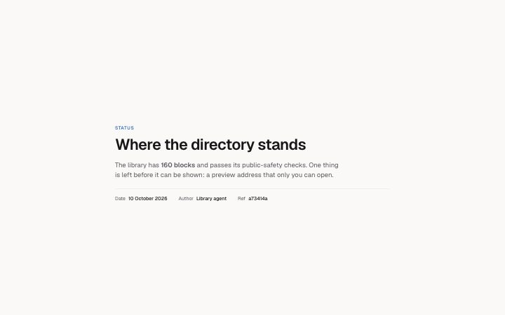
          "eyebrow": "Status",
          "title": "Where the directory stands",
          "summary": "The library has **160 blocks** and passes its public-safety checks. One thing is left before it can be shown: a preview address that only you can open.",
          "meta": [
            {
              "label": "Date",
              "value": "10 October 2026"
            },
            {
              "label": "Author",
              "value": "Library agent"
            },
            {
              "label": "Ref",
              "value": "a73414a"
            }
          ]
        }} />
      </BlockSurface>
    </Theme>
  );
}
Install
Import
import Block from '@/components/klarhimmel/blocks/report-header';- report/header
- Category
- A document for a reader: key figures, decisions with a recommended default, long-cell tables, timelines, callouts, sources and prose. Rendered to one HTML file by kh-report.
Notes
When to use it
The top of a report: what kind of report it is, its title, a short summary and a few facts such as date and author. It is the only report block that draws the page's h1, so use it once, first. For a marketing page, `hero-minimal` does the opening job instead.
Writing for it
- Put the report type in the eyebrow (40 characters), for example Status or Research, so a reader knows the genre before reading the title. - The title holds 160 characters and wraps balanced. Say what was found or decided, not just the topic, because it is also the section label for screen readers. - Meta takes up to 8 label and value pairs, labels to 30 characters and values to 120. Keep to the facts a reader would ask for first, such as date, owner and a reference.
Watch out for
The title is rendered as h1 and the container is 54rem wide, narrower than marketing sections. A second report-header on the same page gives you two h1 elements.
Pairs well with
Usage
The block in a page, with its default content (long lists shortened). Every prop is in the table below.
import { Theme } from '@/components/klarhimmel/theme/style';
import { BlockSurface } from '@/components/klarhimmel/blocks/surface';
import ReportHeader from '@/components/klarhimmel/blocks/report-header';

export default function Section() {
  return (
    <Theme theme="brand">
      <BlockSurface>
        <ReportHeader props={{
          "eyebrow": "Status",
          "title": "Where the directory stands",
          "summary": "The library has **160 blocks** and passes its public-safety checks. One thing is left before it can be shown: a preview address that only you can open.",
          "meta": [
            {
              "label": "Date",
              "value": "10 October 2026"
            },
            {
              "label": "Author",
              "value": "Library agent"
            },
            {
              "label": "Ref",
              "value": "a73414a"
            }
          ]
        }} />
      </BlockSurface>
    </Theme>
  );
}
Props
The type, default and text limit of every prop. On a real page, over-limit text is kept and checkSections flags it (Installation, Check a page before you ship); this live preview shows the default until it fits. The panel above edits all props.
| Prop | Type | Default | Description |
|---|---|---|---|
eyebrow | string | 'Status' | Text, up to 40 characters. |
title | string | 'Where the directory stands' | Text, up to 160 characters. |
summary | string | 'The library has **160 blocks** and …' | Text, up to 1200 characters. |
meta | { label, value }[] | 3 items | List of up to 8. Each item: label, value. |
headingLevel | '1' | '2' | - | One of '1', '2'. Optional; empty is not rendered. |