Snapshot, profile
Install
npx shadcn add @klarhimmel/snapshot-profileUsage
import { Theme } from '@/components/klarhimmel/theme/style';
import { BlockSurface } from '@/components/klarhimmel/blocks/surface';
import SnapshotProfile from '@/components/klarhimmel/blocks/snapshot-profile';

export default function Section() {
  return (
    <Theme theme="brand">
      <BlockSurface>
        <SnapshotProfile props={{
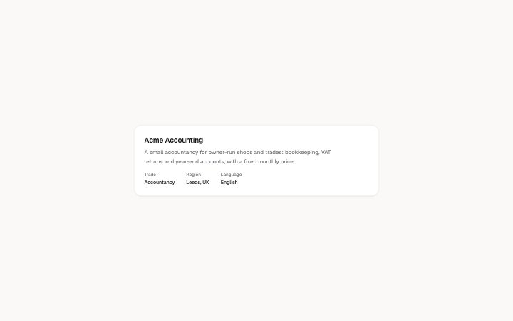
          "name": "Acme Accounting",
          "summary": "A small accountancy for owner-run shops and trades: bookkeeping, VAT returns and year-end accounts, with a fixed monthly price.",
          "trade": "Accountancy",
          "region": "Leeds, UK",
          "language": "English",
          "words": {
            "trade": "Trade",
            "region": "Region",
            "language": "Language"
          }
        }} />
      </BlockSurface>
    </Theme>
  );
}
Install
Import
import Block from '@/components/klarhimmel/blocks/snapshot-profile';- snapshot/profile
- About
- A compact card shown first in a snapshot: the site's name, what it does in a few sentences, and its trade, region and language when known. Text only (the data is read from a crawl); an empty field is left out.
- Category
- The live snapshot of a site: progress narration, the profile, one card per research module and the numbered sources behind it. Rendered in a page island that re-renders on each poll.
Notes
When to use it
The compact card that opens a snapshot: the site's name, a short account of what it does, and its trade, region and language. Put it before the `snapshot-module` cards, and use `snapshot-progress` ahead of it while the research is still being read.
Writing for it
- The name is required (120 characters) and is the card's h2. Use the name the crawl found, since the card reports what was read rather than what the customer calls itself. - Summary holds 800 characters of plain text with no formatting. Two or three sentences on what the site sells and to whom is enough. - Trade and region hold 120 characters and language 40. Leave a fact out when it is not known; the labels in front can be translated through the words field.
Watch out for
Empty trade, region and language are left out of the list entirely, so an unknown value never reads as a blank. The summary is plain text, so bold and links typed into it are shown as typed.
Pairs well with
Usage
The block in a page, with its default content (long lists shortened). Every prop is in the table below.
import { Theme } from '@/components/klarhimmel/theme/style';
import { BlockSurface } from '@/components/klarhimmel/blocks/surface';
import SnapshotProfile from '@/components/klarhimmel/blocks/snapshot-profile';

export default function Section() {
  return (
    <Theme theme="brand">
      <BlockSurface>
        <SnapshotProfile props={{
          "name": "Acme Accounting",
          "summary": "A small accountancy for owner-run shops and trades: bookkeeping, VAT returns and year-end accounts, with a fixed monthly price.",
          "trade": "Accountancy",
          "region": "Leeds, UK",
          "language": "English",
          "words": {
            "trade": "Trade",
            "region": "Region",
            "language": "Language"
          }
        }} />
      </BlockSurface>
    </Theme>
  );
}
Props
The type, default and text limit of every prop. On a real page, over-limit text is kept and checkSections flags it (Installation, Check a page before you ship); this live preview shows the default until it fits. The panel above edits all props.
| Prop | Type | Default | Description |
|---|---|---|---|
name | string | 'Acme Accounting' | Text, up to 120 characters. |
summary | string | 'A small accountancy for owner-run s…' | Text, up to 800 characters. |
trade | string | 'Accountancy' | Text, up to 120 characters. |
region | string | 'Leeds, UK' | Text, up to 120 characters. |
language | string | 'English' | Text, up to 40 characters. |
words | { trade, region, language } | {…} | Fields: trade (optional), region (optional), language (optional). Optional; empty is not rendered. |
headingLevel | '1' | '2' | - | One of '1', '2'. Optional; empty is not rendered. |