Testimonials, carousel
Install
npx shadcn add @klarhimmel/testimonials-carouselUsage
import { Theme } from '@/components/klarhimmel/theme/style';
import { BlockSurface } from '@/components/klarhimmel/blocks/surface';
import TestimonialsCarousel from '@/components/klarhimmel/blocks/testimonials-carousel';

export default function Section() {
  return (
    <Theme theme="brand">
      <BlockSurface>
        <TestimonialsCarousel props={{
          "eyebrow": "Customers",
          "title": "What teams say after the first month",
          "items": [
            {
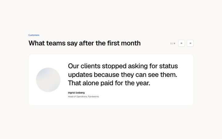
              "quote": "Our clients stopped asking for status updates because they can see them. That alone paid for the year.",
              "name": "Ingrid Solberg",
              "role": "Head of Operations, Fjordworks",
              "photo": {
                "src": "",
                "alt": "Portrait of Ingrid Solberg"
              }
            },
            {
              "quote": "It is the first planning tool the whole studio actually opens in the morning. Nobody had to be told to.",
              "name": "Tomas Ekberg",
              "role": "Studio Director, Alder & Co",
              "photo": {
                "src": "",
                "alt": "Portrait of Tomas Ekberg"
              }
            },
            {
              "quote": "Review used to mean five email threads and a spreadsheet. Now it is one link and a checklist.",
              "name": "Priya Raman",
              "role": "Delivery Lead, Meridian",
              "photo": {
                "src": "",
                "alt": "Portrait of Priya Raman"
              }
            },
            {
              "quote": "We moved forty active projects in a weekend. Support answered every question in under an hour.",
              "name": "Jonas Berg",
              "role": "Founder, Basalt",
              "photo": {
                "src": "",
                "alt": "Portrait of Jonas Berg"
              }
            }
          ]
        }} />
      </BlockSurface>
    </Theme>
  );
}
Install
Import
import Block from '@/components/klarhimmel/blocks/testimonials-carousel';- testimonials/carousel
- Category
- What customers say, one quote or many.
Notes
When to use it
One quote at a time with previous and next buttons, for up to six portraits of customers. If all quotes should be visible without a click, use `testimonials-grid` or `testimonials-wall`.
Writing for it
- Every item needs a quote (400 characters), a name, a role and a portrait. The portrait is shown large on wide containers, so use a square crop. - Order the items with the strongest quote first, because that is the one visible when the page loads. - Keep the quotes about the same length. Slides swap in place, and a short slide after a long one makes the box jump in height.
Watch out for
It only moves when someone presses a button, and the buttons and counter are hidden when there is a single item. While editing in the canvas all quotes are shown stacked, so the real look is the published one.
Pairs well with
Usage
The block in a page, with its default content (long lists shortened). Every prop is in the table below.
import { Theme } from '@/components/klarhimmel/theme/style';
import { BlockSurface } from '@/components/klarhimmel/blocks/surface';
import TestimonialsCarousel from '@/components/klarhimmel/blocks/testimonials-carousel';

export default function Section() {
  return (
    <Theme theme="brand">
      <BlockSurface>
        <TestimonialsCarousel props={{
          "eyebrow": "Customers",
          "title": "What teams say after the first month",
          "items": [
            {
              "quote": "Our clients stopped asking for status updates because they can see them. That alone paid for the year.",
              "name": "Ingrid Solberg",
              "role": "Head of Operations, Fjordworks",
              "photo": {
                "src": "",
                "alt": "Portrait of Ingrid Solberg"
              }
            },
            {
              "quote": "It is the first planning tool the whole studio actually opens in the morning. Nobody had to be told to.",
              "name": "Tomas Ekberg",
              "role": "Studio Director, Alder & Co",
              "photo": {
                "src": "",
                "alt": "Portrait of Tomas Ekberg"
              }
            },
            {
              "quote": "Review used to mean five email threads and a spreadsheet. Now it is one link and a checklist.",
              "name": "Priya Raman",
              "role": "Delivery Lead, Meridian",
              "photo": {
                "src": "",
                "alt": "Portrait of Priya Raman"
              }
            }
          ]
        }} />
      </BlockSurface>
    </Theme>
  );
}
Props
The type, default and text limit of every prop. On a real page, over-limit text is kept and checkSections flags it (Installation, Check a page before you ship); this live preview shows the default until it fits. The panel above edits all props.
| Prop | Type | Default | Description |
|---|---|---|---|
eyebrow | string | 'Customers' | Text, up to 60 characters. |
title | string | 'What teams say after the first month' | Text, up to 120 characters. |
items | { quote, name, role, photo }[] | 4 items | List of 1 to 6. Each item: quote, name, role, photo. |
headingLevel | '1' | '2' | - | One of '1', '2'. Optional; empty is not rendered. |