Top bar
Install
npx shadcn add @klarhimmel/app-shell-topbarUsage
import { Theme } from '@/components/klarhimmel/theme/style';
import { BlockSurface } from '@/components/klarhimmel/blocks/surface';
import AppShellTopbar from '@/components/klarhimmel/blocks/app-shell-topbar';

export default function Section() {
  return (
    <Theme theme="brand">
      <BlockSurface>
        <AppShellTopbar props={{
          "crumbsLabel": "You are here",
          "crumbs": [
            {
              "label": "Exempelhotellet",
              "href": "#home"
            },
            {
              "label": "Bookings",
              "href": "#bookings"
            },
            {
              "label": "Maja Lindqvist",
              "href": "#booking"
            }
          ],
          "account": {
            "label": "Account menu",
            "name": "Maja Lindqvist",
            "email": "maja@northlight.example",
            "items": [
              "Profile",
              "Notifications",
              "Billing"
            ],
            "signOut": "Sign out"
          }
        }} />
      </BlockSurface>
    </Theme>
  );
}
States
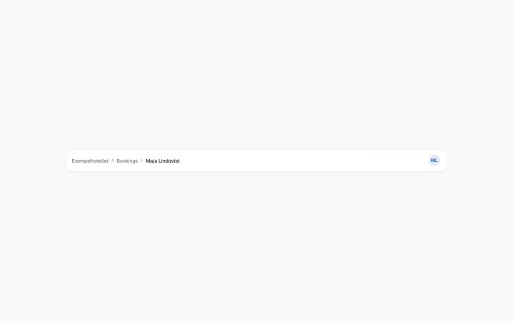
top bar in 3 forms: three crumbs, two crumbs, a long trail.
three crumbs
You are here two crumbs
You are here a long trail
You are here
Notes
When to use it
The bar across the top of an app page with a breadcrumb trail and an account menu. Put it next to `app-shell-sidebar`; for a public site header use a navbar block, which has a brand and calls to action instead.
Writing for it
- crumbs need 2 to 5 links, written from the top down. The last one is the current page and is plain text, so its href does not matter. - Keep each crumb short, as the trail truncates long labels. The account name holds 40 characters and the email 60, shown inside the opened menu. - account.items are plain labels of at most 30 characters, up to 4. List the common destinations, and keep signOut as its own field below them.
Watch out for
account.label names the menu button for screen readers and is not shown, yet it is required. If it is left empty the account menu is not drawn at all, so the person has no way to sign out.
Usage
The block in a page, with its default content (long lists shortened). Every prop is in the table below.
import { Theme } from '@/components/klarhimmel/theme/style';
import { BlockSurface } from '@/components/klarhimmel/blocks/surface';
import AppShellTopbar from '@/components/klarhimmel/blocks/app-shell-topbar';

export default function Section() {
  return (
    <Theme theme="brand">
      <BlockSurface>
        <AppShellTopbar props={{
          "crumbsLabel": "You are here",
          "crumbs": [
            {
              "label": "Exempelhotellet",
              "href": "#home"
            },
            {
              "label": "Bookings",
              "href": "#bookings"
            },
            {
              "label": "Maja Lindqvist",
              "href": "#booking"
            }
          ],
          "account": {
            "label": "Account menu",
            "name": "Maja Lindqvist",
            "email": "maja@northlight.example",
            "items": [
              "Profile",
              "Notifications",
              "Billing"
            ],
            "signOut": "Sign out"
          }
        }} />
      </BlockSurface>
    </Theme>
  );
}
Props
The type, default and text limit of every prop. On a real page, over-limit text is kept and checkSections flags it (Installation, Check a page before you ship); this live preview shows the default until it fits. The panel above edits all props.
| Prop | Type | Default | Description |
|---|---|---|---|
crumbsLabel | string | 'You are here' | Text, up to 40 characters. |
crumbs | Link[] | 3 items | List of 2 to 5. |
account | { label, name, email, items, signOut } | {…} | Fields: label, name, email, items, signOut. |
Install
Installs
app-shell-topbar- Avatar
- Menu
- About
- The top bar of an app: breadcrumbs (the last is the current page, aria-current) and an account menu on an avatar button that opens with Enter, Space or the arrow keys, lists the account actions and returns focus on Escape.
- States
- Breadcrumbs and the account menu, closed and open. Arrow keys move in the menu, Escape returns focus to the button.