App, profile settings
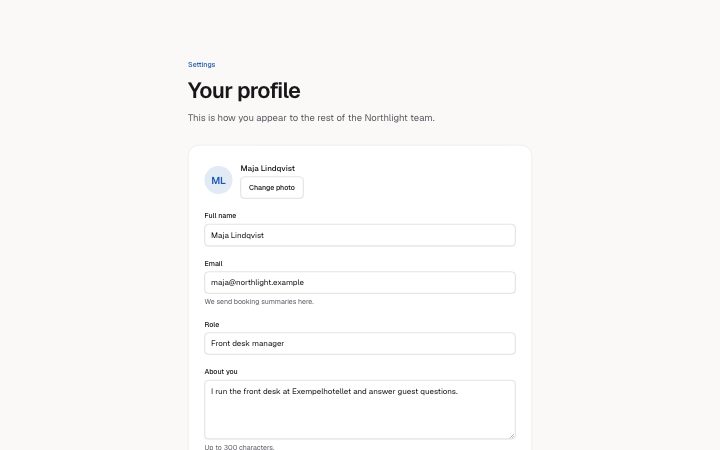
Install
npx shadcn add @klarhimmel/app-settings-profileUsage
import { Theme } from '@/components/klarhimmel/theme/style';
import { BlockSurface } from '@/components/klarhimmel/blocks/surface';
import AppSettingsProfile from '@/components/klarhimmel/blocks/app-settings-profile';

export default function Section() {
  return (
    <Theme theme="brand">
      <BlockSurface>
        <AppSettingsProfile props={{
          "eyebrow": "Settings",
          "title": "Your profile",
          "description": "This is how you appear to the rest of the Northlight team.",
          "avatar": {
            "name": "Maja Lindqvist",
            "change": "Change photo"
          },
          "fields": [
            {
              "label": "Full name",
              "kind": "text",
              "sample": "Maja Lindqvist",
              "autocomplete": "name",
              "invalid": false
            },
            {
              "label": "Email",
              "kind": "email",
              "sample": "maja@northlight.example",
              "hint": "We send booking summaries here.",
              "autocomplete": "email",
              "invalid": true
            },
            {
              "label": "Role",
              "kind": "text",
              "sample": "Front desk manager",
              "autocomplete": "organization-title",
              "invalid": false
            },
            {
              "label": "About you",
              "kind": "textarea",
              "sample": "I run the front desk at Exempelhotellet and answer guest questions.",
              "hint": "Up to 300 characters.",
              "autocomplete": "off",
              "invalid": false
            }
          ],
          "actions": {
            "save": "Save changes",
            "saving": "Saving…",
            "cancel": "Cancel"
          },
          "state": "idle",
          "messages": {
            "saved": "Your profile is saved.",
            "error": "We could not save your profile. Fix the marked field and try again.",
            "fieldError": "That email is already used by another account."
          }
        }} />
      </BlockSurface>
    </Theme>
  );
}
Install
Import
import Block from '@/components/klarhimmel/blocks/app-settings-profile';- app/settings-profile
- About
- A profile form: photo, labelled fields with hints and autofill hints, save and cancel, and four states (idle; saving, which disables every field; saved; error, which marks and describes the flagged field). Never submits.
- Category
- Interface sections for signed-in products.
Notes
When to use it
An account profile form with a photo and a few fields. For inviting another person use `app-team-invite`; for the irreversible actions that sit below the profile, use `app-settings-danger`.
Writing for it
- Each field needs a label (40) and a kind: text, email or textarea. The sample (300) is the value the input starts with, not placeholder copy. - Set autocomplete on every field to the matching hint, such as name or email, so browsers can fill the form. Use off for free text like a bio. - Mark exactly one field invalid: true if the error state should point at it. The fieldError text (120) then appears under that field and in the banner.
Watch out for
Saving is a state you set, not an action the block performs: the form never submits. In the saving state every field is disabled, and in the error state only the first field with invalid set is marked.
Usage
The block in a page, with its default content (long lists shortened). Every prop is in the table below.
import { Theme } from '@/components/klarhimmel/theme/style';
import { BlockSurface } from '@/components/klarhimmel/blocks/surface';
import AppSettingsProfile from '@/components/klarhimmel/blocks/app-settings-profile';

export default function Section() {
  return (
    <Theme theme="brand">
      <BlockSurface>
        <AppSettingsProfile props={{
          "eyebrow": "Settings",
          "title": "Your profile",
          "description": "This is how you appear to the rest of the Northlight team.",
          "avatar": {
            "name": "Maja Lindqvist",
            "change": "Change photo"
          },
          "fields": [
            {
              "label": "Full name",
              "kind": "text",
              "sample": "Maja Lindqvist",
              "autocomplete": "name",
              "invalid": false
            },
            {
              "label": "Email",
              "kind": "email",
              "sample": "maja@northlight.example",
              "hint": "We send booking summaries here.",
              "autocomplete": "email",
              "invalid": true
            },
            {
              "label": "Role",
              "kind": "text",
              "sample": "Front desk manager",
              "autocomplete": "organization-title",
              "invalid": false
            }
          ],
          "actions": {
            "save": "Save changes",
            "saving": "Saving…",
            "cancel": "Cancel"
          },
          "state": "idle",
          "messages": {
            "saved": "Your profile is saved.",
            "error": "We could not save your profile. Fix the marked field and try again.",
            "fieldError": "That email is already used by another account."
          }
        }} />
      </BlockSurface>
    </Theme>
  );
}
Props
The type, default and text limit of every prop. On a real page, over-limit text is kept and checkSections flags it (Installation, Check a page before you ship); this live preview shows the default until it fits. The panel above edits all props.
| Prop | Type | Default | Description |
|---|---|---|---|
eyebrow | string | 'Settings' | Text, up to 60 characters. Optional; empty is not rendered. |
title | string | 'Your profile' | Text, up to 120 characters. |
description | string | 'This is how you appear to the rest …' | Text, up to 300 characters. Optional; empty is not rendered. |
avatar | { name, change } | {…} | Fields: name, change. |
fields | { label, kind, sample, hint, autocomplete, invalid }[] | 4 items | List of 2 to 6. Each item: label, kind ('text' | 'email' | 'textarea'), sample, hint (optional), autocomplete ('name' | 'given-name' | 'family-name' | 'email' | 'tel' | 'organization' | 'organization-title' | 'url' | 'off'), invalid. |
actions | { save, saving, cancel } | {…} | Fields: save, saving, cancel. |
state | 'idle' | 'saving' | 'saved' | 'error' | 'idle' | One of 'idle', 'saving', 'saved', 'error'. |
messages | { saved, error, fieldError } | {…} | Fields: saved, error, fieldError. |
headingLevel | '1' | '2' | - | One of '1', '2'. Optional; empty is not rendered. |