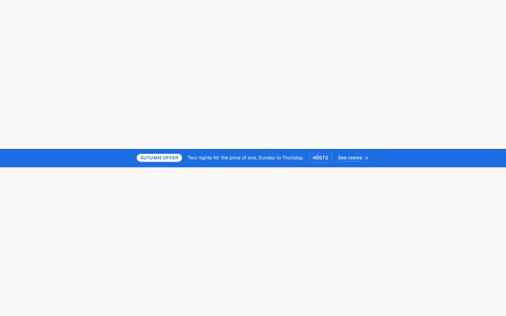
Banner, promo code
Install
npx shadcn add @klarhimmel/banner-promoUsage
import { Theme } from '@/components/klarhimmel/theme/style';
import { BlockSurface } from '@/components/klarhimmel/blocks/surface';
import BannerPromo from '@/components/klarhimmel/blocks/banner-promo';

export default function Section() {
  return (
    <Theme theme="brand">
      <BlockSurface>
        <BannerPromo props={{
          "badge": "Autumn offer",
          "text": "Two nights for the price of one, Sunday to Thursday.",
          "code": "HÖST2",
          "link": {
            "label": "See rooms",
            "href": "/rooms"
          }
        }} />
      </BlockSurface>
    </Theme>
  );
}
Install
Import
import Block from '@/components/klarhimmel/blocks/banner-promo';- banner/promo
- Category
- Announcement bars and the cookie notice.
Notes
When to use it
A slim bar above the navbar for a time-limited campaign, with a badge, a line of text and a discount code in a dashed chip. For general news without a code, `banner-announcement` is simpler and can be dismissed.
Writing for it
- The badge holds 24 characters and names the campaign, like Autumn offer. It is a label, not a sentence. - The text holds 120 characters; state the deal and its limits, such as days or conditions, because the code chip carries no explanation. - The code holds 24 characters. Write it exactly as the shopper must type it, including capitals and special letters.
Watch out for
Badge and code each vanish from the bar when left empty, and the link goes the same way with an empty label. A bar with all three empty is reduced to the text line alone.
Pairs well with
Usage
The block in a page, with its default content (long lists shortened). Every prop is in the table below.
import { Theme } from '@/components/klarhimmel/theme/style';
import { BlockSurface } from '@/components/klarhimmel/blocks/surface';
import BannerPromo from '@/components/klarhimmel/blocks/banner-promo';

export default function Section() {
  return (
    <Theme theme="brand">
      <BlockSurface>
        <BannerPromo props={{
          "badge": "Autumn offer",
          "text": "Two nights for the price of one, Sunday to Thursday.",
          "code": "HÖST2",
          "link": {
            "label": "See rooms",
            "href": "/rooms"
          }
        }} />
      </BlockSurface>
    </Theme>
  );
}
Props
The type, default and text limit of every prop. On a real page, over-limit text is kept and checkSections flags it (Installation, Check a page before you ship); this live preview shows the default until it fits. The panel above edits all props.
| Prop | Type | Default | Description |
|---|---|---|---|
badge | string | 'Autumn offer' | Text, up to 24 characters. |
text | string | 'Two nights for the price of one, Su…' | Text, up to 120 characters. |
code | string | 'HÖST2' | Text, up to 24 characters. |
link | Link | {…} | See the type. |