Hero, centered
Install
npx shadcn add @klarhimmel/hero-centeredUsage
import { Theme } from '@/components/klarhimmel/theme/style';
import { BlockSurface } from '@/components/klarhimmel/blocks/surface';
import HeroCentered from '@/components/klarhimmel/blocks/hero-centered';

export default function Section() {
  return (
    <Theme theme="brand">
      <BlockSurface>
        <HeroCentered props={{
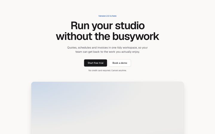
          "eyebrow": "Version 2.0 is here",
          "title": "Run your studio without the busywork",
          "description": "Quotes, schedules and invoices in one tidy workspace, so your team can get back to the work you actually enjoy.",
          "primary": {
            "label": "Start free trial",
            "href": "#start"
          },
          "secondary": {
            "label": "Book a demo",
            "href": "#demo"
          },
          "note": "No credit card required. Cancel anytime.",
          "media": {
            "src": "",
            "alt": "The dashboard showing this week at a glance"
          }
        }} />
      </BlockSurface>
    </Theme>
  );
}
Install
Import
import Block from '@/components/klarhimmel/blocks/hero-centered';- hero/centered
- Category
- The first screen: what it is, who it is for, what to do next.
Notes
When to use it
The classic opener: centred headline, a description, two actions and a wide image below. Choose `hero-split` when the image should sit beside the text, and `hero-minimal` when there is no image.
Writing for it
- The title is the h1 of the page and holds 120 characters. State what the product does for the reader rather than its category. - Description holds 300 characters but reads as a lead paragraph, so two sentences is the useful length. The note (80) sits under the buttons for reassurance such as no card needed. - The media field is a wide framed image and its alt text is required in the defaults, so describe what the screenshot shows.
Watch out for
This block renders the page's only h1. Putting a second hero or another block with an h1 on the same page breaks the heading outline.
Pairs well with
Usage
The block in a page, with its default content (long lists shortened). Every prop is in the table below.
import { Theme } from '@/components/klarhimmel/theme/style';
import { BlockSurface } from '@/components/klarhimmel/blocks/surface';
import HeroCentered from '@/components/klarhimmel/blocks/hero-centered';

export default function Section() {
  return (
    <Theme theme="brand">
      <BlockSurface>
        <HeroCentered props={{
          "eyebrow": "Version 2.0 is here",
          "title": "Run your studio without the busywork",
          "description": "Quotes, schedules and invoices in one tidy workspace, so your team can get back to the work you actually enjoy.",
          "primary": {
            "label": "Start free trial",
            "href": "#start"
          },
          "secondary": {
            "label": "Book a demo",
            "href": "#demo"
          },
          "note": "No credit card required. Cancel anytime.",
          "media": {
            "src": "",
            "alt": "The dashboard showing this week at a glance"
          }
        }} />
      </BlockSurface>
    </Theme>
  );
}
Props
The type, default and text limit of every prop. On a real page, over-limit text is kept and checkSections flags it (Installation, Check a page before you ship); this live preview shows the default until it fits. The panel above edits all props.
| Prop | Type | Default | Description |
|---|---|---|---|
eyebrow | string | 'Version 2.0 is here' | Text, up to 60 characters. |
title | string | 'Run your studio without the busywork' | Text, up to 120 characters. |
description | string | 'Quotes, schedules and invoices in o…' | Text, up to 300 characters. |
primary | Link | {…} | See the type. |
secondary | Link | {…} | See the type. |
note | string | 'No credit card required. Cancel any…' | Text, up to 80 characters. |
media | Media | {…} | See the type. |
headingLevel | '1' | '2' | - | One of '1', '2'. Optional; empty is not rendered. |