Blog, cards
Install
npx shadcn add @klarhimmel/blog-cardsUsage
import { Theme } from '@/components/klarhimmel/theme/style';
import { BlockSurface } from '@/components/klarhimmel/blocks/surface';
import BlogCards from '@/components/klarhimmel/blocks/blog-cards';

export default function Section() {
  return (
    <Theme theme="brand">
      <BlockSurface>
        <BlogCards props={{
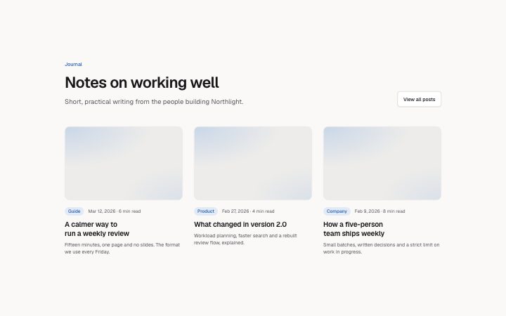
          "eyebrow": "Journal",
          "title": "Notes on working well",
          "description": "Short, practical writing from the people building Northlight.",
          "posts": [
            {
              "category": "Guide",
              "title": "A calmer way to run a weekly review",
              "excerpt": "Fifteen minutes, one page and no slides. The format we use every Friday.",
              "meta": "Mar 12, 2026 · 6 min read",
              "href": "#post-1",
              "media": {
                "src": "",
                "alt": "A notebook open on a desk"
              }
            },
            {
              "category": "Product",
              "title": "What changed in version 2.0",
              "excerpt": "Workload planning, faster search and a rebuilt review flow, explained.",
              "meta": "Feb 27, 2026 · 4 min read",
              "href": "#post-2",
              "media": {
                "src": "",
                "alt": "The new planning calendar"
              }
            },
            {
              "category": "Company",
              "title": "How a five-person team ships weekly",
              "excerpt": "Small batches, written decisions and a strict limit on work in progress.",
              "meta": "Feb 9, 2026 · 8 min read",
              "href": "#post-3",
              "media": {
                "src": "",
                "alt": "A team around a table"
              }
            }
          ],
          "more": {
            "label": "View all posts",
            "href": "#journal"
          }
        }} />
      </BlockSurface>
    </Theme>
  );
}
Install
Import
import Block from '@/components/klarhimmel/blocks/blog-cards';- blog/cards
- Category
- Post cards, lists and the article page.
Notes
When to use it
A grid of article cards with image, category badge, title, excerpt and date line, for a journal landing section. When one post matters most, use `blog-featured`; for an archive that is easy to scan, use `blog-list`.
Writing for it
- Each post title is required and holds 100 characters; write it as the thing a reader learns. Set showHeader to false when the surrounding page supplies the section heading and introduction, so the grid starts without duplicate copy or spacing. - Use the meta field (60 characters) for date and reading time together, as in 'Mar 12, 2026 · 6 min read'. It is a plain text line, so format the date yourself. - Keep the category to one word of up to 30 characters. It becomes a badge, and a long one wraps awkwardly.
Watch out for
Each post uses the href field as the destination of the title link, and nothing else on the card is a separate link. A post with an empty href still renders but points nowhere. Also, one to six posts only, with a card image forced to 16 by 10.
Pairs well with
Usage
The block in a page, with its default content (long lists shortened). Every prop is in the table below.
import { Theme } from '@/components/klarhimmel/theme/style';
import { BlockSurface } from '@/components/klarhimmel/blocks/surface';
import BlogCards from '@/components/klarhimmel/blocks/blog-cards';

export default function Section() {
  return (
    <Theme theme="brand">
      <BlockSurface>
        <BlogCards props={{
          "eyebrow": "Journal",
          "title": "Notes on working well",
          "description": "Short, practical writing from the people building Northlight.",
          "posts": [
            {
              "category": "Guide",
              "title": "A calmer way to run a weekly review",
              "excerpt": "Fifteen minutes, one page and no slides. The format we use every Friday.",
              "meta": "Mar 12, 2026 · 6 min read",
              "href": "#post-1",
              "media": {
                "src": "",
                "alt": "A notebook open on a desk"
              }
            },
            {
              "category": "Product",
              "title": "What changed in version 2.0",
              "excerpt": "Workload planning, faster search and a rebuilt review flow, explained.",
              "meta": "Feb 27, 2026 · 4 min read",
              "href": "#post-2",
              "media": {
                "src": "",
                "alt": "The new planning calendar"
              }
            }
          ],
          "more": {
            "label": "View all posts",
            "href": "#journal"
          }
        }} />
      </BlockSurface>
    </Theme>
  );
}
Props
The type, default and text limit of every prop. On a real page, over-limit text is kept and checkSections flags it (Installation, Check a page before you ship); this live preview shows the default until it fits. The panel above edits all props.
| Prop | Type | Default | Description |
|---|---|---|---|
showHeader | boolean | - | Optional; empty is not rendered. |
eyebrow | string | 'Journal' | Text, up to 60 characters. |
title | string | 'Notes on working well' | Text, up to 120 characters. |
description | string | 'Short, practical writing from the p…' | Text, up to 300 characters. |
posts | { category, title, excerpt, meta, href, media }[] | 3 items | List of 1 to 6. Each item: category, title, excerpt, meta, href, media. |
more | Link | {…} | See the type. |
headingLevel | '1' | '2' | - | One of '1', '2'. Optional; empty is not rendered. |