Navbar, simple
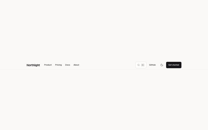
Install
npx shadcn add @klarhimmel/navbar-simpleUsage
import { Theme } from '@/components/klarhimmel/theme/style';
import { BlockSurface } from '@/components/klarhimmel/blocks/surface';
import NavbarSimple from '@/components/klarhimmel/blocks/navbar-simple';

export default function Section() {
  return (
    <Theme theme="brand">
      <BlockSurface>
        <NavbarSimple props={{
          "brand": "Northlight",
          "links": [
            {
              "label": "Product",
              "href": "#product"
            },
            {
              "label": "Pricing",
              "href": "#pricing"
            },
            {
              "label": "Docs",
              "href": "#docs"
            },
            {
              "label": "About",
              "href": "#about"
            }
          ],
          "cta": {
            "label": "Get started",
            "href": "#start"
          },
          "search": {
            "label": "Search",
            "hint": "⌘K"
          },
          "secondary": {
            "label": "GitHub",
            "href": "#github"
          },
          "themeToggle": true
        }} />
      </BlockSurface>
    </Theme>
  );
}
Install
Import
import Block from '@/components/klarhimmel/blocks/navbar-simple';- header/simple
- About
- Brand on the left, up to eight links, an optional search trigger, secondary link and theme toggle, and one call to action. An optional Products disclosure holds short descriptions and status labels. Collapses to a menu in narrow containers.
- Category
- The bar at the top of every page: brand, links, one action.
Notes
When to use it
The default header: brand on the left, a row of links, and one action on the right. Pick it when you need a search trigger, a theme toggle or a secondary link; `navbar-centered` fits a smaller, more symmetrical bar.
Writing for it
- Links go up to eight, but beyond five the bar switches to its heavier layout and collapses into the menu sooner, so cut to five if the site allows. - The search object takes a label (24) and a hint (12) such as the keyboard shortcut. Leave the object out entirely to drop the search trigger. - The logo field draws a small mark before the brand name only when it has a src; the wordmark still needs its text in brand (40).
Watch out for
Search and the theme toggle only render when the page is interactive. A static or no-script copy shows the brand, links, secondary link and cta, and nothing for search.
Pairs well with
Usage
The block in a page, with its default content (long lists shortened). Every prop is in the table below.
import { Theme } from '@/components/klarhimmel/theme/style';
import { BlockSurface } from '@/components/klarhimmel/blocks/surface';
import NavbarSimple from '@/components/klarhimmel/blocks/navbar-simple';

export default function Section() {
  return (
    <Theme theme="brand">
      <BlockSurface>
        <NavbarSimple props={{
          "brand": "Northlight",
          "links": [
            {
              "label": "Product",
              "href": "#product"
            },
            {
              "label": "Pricing",
              "href": "#pricing"
            },
            {
              "label": "Docs",
              "href": "#docs"
            },
            {
              "label": "About",
              "href": "#about"
            }
          ],
          "cta": {
            "label": "Get started",
            "href": "#start"
          },
          "search": {
            "label": "Search",
            "hint": "⌘K"
          },
          "secondary": {
            "label": "GitHub",
            "href": "#github"
          },
          "themeToggle": true
        }} />
      </BlockSurface>
    </Theme>
  );
}
Props
The type, default and text limit of every prop. On a real page, over-limit text is kept and checkSections flags it (Installation, Check a page before you ship); this live preview shows the default until it fits. The panel above edits all props.
| Prop | Type | Default | Description |
|---|---|---|---|
brand | string | 'Northlight' | Text, up to 40 characters. |
mark | { paths, viewBox, src } | - | Fields: paths (optional), viewBox (optional), src (optional). Optional; empty is not rendered. |
logo | Media | - | Optional; empty is not rendered. |
brandHref | string | - | Text, up to 300 characters. Optional; empty is not rendered. |
links | Link[] | 4 items | List of up to 8. |
products | { label, layout, items } | - | Fields: label (optional), layout ('list' | 'mega') (optional), items (optional). Optional; empty is not rendered. |
dropdowns | { label, layout, items }[] | - | List of up to 4. Each item: label (optional), layout ('list' | 'mega') (optional), items (optional). Optional; empty is not rendered. |
current | string | - | Text, up to 300 characters. Optional; empty is not rendered. |
cta | Link | {…} | See the type. |
secondaryCta | Link | - | Optional; empty is not rendered. |
search | { label, hint } | {…} | Fields: label (optional), hint. Optional; empty is not rendered. |
secondary | Link | {…} | Optional; empty is not rendered. |
themeToggle | boolean | true | Optional; empty is not rendered. |