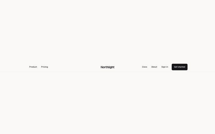
Navbar, centred
Install
npx shadcn add @klarhimmel/navbar-centeredUsage
import { Theme } from '@/components/klarhimmel/theme/style';
import { BlockSurface } from '@/components/klarhimmel/blocks/surface';
import NavbarCentered from '@/components/klarhimmel/blocks/navbar-centered';

export default function Section() {
  return (
    <Theme theme="brand">
      <BlockSurface>
        <NavbarCentered props={{
          "brand": "Northlight",
          "links": [
            {
              "label": "Product",
              "href": "#product"
            },
            {
              "label": "Pricing",
              "href": "#pricing"
            },
            {
              "label": "Docs",
              "href": "#docs"
            },
            {
              "label": "About",
              "href": "#about"
            }
          ],
          "secondary": {
            "label": "Sign in",
            "href": "#signin"
          },
          "cta": {
            "label": "Get started",
            "href": "#start"
          }
        }} />
      </BlockSurface>
    </Theme>
  );
}
Install
Import
import Block from '@/components/klarhimmel/blocks/navbar-centered';- header/centered
- Category
- The bar at the top of every page: brand, links, one action.
Notes
When to use it
A header for brands that should sit in the middle, with the links split on either side of the name. It suits a small site with four to six links; with more links or a search field, `navbar-simple` is the better choice.
Writing for it
- The brand holds 40 characters and is the centre of the whole bar, so a short name looks balanced and a long one pushes the links apart. - Give links up to six entries. The block cuts the list in half, rounding up, so an odd count puts the extra link on the left. - Use secondary for the quiet option like Sign in, and cta for the single action you want taken. Both are separate link fields.
Watch out for
The current field takes the href of the page you are on and marks the matching link with aria-current. If the string differs from a link's href even by a trailing slash, nothing is marked.
Pairs well with
Usage
The block in a page, with its default content (long lists shortened). Every prop is in the table below.
import { Theme } from '@/components/klarhimmel/theme/style';
import { BlockSurface } from '@/components/klarhimmel/blocks/surface';
import NavbarCentered from '@/components/klarhimmel/blocks/navbar-centered';

export default function Section() {
  return (
    <Theme theme="brand">
      <BlockSurface>
        <NavbarCentered props={{
          "brand": "Northlight",
          "links": [
            {
              "label": "Product",
              "href": "#product"
            },
            {
              "label": "Pricing",
              "href": "#pricing"
            },
            {
              "label": "Docs",
              "href": "#docs"
            },
            {
              "label": "About",
              "href": "#about"
            }
          ],
          "secondary": {
            "label": "Sign in",
            "href": "#signin"
          },
          "cta": {
            "label": "Get started",
            "href": "#start"
          }
        }} />
      </BlockSurface>
    </Theme>
  );
}
Props
The type, default and text limit of every prop. On a real page, over-limit text is kept and checkSections flags it (Installation, Check a page before you ship); this live preview shows the default until it fits. The panel above edits all props.
| Prop | Type | Default | Description |
|---|---|---|---|
brand | string | 'Northlight' | Text, up to 40 characters. |
brandHref | string | - | Text, up to 300 characters. Optional; empty is not rendered. |
links | Link[] | 4 items | List of up to 6. |
current | string | - | Text, up to 300 characters. Optional; empty is not rendered. |
secondary | Link | {…} | See the type. |
cta | Link | {…} | See the type. |