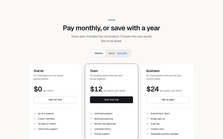
Pricing, billing toggle
Install
npx shadcn add @klarhimmel/pricing-toggleUsage
import { Theme } from '@/components/klarhimmel/theme/style';
import { BlockSurface } from '@/components/klarhimmel/blocks/surface';
import PricingToggle from '@/components/klarhimmel/blocks/pricing-toggle';

export default function Section() {
  return (
    <Theme theme="brand">
      <BlockSurface>
        <PricingToggle props={{
          "eyebrow": "Pricing",
          "title": "Pay monthly, or save with a year",
          "description": "Every plan includes the full product. Choose how you would like to be billed.",
          "monthlyLabel": "Monthly",
          "yearlyLabel": "Yearly",
          "saving": "Save 20%",
          "tiers": [
            {
              "name": "Starter",
              "monthly": "$0",
              "yearly": "$0",
              "period": "per month",
              "description": "For individuals and tiny teams getting started.",
              "features": [
                "Up to 3 projects",
                "2 team members",
                "30 days of history",
                "Community support"
              ],
              "cta": {
                "label": "Start for free",
                "href": "#start"
              },
              "featured": false
            },
            {
              "name": "Team",
              "monthly": "$12",
              "yearly": "$10",
              "period": "per person, per month",
              "description": "For growing teams that plan and review together.",
              "features": [
                "Unlimited projects",
                "Workload planning",
                "Review and approvals",
                "Unlimited history",
                "Priority support"
              ],
              "cta": {
                "label": "Start free trial",
                "href": "#trial"
              },
              "featured": true
            },
            {
              "name": "Business",
              "monthly": "$24",
              "yearly": "$19",
              "period": "per person, per month",
              "description": "For organisations with security and control needs.",
              "features": [
                "Everything in Team",
                "Single sign-on",
                "Audit log",
                "Custom roles",
                "Dedicated success manager"
              ],
              "cta": {
                "label": "Talk to sales",
                "href": "#sales"
              },
              "featured": false
            }
          ]
        }} />
      </BlockSurface>
    </Theme>
  );
}
Install
Import
import Block from '@/components/klarhimmel/blocks/pricing-toggle';- pricing/toggle
- Category
- Plans and prices: tiers, a single plan, a toggle or a comparison table.
Notes
When to use it
Up to three plans with a monthly and yearly switch that changes every price at once. Use `pricing-tiers` when you offer one billing period only.
Writing for it
- Each tier carries a monthly and a yearly price of 16 characters each. Write the yearly figure as the monthly equivalent if the period says 'per month'. - The saving badge (32 characters) is drawn on the yearly button, such as 'Save 20%'. Empty it and the badge disappears. - The monthly label is required, and yearly and monthly labels are also the accessible name of the switch. Use plain words like 'Monthly' and 'Yearly'.
Watch out for
The page always loads on monthly, and only a visitor can switch it. In the canvas both prices are shown and the toggle is a static label, so a screenshot of the published page may show different numbers than your editor.
Pairs well with
Usage
The block in a page, with its default content (long lists shortened). Every prop is in the table below.
import { Theme } from '@/components/klarhimmel/theme/style';
import { BlockSurface } from '@/components/klarhimmel/blocks/surface';
import PricingToggle from '@/components/klarhimmel/blocks/pricing-toggle';

export default function Section() {
  return (
    <Theme theme="brand">
      <BlockSurface>
        <PricingToggle props={{
          "eyebrow": "Pricing",
          "title": "Pay monthly, or save with a year",
          "description": "Every plan includes the full product. Choose how you would like to be billed.",
          "monthlyLabel": "Monthly",
          "yearlyLabel": "Yearly",
          "saving": "Save 20%",
          "tiers": [
            {
              "name": "Starter",
              "monthly": "$0",
              "yearly": "$0",
              "period": "per month",
              "description": "For individuals and tiny teams getting started.",
              "features": [
                "Up to 3 projects",
                "2 team members"
              ],
              "cta": {
                "label": "Start for free",
                "href": "#start"
              },
              "featured": false
            },
            {
              "name": "Team",
              "monthly": "$12",
              "yearly": "$10",
              "period": "per person, per month",
              "description": "For growing teams that plan and review together.",
              "features": [
                "Unlimited projects",
                "Workload planning"
              ],
              "cta": {
                "label": "Start free trial",
                "href": "#trial"
              },
              "featured": true
            }
          ]
        }} />
      </BlockSurface>
    </Theme>
  );
}
Props
The type, default and text limit of every prop. On a real page, over-limit text is kept and checkSections flags it (Installation, Check a page before you ship); this live preview shows the default until it fits. The panel above edits all props.
| Prop | Type | Default | Description |
|---|---|---|---|
eyebrow | string | 'Pricing' | Text, up to 60 characters. |
title | string | 'Pay monthly, or save with a year' | Text, up to 120 characters. |
description | string | 'Every plan includes the full produc…' | Text, up to 300 characters. |
monthlyLabel | string | 'Monthly' | Text, up to 24 characters. |
yearlyLabel | string | 'Yearly' | Text, up to 24 characters. |
saving | string | 'Save 20%' | Text, up to 32 characters. |
tiers | { name, monthly, yearly, period, description, features, cta, featured }[] | 3 items | List of 1 to 3. Each item: name, monthly, yearly, period, description, features, cta, featured. |
headingLevel | '1' | '2' | - | One of '1', '2'. Optional; empty is not rendered. |