Stat panel row
Install
npx shadcn add @klarhimmel/app-dashboard-statsUsage
import { Theme } from '@/components/klarhimmel/theme/style';
import { BlockSurface } from '@/components/klarhimmel/blocks/surface';
import AppDashboardStats from '@/components/klarhimmel/blocks/app-dashboard-stats';

export default function Section() {
  return (
    <Theme theme="brand">
      <BlockSurface>
        <AppDashboardStats props={{
          "eyebrow": "Overview",
          "title": "June at Exempelhotellet",
          "description": "How the month is going, compared with May.",
          "items": [
            {
              "label": "Occupancy",
              "value": "82%",
              "change": "+6%",
              "trend": "up",
              "against": "vs May"
            },
            {
              "label": "Bookings",
              "value": "214",
              "change": "+18",
              "trend": "up",
              "against": "vs May"
            },
            {
              "label": "Average stay",
              "value": "2.8 nights",
              "change": "0.0",
              "trend": "flat",
              "against": "vs May"
            },
            {
              "label": "Cancellations",
              "value": "9",
              "change": "−3",
              "trend": "down",
              "against": "vs May"
            }
          ],
          "state": "filled",
          "messages": {
            "loading": "Loading the figures",
            "error": "We could not load the figures. Try again in a moment.",
            "retry": "Try again"
          }
        }} />
      </BlockSurface>
    </Theme>
  );
}
States
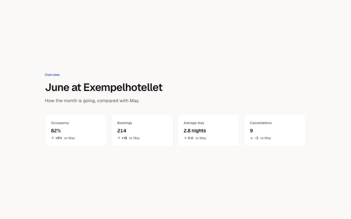
stat panel row in 3 forms: filled, loading, error.
state: filled
Overview
June at Exempelhotellet
How the month is going, compared with May.
We could not load the figures. Try again in a moment.Loading the figures
- Occupancy
- 82%+6%vs May
- Bookings
- 214+18vs May
- Average stay
- 2.8 nights0.0vs May
- Cancellations
- 9−3vs May
state: loading
Overview
June at Exempelhotellet
How the month is going, compared with May.
We could not load the figures. Try again in a moment.Loading the figures
- Occupancy
- 82%+6%vs May
- Bookings
- 214+18vs May
- Average stay
- 2.8 nights0.0vs May
- Cancellations
- 9−3vs May
state: error
Overview
June at Exempelhotellet
How the month is going, compared with May.
We could not load the figures. Try again in a moment.Loading the figures
- Occupancy
- 82%+6%vs May
- Bookings
- 214+18vs May
- Average stay
- 2.8 nights0.0vs May
- Cancellations
- 9−3vs May
Notes
When to use it
A row of two to four figures at the top of a dashboard, each with a change and a comparison. When you need a trend across time use `app-dashboard-chart`.
Writing for it
- Each item has a `label` (40), a large `value` (20) and a `change` (30). Include the sign in the change text, such as +12%, because the arrow only repeats the direction. - `against` (40) names the baseline, for instance vs last month. Without it a change figure has nothing to compare with. - Keep `value` short enough for a large type size: 20 characters is the limit, and 6 to 8 usually fits four columns.
Watch out for
There must be at least 2 items and at most 4. The `trend` value sets the arrow, not the colour meaning, so a down arrow on churn is still shown the same as a down arrow on revenue.
Pairs well with
Usage
The block in a page, with its default content (long lists shortened). Every prop is in the table below.
import { Theme } from '@/components/klarhimmel/theme/style';
import { BlockSurface } from '@/components/klarhimmel/blocks/surface';
import AppDashboardStats from '@/components/klarhimmel/blocks/app-dashboard-stats';

export default function Section() {
  return (
    <Theme theme="brand">
      <BlockSurface>
        <AppDashboardStats props={{
          "eyebrow": "Overview",
          "title": "June at Exempelhotellet",
          "description": "How the month is going, compared with May.",
          "items": [
            {
              "label": "Occupancy",
              "value": "82%",
              "change": "+6%",
              "trend": "up",
              "against": "vs May"
            },
            {
              "label": "Bookings",
              "value": "214",
              "change": "+18",
              "trend": "up",
              "against": "vs May"
            },
            {
              "label": "Average stay",
              "value": "2.8 nights",
              "change": "0.0",
              "trend": "flat",
              "against": "vs May"
            },
            {
              "label": "Cancellations",
              "value": "9",
              "change": "−3",
              "trend": "down",
              "against": "vs May"
            }
          ],
          "state": "filled",
          "messages": {
            "loading": "Loading the figures",
            "error": "We could not load the figures. Try again in a moment.",
            "retry": "Try again"
          }
        }} />
      </BlockSurface>
    </Theme>
  );
}
Props
The type, default and text limit of every prop. On a real page, over-limit text is kept and checkSections flags it (Installation, Check a page before you ship); this live preview shows the default until it fits. The panel above edits all props.
| Prop | Type | Default | Description |
|---|---|---|---|
eyebrow | string | 'Overview' | Text, up to 60 characters. Optional; empty is not rendered. |
title | string | 'June at Exempelhotellet' | Text, up to 120 characters. |
description | string | 'How the month is going, compared wi…' | Text, up to 300 characters. Optional; empty is not rendered. |
items | { label, value, change, trend, against }[] | 4 items | List of 2 to 4. Each item: label, value, change, trend ('up' | 'down' | 'flat'), against. |
state | 'filled' | 'loading' | 'error' | 'filled' | One of 'filled', 'loading', 'error'. |
messages | { loading, error, retry } | {…} | Fields: loading, error, retry. |
headingLevel | '1' | '2' | - | One of '1', '2'. Optional; empty is not rendered. |
Install
Installs
app-dashboard-stats- Banner
- Button
- Skeleton
- About
- A row of two to four figures for a dashboard: label, large value, the change with a sign and an arrow, and what it is measured against. A definition list for assistive tech, with loading and error states.
- States
- Filled, loading and error. Up, down or flat; the arrow always comes with a signed number.