App, chart card
Install
npx shadcn add @klarhimmel/app-dashboard-chartUsage
import { Theme } from '@/components/klarhimmel/theme/style';
import { BlockSurface } from '@/components/klarhimmel/blocks/surface';
import AppDashboardChart from '@/components/klarhimmel/blocks/app-dashboard-chart';

export default function Section() {
  return (
    <Theme theme="brand">
      <BlockSurface>
        <AppDashboardChart props={{
          "eyebrow": "Revenue",
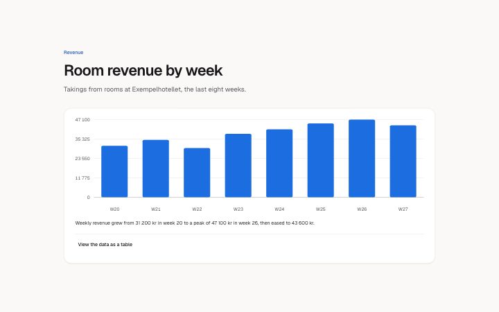
          "title": "Room revenue by week",
          "description": "Takings from rooms at Exempelhotellet, the last eight weeks.",
          "kind": "bar",
          "points": [
            {
              "label": "W20",
              "value": "31200"
            },
            {
              "label": "W21",
              "value": "34800"
            },
            {
              "label": "W22",
              "value": "29900"
            },
            {
              "label": "W23",
              "value": "38500"
            },
            {
              "label": "W24",
              "value": "41200"
            },
            {
              "label": "W25",
              "value": "44800"
            },
            {
              "label": "W26",
              "value": "47100"
            },
            {
              "label": "W27",
              "value": "43600"
            }
          ],
          "unit": "kr",
          "summary": "Weekly revenue grew from 31 200 kr in week 20 to a peak of 47 100 kr in week 26, then eased to 43 600 kr.",
          "tableLabel": "View the data as a table",
          "scrollHint": "Scroll sideways for more",
          "tableHead": {
            "label": "Week",
            "value": "Revenue"
          },
          "state": "filled",
          "messages": {
            "loading": "Loading the chart",
            "empty": "There is no revenue to show for these weeks yet.",
            "error": "We could not load the chart. Try again in a moment.",
            "retry": "Try again"
          }
        }} />
      </BlockSurface>
    </Theme>
  );
}
Install
Import
import Block from '@/components/klarhimmel/blocks/app-dashboard-chart';- app/dashboard-chart
- About
- A chart card for a dashboard: a bar or line chart drawn as plain SVG from a short list of readings, a sentence that says what it shows, and a value axis, negative values below a zero line, and a data table behind a disclosure so nobody…
- Category
- Interface sections for signed-in products.
Notes
When to use it
A card with a bar or line chart of one short series and a table behind a disclosure. For headline figures without a trend use `app-dashboard-stats`; for many rows of data use `app-data-table`.
Writing for it
- Give 3 to 12 `points`, with labels of 12 characters or less such as Jan, and values written as text like 4 200 or -5 000. A value with no number is drawn as a gap. - `summary` (200) is the sentence under the chart and also its description for screen readers, so state the finding, like which month was highest. - `unit` (10) shows after each value in the table only, not on the chart axis, so put the unit in the title or summary too.
Watch out for
Labels past 12 characters are cut by the schema, and with 12 points they sit tightly on the axis. In the empty state `messages.empty` is required, while loading and error show no chart at all, only the message.
Pairs well with
Usage
The block in a page, with its default content (long lists shortened). Every prop is in the table below.
import { Theme } from '@/components/klarhimmel/theme/style';
import { BlockSurface } from '@/components/klarhimmel/blocks/surface';
import AppDashboardChart from '@/components/klarhimmel/blocks/app-dashboard-chart';

export default function Section() {
  return (
    <Theme theme="brand">
      <BlockSurface>
        <AppDashboardChart props={{
          "eyebrow": "Revenue",
          "title": "Room revenue by week",
          "description": "Takings from rooms at Exempelhotellet, the last eight weeks.",
          "kind": "bar",
          "points": [
            {
              "label": "W20",
              "value": "31200"
            },
            {
              "label": "W21",
              "value": "34800"
            },
            {
              "label": "W22",
              "value": "29900"
            }
          ],
          "unit": "kr",
          "summary": "Weekly revenue grew from 31 200 kr in week 20 to a peak of 47 100 kr in week 26, then eased to 43 600 kr.",
          "tableLabel": "View the data as a table",
          "scrollHint": "Scroll sideways for more",
          "tableHead": {
            "label": "Week",
            "value": "Revenue"
          },
          "state": "filled",
          "messages": {
            "loading": "Loading the chart",
            "empty": "There is no revenue to show for these weeks yet.",
            "error": "We could not load the chart. Try again in a moment.",
            "retry": "Try again"
          }
        }} />
      </BlockSurface>
    </Theme>
  );
}
Props
The type, default and text limit of every prop. On a real page, over-limit text is kept and checkSections flags it (Installation, Check a page before you ship); this live preview shows the default until it fits. The panel above edits all props.
| Prop | Type | Default | Description |
|---|---|---|---|
eyebrow | string | 'Revenue' | Text, up to 60 characters. Optional; empty is not rendered. |
title | string | 'Room revenue by week' | Text, up to 120 characters. |
description | string | 'Takings from rooms at Exempelhotell…' | Text, up to 300 characters. Optional; empty is not rendered. |
kind | 'bar' | 'line' | 'bar' | One of 'bar', 'line'. |
points | { label, value }[] | 8 items | List of 3 to 12. Each item: label, value. |
unit | string | 'kr' | Text, up to 10 characters. Optional; empty is not rendered. |
summary | string | 'Weekly revenue grew from 31 200 kr …' | Text, up to 200 characters. |
tableLabel | string | 'View the data as a table' | Text, up to 40 characters. |
scrollHint | string | 'Scroll sideways for more' | Text, up to 40 characters. |
tableHead | { label, value } | {…} | Fields: label, value. |
state | 'filled' | 'empty' | 'loading' | 'error' | 'filled' | One of 'filled', 'empty', 'loading', 'error'. |
messages | { loading, empty, error, retry } | {…} | Fields: loading, empty, error, retry. |
headingLevel | '1' | '2' | - | One of '1', '2'. Optional; empty is not rendered. |