App, data table
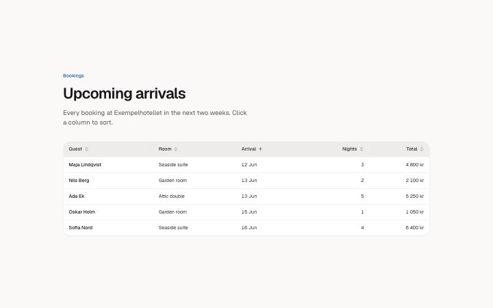
Install
npx shadcn add @klarhimmel/app-data-tableUsage
import { Theme } from '@/components/klarhimmel/theme/style';
import { BlockSurface } from '@/components/klarhimmel/blocks/surface';
import AppDataTable from '@/components/klarhimmel/blocks/app-data-table';

export default function Section() {
  return (
    <Theme theme="brand">
      <BlockSurface>
        <AppDataTable props={{
          "eyebrow": "Bookings",
          "title": "Upcoming arrivals",
          "description": "Every booking at Exempelhotellet in the next two weeks. Click a column to sort.",
          "caption": "Upcoming arrivals, sortable by column",
          "columns": [
            {
              "label": "Guest",
              "align": "left",
              "sortable": true,
              "kind": "text"
            },
            {
              "label": "Room",
              "align": "left",
              "sortable": true,
              "kind": "text"
            },
            {
              "label": "Arrival",
              "align": "left",
              "sortable": true,
              "kind": "date"
            },
            {
              "label": "Nights",
              "align": "right",
              "sortable": true,
              "kind": "number"
            },
            {
              "label": "Total",
              "align": "right",
              "sortable": true,
              "kind": "number"
            }
          ],
          "rows": [
            {
              "cells": [
                "Maja Lindqvist",
                "Seaside suite",
                "12 Jun",
                "3",
                "4 800 kr"
              ],
              "keys": [
                "",
                "",
                "2026-06-12",
                "3",
                "4800"
              ]
            },
            {
              "cells": [
                "Nils Berg",
                "Garden room",
                "13 Jun",
                "2",
                "2 100 kr"
              ],
              "keys": [
                "",
                "",
                "2026-06-13",
                "2",
                "2100"
              ]
            },
            {
              "cells": [
                "Ada Ek",
                "Attic double",
                "13 Jun",
                "5",
                "5 250 kr"
              ],
              "keys": [
                "",
                "",
                "2026-06-13",
                "5",
                "5250"
              ]
            },
            {
              "cells": [
                "Oskar Holm",
                "Garden room",
                "15 Jun",
                "1",
                "1 050 kr"
              ],
              "keys": [
                "",
                "",
                "2026-06-15",
                "1",
                "1050"
              ]
            },
            {
              "cells": [
                "Sofia Nord",
                "Seaside suite",
                "16 Jun",
                "4",
                "6 400 kr"
              ],
              "keys": [
                "",
                "",
                "2026-06-16",
                "4",
                "6400"
              ]
            }
          ],
          "locale": "sv",
          "density": "comfortable",
          "selectable": false,
          "select": {
            "row": "Select",
            "all": "Select all rows",
            "selected": "selected",
            "clear": "Clear selection",
            "barLabel": "Actions for the selected rows",
            "actions": [
              "Export",
              "Archive"
            ]
          },
          "scrollHint": "Scroll sideways for more columns",
          "sort": {
            "active": "Arrival",
            "direction": "ascending"
          },
          "state": "filled",
          "messages": {
            "loading": "Loading bookings",
            "emptyTitle": "No arrivals in the next two weeks",
            "emptyBody": "New bookings show up here as soon as a guest reserves a room.",
            "emptyAction": "Add a booking",
            "errorTitle": "We could not load the bookings",
            "errorBody": "Check your connection and try again.",
            "retry": "Try again"
          }
        }} />
      </BlockSurface>
    </Theme>
  );
}
Install
Import
import Block from '@/components/klarhimmel/blocks/app-data-table';- app/data-table
- About
- A data table: sort buttons that order by what a column holds (text, numbers, dates; aria-sort), a first column that stays in view while the rest scrolls with an edge fade, comfortable or compact rows, optional row selection with select…
- Category
- Interface sections for signed-in products.
Notes
When to use it
A sortable table of records with optional row selection and bulk actions. For a handful of invoices use `app-billing-invoices`; for a table where nothing is sorted a simple comparison block is lighter.
Writing for it
- Each column needs a `kind` of text, number or date, and sorting follows it, so 800 kr comes before 12 000 kr. Set `locale` (10), such as sv, for the alphabet. - Add `keys` to a row (30 characters each) when the shown text cannot sort, for example an ISO date behind a text date. They win over the displayed cell. - The first cell in every row is its row header, so put the name there. Rows allow 2 to 6 cells and up to 10 rows.
Watch out for
Turning on `selectable` adds a checkbox column and a bulk action bar of at most 3 actions that appears only once something is picked. The selection exists only in the block, and selecting works only in the filled state.
Pairs well with
Usage
The block in a page, with its default content (long lists shortened). Every prop is in the table below.
import { Theme } from '@/components/klarhimmel/theme/style';
import { BlockSurface } from '@/components/klarhimmel/blocks/surface';
import AppDataTable from '@/components/klarhimmel/blocks/app-data-table';

export default function Section() {
  return (
    <Theme theme="brand">
      <BlockSurface>
        <AppDataTable props={{
          "eyebrow": "Bookings",
          "title": "Upcoming arrivals",
          "description": "Every booking at Exempe…",
          "caption": "Upcoming arrivals, sort…",
          "columns": [
            {
              "label": "Guest",
              "align": "left",
              "sortable": true,
              "kind": "text"
            }
          ],
          "rows": [
            {
              "cells": [
                "Maja Lindqvist"
              ],
              "keys": [
                ""
              ]
            }
          ],
          "locale": "sv",
          "density": "comfortable",
          "selectable": false,
          "select": {
            "row": "Select",
            "all": "Select all rows",
            "selected": "selected",
            "clear": "Clear selection",
            "barLabel": "Actions for the selecte…",
            "actions": [
              "Export"
            ]
          },
          "scrollHint": "Scroll sideways for mor…",
          "sort": {
            "active": "Arrival",
            "direction": "ascending"
          },
          "state": "filled",
          "messages": {
            "loading": "Loading bookings",
            "emptyTitle": "No arrivals in the next…",
            "emptyBody": "New bookings show up he…",
            "emptyAction": "Add a booking",
            "errorTitle": "We could not load the b…",
            "errorBody": "Check your connection a…",
            "retry": "Try again"
          }
        }} />
      </BlockSurface>
    </Theme>
  );
}
Props
The type, default and text limit of every prop. On a real page, over-limit text is kept and checkSections flags it (Installation, Check a page before you ship); this live preview shows the default until it fits. The panel above edits all props.
| Prop | Type | Default | Description |
|---|---|---|---|
eyebrow | string | 'Bookings' | Text, up to 60 characters. Optional; empty is not rendered. |
title | string | 'Upcoming arrivals' | Text, up to 120 characters. |
description | string | 'Every booking at Exempelhotellet in…' | Text, up to 300 characters. Optional; empty is not rendered. |
caption | string | 'Upcoming arrivals, sortable by colu…' | Text, up to 80 characters. |
columns | { label, align, sortable, kind }[] | 5 items | List of 2 to 6. Each item: label, align ('left' | 'right'), sortable, kind ('text' | 'number' | 'date'). |
rows | { cells, keys }[] | 5 items | List of 1 to 10. Each item: cells, keys (optional). |
locale | string | 'sv' | Text, up to 10 characters. |
density | 'comfortable' | 'compact' | 'comfortable' | One of 'comfortable', 'compact'. |
selectable | boolean | false | See the type. |
select | { row, all, selected, clear, barLabel, actions } | {…} | Fields: row, all, selected, clear, barLabel, actions. |
scrollHint | string | 'Scroll sideways for more columns' | Text, up to 40 characters. |
sort | { active, direction } | {…} | Fields: active, direction ('ascending' | 'descending'). |
state | 'filled' | 'empty' | 'loading' | 'error' | 'filled' | One of 'filled', 'empty', 'loading', 'error'. |
messages | { loading, emptyTitle, emptyBody, emptyAction, errorTitle, errorBody, retry } | {…} | Fields: loading, emptyTitle, emptyBody, emptyAction, errorTitle, errorBody, retry. |
headingLevel | '1' | '2' | - | One of '1', '2'. Optional; empty is not rendered. |