Notification preferences
Install
npx shadcn add @klarhimmel/app-settings-notificationsUsage
import { Theme } from '@/components/klarhimmel/theme/style';
import { BlockSurface } from '@/components/klarhimmel/blocks/surface';
import AppSettingsNotifications from '@/components/klarhimmel/blocks/app-settings-notifications';

export default function Section() {
  return (
    <Theme theme="brand">
      <BlockSurface>
        <AppSettingsNotifications props={{
          "eyebrow": "Settings",
          "title": "Notifications",
          "description": "Choose what Exempelhotellet tells you about, and how.",
          "control": "switch",
          "rows": [
            {
              "title": "New bookings",
              "description": "An email each time a guest books a room.",
              "on": true
            },
            {
              "title": "Cancellations",
              "description": "Know at once when a room frees up.",
              "on": true
            },
            {
              "title": "Weekly summary",
              "description": "Occupancy and revenue, every Monday at 08:00.",
              "on": false
            },
            {
              "title": "Product news",
              "description": "Occasional notes about new features.",
              "on": false
            }
          ],
          "save": "Save preferences"
        }} />
      </BlockSurface>
    </Theme>
  );
}
States
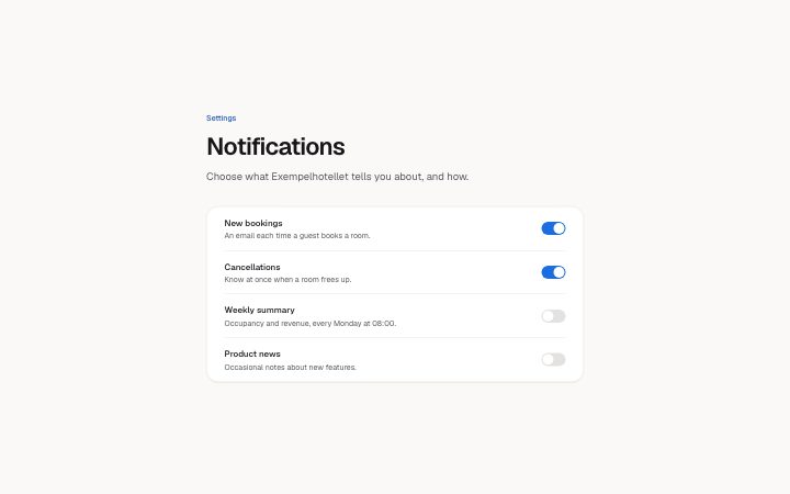
notification preferences in 3 forms: switches, checkboxes with a save button, everything off.
switches
Settings
Notifications
Choose what Exempelhotellet tells you about, and how.
checkboxes with a save button
Settings
Notifications
Choose what Exempelhotellet tells you about, and how.
everything off
Settings
Notifications
Choose what Exempelhotellet tells you about, and how.
Notes
When to use it
A list of preferences with an on or off state per row. It fits a settings page; to read what has already arrived, use `app-notifications-inbox`. Choose switch when each change should apply at once and checkbox when rows are saved together.
Writing for it
- The control enum decides the whole block. With switch there is no save button, so the save text (30) is only used with checkbox. - A row title holds 60 characters and the description 140. Describe when the message is sent, such as 'every Monday at 08:00', rather than repeating the title. - The on field carries the starting state of each row, so set it to the person's current choice and not to a default you hope for. Two to seven rows are allowed.
Watch out for
The block does not save anything by itself. Switches change visually on click, but persisting them is up to the host app, so a preview that looks saved is not a stored preference.
Pairs well with
Usage
The block in a page, with its default content (long lists shortened). Every prop is in the table below.
import { Theme } from '@/components/klarhimmel/theme/style';
import { BlockSurface } from '@/components/klarhimmel/blocks/surface';
import AppSettingsNotifications from '@/components/klarhimmel/blocks/app-settings-notifications';

export default function Section() {
  return (
    <Theme theme="brand">
      <BlockSurface>
        <AppSettingsNotifications props={{
          "eyebrow": "Settings",
          "title": "Notifications",
          "description": "Choose what Exempelhotellet tells you about, and how.",
          "control": "switch",
          "rows": [
            {
              "title": "New bookings",
              "description": "An email each time a guest books a room.",
              "on": true
            },
            {
              "title": "Cancellations",
              "description": "Know at once when a room frees up.",
              "on": true
            },
            {
              "title": "Weekly summary",
              "description": "Occupancy and revenue, every Monday at 08:00.",
              "on": false
            },
            {
              "title": "Product news",
              "description": "Occasional notes about new features.",
              "on": false
            }
          ],
          "save": "Save preferences"
        }} />
      </BlockSurface>
    </Theme>
  );
}
Props
The type, default and text limit of every prop. On a real page, over-limit text is kept and checkSections flags it (Installation, Check a page before you ship); this live preview shows the default until it fits. The panel above edits all props.
| Prop | Type | Default | Description |
|---|---|---|---|
eyebrow | string | 'Settings' | Text, up to 60 characters. Optional; empty is not rendered. |
title | string | 'Notifications' | Text, up to 120 characters. |
description | string | 'Choose what Exempelhotellet tells y…' | Text, up to 300 characters. Optional; empty is not rendered. |
control | 'switch' | 'checkbox' | 'switch' | One of 'switch', 'checkbox'. |
rows | { title, description, on }[] | 4 items | List of 2 to 7. Each item: title, description, on. |
save | string | 'Save preferences' | Text, up to 30 characters. |
headingLevel | '1' | '2' | - | One of '1', '2'. Optional; empty is not rendered. |
Install
Installs
app-settings-notifications- Switch
- Checkbox
- Button
- About
- A list of notification preferences, each a title, one line of explanation and a switch (applies at once) or a checkbox (saved with a button). The on/off state of every row is a prop.
- States
- Switch rows (apply at once) or checkbox rows (saved with a button). Each row is on or off.