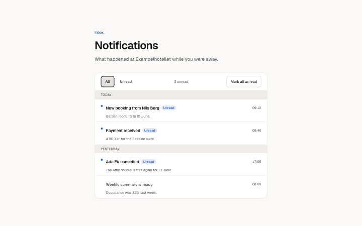
App, notification inbox
Install
npx shadcn add @klarhimmel/app-notifications-inboxUsage
import { Theme } from '@/components/klarhimmel/theme/style';
import { BlockSurface } from '@/components/klarhimmel/blocks/surface';
import AppNotificationsInbox from '@/components/klarhimmel/blocks/app-notifications-inbox';

export default function Section() {
  return (
    <Theme theme="brand">
      <BlockSurface>
        <AppNotificationsInbox props={{
          "eyebrow": "Inbox",
          "title": "Notifications",
          "description": "What happened at Exempelhotellet while you were away.",
          "filterLabel": "Show",
          "filters": {
            "all": "All",
            "unread": "Unread"
          },
          "unreadSuffix": "unread",
          "unreadWord": "Unread",
          "markAll": "Mark all as read",
          "groups": [
            {
              "label": "Today",
              "items": [
                {
                  "title": "New booking from Nils Berg",
                  "body": "Garden room, 13 to 15 June.",
                  "time": "09:12",
                  "unread": true,
                  "href": "#n1"
                },
                {
                  "title": "Payment received",
                  "body": "4 800 kr for the Seaside suite.",
                  "time": "08:40",
                  "unread": true,
                  "href": "#n2"
                }
              ]
            },
            {
              "label": "Yesterday",
              "items": [
                {
                  "title": "Ada Ek cancelled",
                  "body": "The Attic double is free again for 13 June.",
                  "time": "17:05",
                  "unread": true,
                  "href": "#n3"
                },
                {
                  "title": "Weekly summary is ready",
                  "body": "Occupancy was 82% last week.",
                  "time": "08:00",
                  "unread": false,
                  "href": "#n4"
                }
              ]
            }
          ],
          "state": "filled",
          "messages": {
            "emptyTitle": "Nothing new",
            "emptyBody": "Bookings, payments and messages show up here.",
            "allRead": "You have read everything."
          }
        }} />
      </BlockSurface>
    </Theme>
  );
}
Install
Import
import Block from '@/components/klarhimmel/blocks/app-notifications-inbox';- app/notifications-inbox
- About
- An inbox of notifications grouped by day: unread items marked with a dot and the word, an unread count in a live region, All and Unread filters, and Mark all as read. Opening an item marks it read in place. Filled and empty states.
- Category
- Interface sections for signed-in products.
Notes
When to use it
A page of notifications grouped by day, with unread marking and a filter. For one short list of alerts inside a settings area, `app-settings-notifications` is the block that controls what gets sent; this one shows what already arrived.
Writing for it
- Group labels hold 30 characters and read best as days: Today, Yesterday. The groups run newest first, and you get at most 3 groups of 5 items. - An item title holds 80 characters and the body 160. Put the event in the title and the detail in the body, and give href a real destination because opening the link marks the item read. - unreadWord (20) is read aloud beside unread items, so use a word that makes sense on its own, such as Unread, not a symbol.
Watch out for
A day group with no visible items is hidden, and with the Unread filter on and everything read, a message from messages.allRead takes its place. Leave allRead empty and that moment is silent.
Pairs well with
Usage
The block in a page, with its default content (long lists shortened). Every prop is in the table below.
import { Theme } from '@/components/klarhimmel/theme/style';
import { BlockSurface } from '@/components/klarhimmel/blocks/surface';
import AppNotificationsInbox from '@/components/klarhimmel/blocks/app-notifications-inbox';

export default function Section() {
  return (
    <Theme theme="brand">
      <BlockSurface>
        <AppNotificationsInbox props={{
          "eyebrow": "Inbox",
          "title": "Notifications",
          "description": "What happened at Exempelhotellet while you were away.",
          "filterLabel": "Show",
          "filters": {
            "all": "All",
            "unread": "Unread"
          },
          "unreadSuffix": "unread",
          "unreadWord": "Unread",
          "markAll": "Mark all as read",
          "groups": [
            {
              "label": "Today",
              "items": [
                {
                  "title": "New booking from Nils Berg",
                  "body": "Garden room, 13 to 15 June.",
                  "time": "09:12",
                  "unread": true,
                  "href": "#n1"
                }
              ]
            }
          ],
          "state": "filled",
          "messages": {
            "emptyTitle": "Nothing new",
            "emptyBody": "Bookings, payments and messages show up here.",
            "allRead": "You have read everything."
          }
        }} />
      </BlockSurface>
    </Theme>
  );
}
Props
The type, default and text limit of every prop. On a real page, over-limit text is kept and checkSections flags it (Installation, Check a page before you ship); this live preview shows the default until it fits. The panel above edits all props.
| Prop | Type | Default | Description |
|---|---|---|---|
eyebrow | string | 'Inbox' | Text, up to 60 characters. Optional; empty is not rendered. |
title | string | 'Notifications' | Text, up to 120 characters. |
description | string | 'What happened at Exempelhotellet wh…' | Text, up to 300 characters. Optional; empty is not rendered. |
filterLabel | string | 'Show' | Text, up to 40 characters. |
filters | { all, unread } | {…} | Fields: all, unread. |
unreadSuffix | string | 'unread' | Text, up to 20 characters. |
unreadWord | string | 'Unread' | Text, up to 20 characters. |
markAll | string | 'Mark all as read' | Text, up to 30 characters. |
groups | { label, items }[] | 2 items | List of 1 to 3. Each item: label, items. |
state | 'filled' | 'empty' | 'filled' | One of 'filled', 'empty'. |
messages | { emptyTitle, emptyBody, allRead } | {…} | Fields: emptyTitle, emptyBody, allRead. |
headingLevel | '1' | '2' | - | One of '1', '2'. Optional; empty is not rendered. |