Content, prose
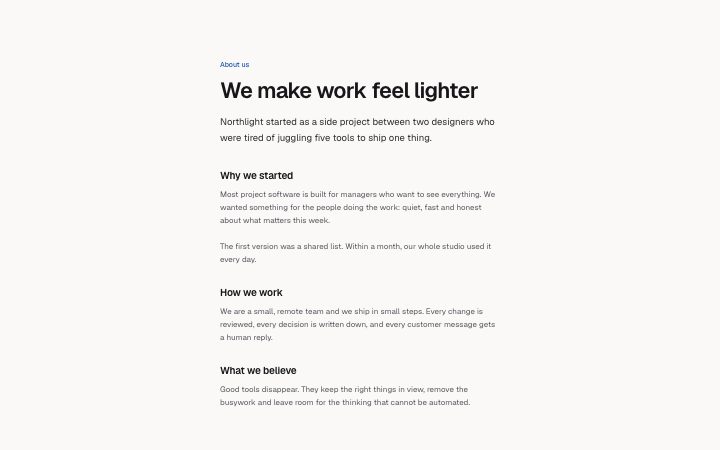
Install
npx shadcn add @klarhimmel/content-proseUsage
import { Theme } from '@/components/klarhimmel/theme/style';
import { BlockSurface } from '@/components/klarhimmel/blocks/surface';
import ContentProse from '@/components/klarhimmel/blocks/content-prose';

export default function Section() {
  return (
    <Theme theme="brand">
      <BlockSurface>
        <ContentProse props={{
          "eyebrow": "About us",
          "title": "We make work feel lighter",
          "lead": "Northlight started as a side project between two designers who were tired of juggling five tools to ship one thing.",
          "sections": [
            {
              "heading": "Why we started",
              "body": "Most project software is built for managers who want to see everything. We wanted something for the people doing the work: quiet, fast and honest about what matters this week.\n\nThe first version was a shared list. Within a month, our whole studio used it every day."
            },
            {
              "heading": "How we work",
              "body": "We are a small, remote team and we ship in small steps. Every change is reviewed, every decision is written down, and every customer message gets a human reply."
            },
            {
              "heading": "What we believe",
              "body": "Good tools disappear. They keep the right things in view, remove the busywork and leave room for the thinking that cannot be automated."
            }
          ]
        }} />
      </BlockSurface>
    </Theme>
  );
}
Install
Import
import Block from '@/components/klarhimmel/blocks/content-prose';- content/prose
- Category
- Long-form text and timelines for about and policy pages.
Notes
When to use it
A single reading column: title, lead paragraph, then up to six headed sections of body text. It suits about pages and articles; use `content-columns` for a wide essay and `content-legal` when readers need a contents list.
Writing for it
- The lead (400 characters) is set larger than the body, so write it as the summary a person would read and stop at. - Section bodies hold 1500 characters and keep their line breaks, so you can separate two short paragraphs inside one section with a blank line. - Section headings (100 characters) are h3 elements under the title. Make them statements that tell the reader what the section decides, not just 'Overview'.
Watch out for
There are no lists, images or links inside the body text. If you need any of those, split the content over several blocks instead of forcing markup into a section body.
Pairs well with
Usage
The block in a page, with its default content (long lists shortened). Every prop is in the table below.
import { Theme } from '@/components/klarhimmel/theme/style';
import { BlockSurface } from '@/components/klarhimmel/blocks/surface';
import ContentProse from '@/components/klarhimmel/blocks/content-prose';

export default function Section() {
  return (
    <Theme theme="brand">
      <BlockSurface>
        <ContentProse props={{
          "eyebrow": "About us",
          "title": "We make work feel lighter",
          "lead": "Northlight started as a side project between two designers who were tired of juggling five tools to ship one thing.",
          "sections": [
            {
              "heading": "Why we started",
              "body": "Most project software is built for managers who want to see everything. We wanted something for the people doing the work: quiet, fast and honest about what matters this week.\n\nThe first version was a shared list. Within a month, our whole studio used it every day."
            },
            {
              "heading": "How we work",
              "body": "We are a small, remote team and we ship in small steps. Every change is reviewed, every decision is written down, and every customer message gets a human reply."
            },
            {
              "heading": "What we believe",
              "body": "Good tools disappear. They keep the right things in view, remove the busywork and leave room for the thinking that cannot be automated."
            }
          ]
        }} />
      </BlockSurface>
    </Theme>
  );
}
Props
The type, default and text limit of every prop. On a real page, over-limit text is kept and checkSections flags it (Installation, Check a page before you ship); this live preview shows the default until it fits. The panel above edits all props.
| Prop | Type | Default | Description |
|---|---|---|---|
eyebrow | string | 'About us' | Text, up to 60 characters. |
title | string | 'We make work feel lighter' | Text, up to 140 characters. |
lead | string | 'Northlight started as a side projec…' | Text, up to 400 characters. |
sections | { heading, body }[] | 3 items | List of 1 to 6. Each item: heading, body. |
headingLevel | '1' | '2' | - | One of '1', '2'. Optional; empty is not rendered. |