About, timeline
Install
npx shadcn add @klarhimmel/about-timelineUsage
import { Theme } from '@/components/klarhimmel/theme/style';
import { BlockSurface } from '@/components/klarhimmel/blocks/surface';
import AboutTimeline from '@/components/klarhimmel/blocks/about-timeline';

export default function Section() {
  return (
    <Theme theme="brand">
      <BlockSurface>
        <AboutTimeline props={{
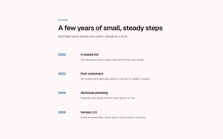
          "eyebrow": "Our story",
          "title": "A few years of small, steady steps",
          "lead": "Northlight grew slowly, one useful change at a time.",
          "items": [
            {
              "year": "2022",
              "title": "A shared list",
              "description": "Two designers build a quiet task list for their own studio."
            },
            {
              "year": "2023",
              "title": "First customers",
              "description": "Ten studios and agencies adopt it and ask for weekly reviews."
            },
            {
              "year": "2025",
              "title": "Workload planning",
              "description": "Capacity view lands, and the team grows to five."
            },
            {
              "year": "2026",
              "title": "Version 2.0",
              "description": "A rebuilt review flow, faster search and a calmer interface."
            }
          ]
        }} />
      </BlockSurface>
    </Theme>
  );
}
Install
Import
import Block from '@/components/klarhimmel/blocks/about-timeline';- content/timeline
- Category
- Long-form text and timelines for about and policy pages.
Notes
When to use it
Company milestones listed by year on a narrow page column, with a heading and lead above. Use it on an about page; for a process rather than history, `steps-timeline` is the closer match.
Writing for it
- The year field holds only 12 characters, so write '2019' or '2019-21', not a sentence. It is drawn in the accent colour as the row anchor. - Each entry has an 80 character title and a 300 character description. Name what happened and what it changed, with a number if you have one. - The lead (300 characters) sits under the title and should say why this history matters to the reader, not repeat the first row.
Watch out for
The year column is a fixed seven rem wide on wider containers, and the text in it does not wrap into a new line nicely. A long label like 'Spring 2019' fits, but a range with words will push into the title.
Pairs well with
Usage
The block in a page, with its default content (long lists shortened). Every prop is in the table below.
import { Theme } from '@/components/klarhimmel/theme/style';
import { BlockSurface } from '@/components/klarhimmel/blocks/surface';
import AboutTimeline from '@/components/klarhimmel/blocks/about-timeline';

export default function Section() {
  return (
    <Theme theme="brand">
      <BlockSurface>
        <AboutTimeline props={{
          "eyebrow": "Our story",
          "title": "A few years of small, steady steps",
          "lead": "Northlight grew slowly, one useful change at a time.",
          "items": [
            {
              "year": "2022",
              "title": "A shared list",
              "description": "Two designers build a quiet task list for their own studio."
            },
            {
              "year": "2023",
              "title": "First customers",
              "description": "Ten studios and agencies adopt it and ask for weekly reviews."
            },
            {
              "year": "2025",
              "title": "Workload planning",
              "description": "Capacity view lands, and the team grows to five."
            },
            {
              "year": "2026",
              "title": "Version 2.0",
              "description": "A rebuilt review flow, faster search and a calmer interface."
            }
          ]
        }} />
      </BlockSurface>
    </Theme>
  );
}
Props
The type, default and text limit of every prop. On a real page, over-limit text is kept and checkSections flags it (Installation, Check a page before you ship); this live preview shows the default until it fits. The panel above edits all props.
| Prop | Type | Default | Description |
|---|---|---|---|
eyebrow | string | 'Our story' | Text, up to 60 characters. |
title | string | 'A few years of small, steady steps' | Text, up to 120 characters. |
lead | string | 'Northlight grew slowly, one useful …' | Text, up to 300 characters. |
items | { year, title, description }[] | 4 items | List of 1 to 8. Each item: year, title, description. |
headingLevel | '1' | '2' | - | One of '1', '2'. Optional; empty is not rendered. |