Team, grid
Install
npx shadcn add @klarhimmel/team-gridUsage
import { Theme } from '@/components/klarhimmel/theme/style';
import { BlockSurface } from '@/components/klarhimmel/blocks/surface';
import TeamGrid from '@/components/klarhimmel/blocks/team-grid';

export default function Section() {
  return (
    <Theme theme="brand">
      <BlockSurface>
        <TeamGrid props={{
          "eyebrow": "Team",
          "title": "The people behind the product",
          "description": "A small team that cares about the details.",
          "members": [
            {
              "name": "Elin Sandberg",
              "role": "Co-founder, design",
              "bio": "Designs the product and answers the support inbox on Fridays.",
              "photo": {
                "src": "",
                "alt": "Portrait of Elin Sandberg"
              }
            },
            {
              "name": "Oskar Wahl",
              "role": "Co-founder, engineering",
              "bio": "Builds the core and keeps the servers quiet.",
              "photo": {
                "src": "",
                "alt": "Portrait of Oskar Wahl"
              }
            },
            {
              "name": "Priya Nair",
              "role": "Product",
              "bio": "Turns customer stories into small, useful changes.",
              "photo": {
                "src": "",
                "alt": "Portrait of Priya Nair"
              }
            },
            {
              "name": "Leo Strand",
              "role": "Customer success",
              "bio": "Helps teams get set up and stay happy.",
              "photo": {
                "src": "",
                "alt": "Portrait of Leo Strand"
              }
            }
          ]
        }} />
      </BlockSurface>
    </Theme>
  );
}
Install
Import
import Block from '@/components/klarhimmel/blocks/team-grid';- team/grid
- Category
- The people behind it.
Notes
When to use it
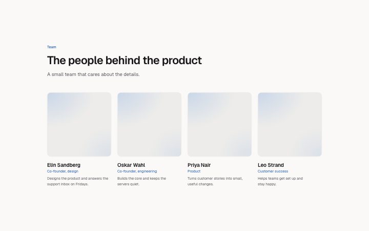
A plain grid of people, each with a square photo, name, role and a short bio. It is the default team block; choose `team-list` when the bios are long, or `team-departments` when you have no photos.
Writing for it
- The bio is capped at 200 characters, so write one sentence about what the person does for customers, not a career summary. - Put the role in plain terms, up to 60 characters. The role is shown in the accent colour right under the name, so 'Co-founder, design' reads better than a slogan. - Use between one and eight members. Four fills one row at wide widths and eight fills two clean rows.
Watch out for
Every member needs a photo, because the square image area is always drawn and an empty src leaves a placeholder frame. Each name is an h3 under the section title, so keep this block below an h2 heading.
Pairs well with
Usage
The block in a page, with its default content (long lists shortened). Every prop is in the table below.
import { Theme } from '@/components/klarhimmel/theme/style';
import { BlockSurface } from '@/components/klarhimmel/blocks/surface';
import TeamGrid from '@/components/klarhimmel/blocks/team-grid';

export default function Section() {
  return (
    <Theme theme="brand">
      <BlockSurface>
        <TeamGrid props={{
          "eyebrow": "Team",
          "title": "The people behind the product",
          "description": "A small team that cares about the details.",
          "members": [
            {
              "name": "Elin Sandberg",
              "role": "Co-founder, design",
              "bio": "Designs the product and answers the support inbox on Fridays.",
              "photo": {
                "src": "",
                "alt": "Portrait of Elin Sandberg"
              }
            },
            {
              "name": "Oskar Wahl",
              "role": "Co-founder, engineering",
              "bio": "Builds the core and keeps the servers quiet.",
              "photo": {
                "src": "",
                "alt": "Portrait of Oskar Wahl"
              }
            },
            {
              "name": "Priya Nair",
              "role": "Product",
              "bio": "Turns customer stories into small, useful changes.",
              "photo": {
                "src": "",
                "alt": "Portrait of Priya Nair"
              }
            },
            {
              "name": "Leo Strand",
              "role": "Customer success",
              "bio": "Helps teams get set up and stay happy.",
              "photo": {
                "src": "",
                "alt": "Portrait of Leo Strand"
              }
            }
          ]
        }} />
      </BlockSurface>
    </Theme>
  );
}
Props
The type, default and text limit of every prop. On a real page, over-limit text is kept and checkSections flags it (Installation, Check a page before you ship); this live preview shows the default until it fits. The panel above edits all props.
| Prop | Type | Default | Description |
|---|---|---|---|
eyebrow | string | 'Team' | Text, up to 60 characters. |
title | string | 'The people behind the product' | Text, up to 120 characters. |
description | string | 'A small team that cares about the d…' | Text, up to 300 characters. |
members | { name, role, bio, photo }[] | 4 items | List of 1 to 8. Each item: name, role, bio, photo. |
headingLevel | '1' | '2' | - | One of '1', '2'. Optional; empty is not rendered. |