Directory, preview
Install
npx shadcn add @klarhimmel/directory-previewUsage
import { Theme } from '@/components/klarhimmel/theme/style';
import { BlockSurface } from '@/components/klarhimmel/blocks/surface';
import DirectoryPreview from '@/components/klarhimmel/blocks/directory-preview';

export default function Section() {
  return (
    <Theme theme="brand">
      <BlockSurface>
        <DirectoryPreview props={{
          "breadcrumbs": [
            {
              "label": "Blocks",
              "href": "/catalogue/blocks/"
            },
            {
              "label": "Hero",
              "href": "/catalogue/blocks/hero/"
            },
            {
              "label": "Split with image",
              "href": ""
            }
          ],
          "title": "Split with image",
          "status": "Free",
          "description": "Headline and actions on the left, an image on the right. Stacks in narrow containers.",
          "viewports": [
            "Desktop",
            "Tablet",
            "Mobile"
          ],
          "tabs": [
            "Preview",
            "Code"
          ],
          "actions": [
            {
              "label": "Copy for AI",
              "href": "#copy"
            }
          ],
          "demo": "hero-split-sample",
          "preview": {
            "src": "",
            "alt": "Split hero for a fictional hotel: Book the room, skip the queue"
          },
          "code": "import HeroSplit from '@/blocks/hero-split';\n\nexport default function Page() {\n  return (\n    <HeroSplit\n      props={{\n        title: 'Book the room, skip the queue',\n        primary: { label: 'Book now', href: '#book' },\n      }}\n    />\n  );\n}"
        }} />
      </BlockSurface>
    </Theme>
  );
}
Install
Import
import Block from '@/components/klarhimmel/blocks/directory-preview';- directory/preview
- About
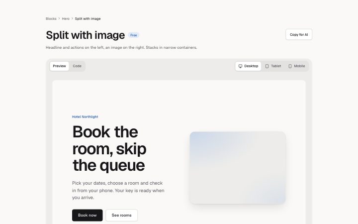
- Full-width preview of one block or screen: breadcrumbs, title, status badge, viewport toggle, Preview and Code tabs, actions and a framed stage that renders a registered demo by id.
- Category
- Catalogue pages: headers with filters, card grids, full-width previews.
Notes
When to use it
A full-width view of one block or screen, with title, status, viewport toggle and Preview and Code tabs. For a list of items to pick from use `directory-cards`.
Writing for it
- The title holds 80 characters and the status 24. The description holds 200 and can name the layout in one sentence. - Viewports take up to 3 labels of 20 characters, such as Desktop, Tablet and Mobile, in that order; the first is the full width. - Set a demo id for the stage, or fall back to an image. Code holds 2000 characters and the tabs are limited to two, usually Preview and Code.
Watch out for
The Code tab exists only when two tabs are written; with one tab the code is not shown. The title here is an h2, not an h1, so the page needs its heading from another block.
Pairs well with
Usage
The block in a page, with its default content (long lists shortened). Every prop is in the table below.
import { Theme } from '@/components/klarhimmel/theme/style';
import { BlockSurface } from '@/components/klarhimmel/blocks/surface';
import DirectoryPreview from '@/components/klarhimmel/blocks/directory-preview';

export default function Section() {
  return (
    <Theme theme="brand">
      <BlockSurface>
        <DirectoryPreview props={{
          "breadcrumbs": [
            {
              "label": "Blocks",
              "href": "/catalogue/blocks/"
            },
            {
              "label": "Hero",
              "href": "/catalogue/blocks/hero/"
            },
            {
              "label": "Split with image",
              "href": ""
            }
          ],
          "title": "Split with image",
          "status": "Free",
          "description": "Headline and actions on the left, an image on the right. Stacks in narrow containers.",
          "viewports": [
            "Desktop",
            "Tablet",
            "Mobile"
          ],
          "tabs": [
            "Preview",
            "Code"
          ],
          "actions": [
            {
              "label": "Copy for AI",
              "href": "#copy"
            }
          ],
          "demo": "hero-split-sample",
          "preview": {
            "src": "",
            "alt": "Split hero for a fictional hotel: Book the room, skip the queue"
          },
          "code": "import HeroSplit from '@/blocks/hero-split';\n\nexport default function Page() {\n  return (\n    <HeroSplit\n      props={{\n        title: 'Book the room, skip the queue',\n        primary: { label: 'Book now', href: '#book' },\n      }}\n    />\n  );\n}"
        }} />
      </BlockSurface>
    </Theme>
  );
}
Props
The type, default and text limit of every prop. On a real page, over-limit text is kept and checkSections flags it (Installation, Check a page before you ship); this live preview shows the default until it fits. The panel above edits all props.
| Prop | Type | Default | Description |
|---|---|---|---|
breadcrumbs | Link[] | 3 items | List of up to 4. |
title | string | 'Split with image' | Text, up to 80 characters. |
status | string | 'Free' | Text, up to 24 characters. |
description | string | 'Headline and actions on the left, a…' | Text, up to 200 characters. |
viewports | string[] | 3 items | List of up to 3. |
tabs | string[] | 2 items | List of up to 2. |
actions | Link[] | 1 item | List of up to 3. |
demo | string | 'hero-split-sample' | Text, up to 80 characters. |
preview | Media | {…} | See the type. |
code | string | 'import HeroSplit from '@/blocks/her…' | Text, up to 2000 characters. |
headingLevel | '1' | '2' | - | One of '1', '2'. Optional; empty is not rendered. |