Docs, related links
Install
npx shadcn add @klarhimmel/docs-relatedUsage
import { Theme } from '@/components/klarhimmel/theme/style';
import { BlockSurface } from '@/components/klarhimmel/blocks/surface';
import DocsRelated from '@/components/klarhimmel/blocks/docs-related';

export default function Section() {
  return (
    <Theme theme="brand">
      <BlockSurface>
        <DocsRelated props={{
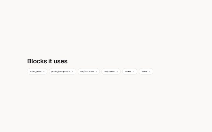
          "title": "Blocks it uses",
          "description": "",
          "links": [
            {
              "label": "pricing/tiers",
              "href": "#pricing-tiers"
            },
            {
              "label": "pricing/comparison",
              "href": "#pricing-comparison"
            },
            {
              "label": "faq/accordion",
              "href": "#faq-accordion"
            },
            {
              "label": "cta/banner",
              "href": "#cta-banner"
            },
            {
              "label": "header",
              "href": "#header"
            },
            {
              "label": "footer",
              "href": "#footer"
            }
          ]
        }} />
      </BlockSurface>
    </Theme>
  );
}
Install
Import
import Block from '@/components/klarhimmel/blocks/docs-related';- docs/related
- Category
- Documentation sections: headers, install panels, props tables, previews.
Notes
When to use it
A short row of link chips pointing to the blocks a page uses or to related components. Use `docs-pager` when you need ordered previous and next steps instead.
Writing for it
- Each chip is one link with a label; the block takes 1 to 12 of them. Use the names a reader would search for. - The title holds 60 characters and the description 200. A title such as Used in this page tells a reader what the chips have in common. - Put the most closely related link first, since the row wraps and the later chips can end up on a second line.
Watch out for
A chip with an empty label is not drawn, so clearing a label removes that link from the published page instead of leaving a blank pill.
Pairs well with
Usage
The block in a page, with its default content (long lists shortened). Every prop is in the table below.
import { Theme } from '@/components/klarhimmel/theme/style';
import { BlockSurface } from '@/components/klarhimmel/blocks/surface';
import DocsRelated from '@/components/klarhimmel/blocks/docs-related';

export default function Section() {
  return (
    <Theme theme="brand">
      <BlockSurface>
        <DocsRelated props={{
          "title": "Blocks it uses",
          "description": "",
          "links": [
            {
              "label": "pricing/tiers",
              "href": "#pricing-tiers"
            },
            {
              "label": "pricing/comparison",
              "href": "#pricing-comparison"
            },
            {
              "label": "faq/accordion",
              "href": "#faq-accordion"
            },
            {
              "label": "cta/banner",
              "href": "#cta-banner"
            },
            {
              "label": "header",
              "href": "#header"
            },
            {
              "label": "footer",
              "href": "#footer"
            }
          ]
        }} />
      </BlockSurface>
    </Theme>
  );
}
Props
The type, default and text limit of every prop. On a real page, over-limit text is kept and checkSections flags it (Installation, Check a page before you ship); this live preview shows the default until it fits. The panel above edits all props.
| Prop | Type | Default | Description |
|---|---|---|---|
title | string | 'Blocks it uses' | Text, up to 60 characters. |
description | string | '' | Text, up to 200 characters. |
links | Link[] | 6 items | List of 1 to 12. |
headingLevel | '1' | '2' | - | One of '1', '2'. Optional; empty is not rendered. |