Directory, template info
Install
npx shadcn add @klarhimmel/directory-template-infoUsage
import { Theme } from '@/components/klarhimmel/theme/style';
import { BlockSurface } from '@/components/klarhimmel/blocks/surface';
import DirectoryTemplateInfo from '@/components/klarhimmel/blocks/directory-template-info';

export default function Section() {
  return (
    <Theme theme="brand">
      <BlockSurface>
        <DirectoryTemplateInfo props={{
          "pagesTitle": "Pages included",
          "pages": [
            {
              "name": "Home",
              "path": "/"
            },
            {
              "name": "Services",
              "path": "/services"
            },
            {
              "name": "Case study",
              "path": "/work/example"
            },
            {
              "name": "Pricing",
              "path": "/pricing"
            },
            {
              "name": "Contact",
              "path": "/contact"
            }
          ],
          "blocksTitle": "Blocks used",
          "blocks": [
            "header/simple",
            "hero/split",
            "logo-cloud/row",
            "features/grid",
            "case-study/before-after",
            "pricing/tiers",
            "faq/accordion",
            "contact/form",
            "footer/link-columns"
          ],
          "customizeTitle": "Customise",
          "customize": "Copy lives in one content file. Colours and fonts come from the tokens, so one change restyles every page. Or hand the recipe to your agent."
        }} />
      </BlockSurface>
    </Theme>
  );
}
Install
Import
import Block from '@/components/klarhimmel/blocks/directory-template-info';- directory/template-info
- Category
- Catalogue pages: headers with filters, card grids, full-width previews.
Notes
When to use it
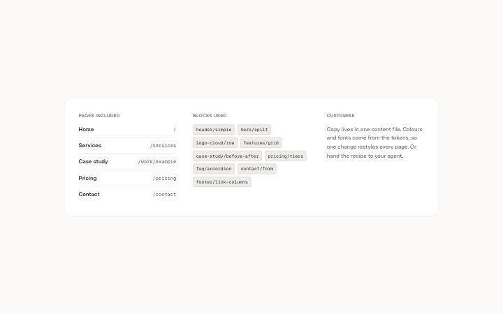
A three-part panel that says what a template contains: its pages, the blocks it uses and how to customise it. Put it under `directory-preview` on a template page.
Writing for it
- List 1 to 10 pages with a name of 40 characters and a path of 80. Write the path as a reader would see it, such as /pricing. - Blocks are chips of 60 characters, up to 16. Use the block ids so a reader can search for them. - The customise paragraph holds 400 characters. Say which files or settings to edit first, and give each of the three section titles 40 characters or less.
Watch out for
This block has no shared heading; each of the three columns has its own h2, and the section is labelled Template details. If the blocks list is empty the column keeps its heading with nothing under it.
Pairs well with
Usage
The block in a page, with its default content (long lists shortened). Every prop is in the table below.
import { Theme } from '@/components/klarhimmel/theme/style';
import { BlockSurface } from '@/components/klarhimmel/blocks/surface';
import DirectoryTemplateInfo from '@/components/klarhimmel/blocks/directory-template-info';

export default function Section() {
  return (
    <Theme theme="brand">
      <BlockSurface>
        <DirectoryTemplateInfo props={{
          "pagesTitle": "Pages included",
          "pages": [
            {
              "name": "Home",
              "path": "/"
            },
            {
              "name": "Services",
              "path": "/services"
            },
            {
              "name": "Case study",
              "path": "/work/example"
            },
            {
              "name": "Pricing",
              "path": "/pricing"
            },
            {
              "name": "Contact",
              "path": "/contact"
            }
          ],
          "blocksTitle": "Blocks used",
          "blocks": [
            "header/simple",
            "hero/split",
            "logo-cloud/row",
            "features/grid",
            "case-study/before-after",
            "pricing/tiers",
            "faq/accordion",
            "contact/form",
            "footer/link-columns"
          ],
          "customizeTitle": "Customise",
          "customize": "Copy lives in one content file. Colours and fonts come from the tokens, so one change restyles every page. Or hand the recipe to your agent."
        }} />
      </BlockSurface>
    </Theme>
  );
}
Props
The type, default and text limit of every prop. On a real page, over-limit text is kept and checkSections flags it (Installation, Check a page before you ship); this live preview shows the default until it fits. The panel above edits all props.
| Prop | Type | Default | Description |
|---|---|---|---|
pagesTitle | string | 'Pages included' | Text, up to 40 characters. |
pages | { name, path }[] | 5 items | List of 1 to 10. Each item: name, path. |
blocksTitle | string | 'Blocks used' | Text, up to 40 characters. |
blocks | string[] | 9 items | List of up to 16. |
customizeTitle | string | 'Customise' | Text, up to 40 characters. |
customize | string | 'Copy lives in one content file. Col…' | Text, up to 400 characters. |