Steps, horizontal
Install
npx shadcn add @klarhimmel/steps-horizontalUsage
import { Theme } from '@/components/klarhimmel/theme/style';
import { BlockSurface } from '@/components/klarhimmel/blocks/surface';
import StepsHorizontal from '@/components/klarhimmel/blocks/steps-horizontal';

export default function Section() {
  return (
    <Theme theme="brand">
      <BlockSurface>
        <StepsHorizontal props={{
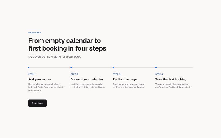
          "eyebrow": "How it works",
          "title": "From empty calendar to first booking in four steps",
          "description": "No developer, no waiting for a call back.",
          "steps": [
            {
              "label": "Step 1",
              "title": "Add your rooms",
              "description": "Names, photos, rates and what is included. Paste from a spreadsheet if you have one."
            },
            {
              "label": "Step 2",
              "title": "Connect your calendar",
              "description": "Northlight reads what is already booked, so nothing gets sold twice."
            },
            {
              "label": "Step 3",
              "title": "Publish the page",
              "description": "One link for your site, your social profiles and the sign by the door."
            },
            {
              "label": "Step 4",
              "title": "Take the first booking",
              "description": "You get an email, the guest gets a confirmation. That is all there is to it."
            }
          ],
          "cta": {
            "label": "Start free",
            "href": "/signup"
          }
        }} />
      </BlockSurface>
    </Theme>
  );
}
Install
Import
import Block from '@/components/klarhimmel/blocks/steps-horizontal';- steps/horizontal
- About
- Three to five steps in a single row, on one continuous line with a marker on each. In narrow containers the same line runs down the left as a vertical list. Short steps only; use the timeline for long ones.
- Category
- How it works, in numbered steps or a timeline.
Notes
When to use it
Shows a short process as three to five steps on one line, each with a marker, so a visitor sees the whole path at a glance. If the steps need long explanations, `steps-timeline` reads better, and if one screenshot explains the flow, use `steps-media`.
Writing for it
- Each step has a 30 character label, an 80 character title and a 240 character description, but the row gets narrow fast, so aim for a title of two to four words and a description of one sentence. - Use the label for something a person can scan, such as 'Day 1' or 'Step 2'. It is optional, and the title sits tighter under the marker when you leave it empty. - The cta is one link under the whole row, not one per step, so point it at the action the last step leads to.
Watch out for
The row only appears once the container is wide enough, at the width for three, four or five columns respectively. Below that the same steps stack down the left as a vertical list, and five steps switch to a row later than three do, so check a mid-width container before assuming a single line.
Pairs well with
Usage
The block in a page, with its default content (long lists shortened). Every prop is in the table below.
import { Theme } from '@/components/klarhimmel/theme/style';
import { BlockSurface } from '@/components/klarhimmel/blocks/surface';
import StepsHorizontal from '@/components/klarhimmel/blocks/steps-horizontal';

export default function Section() {
  return (
    <Theme theme="brand">
      <BlockSurface>
        <StepsHorizontal props={{
          "eyebrow": "How it works",
          "title": "From empty calendar to first booking in four steps",
          "description": "No developer, no waiting for a call back.",
          "steps": [
            {
              "label": "Step 1",
              "title": "Add your rooms",
              "description": "Names, photos, rates and what is included. Paste from a spreadsheet if you have one."
            },
            {
              "label": "Step 2",
              "title": "Connect your calendar",
              "description": "Northlight reads what is already booked, so nothing gets sold twice."
            },
            {
              "label": "Step 3",
              "title": "Publish the page",
              "description": "One link for your site, your social profiles and the sign by the door."
            },
            {
              "label": "Step 4",
              "title": "Take the first booking",
              "description": "You get an email, the guest gets a confirmation. That is all there is to it."
            }
          ],
          "cta": {
            "label": "Start free",
            "href": "/signup"
          }
        }} />
      </BlockSurface>
    </Theme>
  );
}
Props
The type, default and text limit of every prop. On a real page, over-limit text is kept and checkSections flags it (Installation, Check a page before you ship); this live preview shows the default until it fits. The panel above edits all props.
| Prop | Type | Default | Description |
|---|---|---|---|
eyebrow | string | 'How it works' | Text, up to 60 characters. |
title | string | 'From empty calendar to first bookin…' | Text, up to 120 characters. |
description | string | 'No developer, no waiting for a call…' | Text, up to 300 characters. |
steps | { label, title, description }[] | 4 items | List of 3 to 5. Each item: label, title, description. |
cta | Link | {…} | See the type. |
headingLevel | '1' | '2' | - | One of '1', '2'. Optional; empty is not rendered. |