Features, terminal
Install
npx shadcn add @klarhimmel/features-terminalUsage
import { Theme } from '@/components/klarhimmel/theme/style';
import { BlockSurface } from '@/components/klarhimmel/blocks/surface';
import FeaturesTerminal from '@/components/klarhimmel/blocks/features-terminal';

export default function Section() {
  return (
    <Theme theme="brand">
      <BlockSurface>
        <FeaturesTerminal props={{
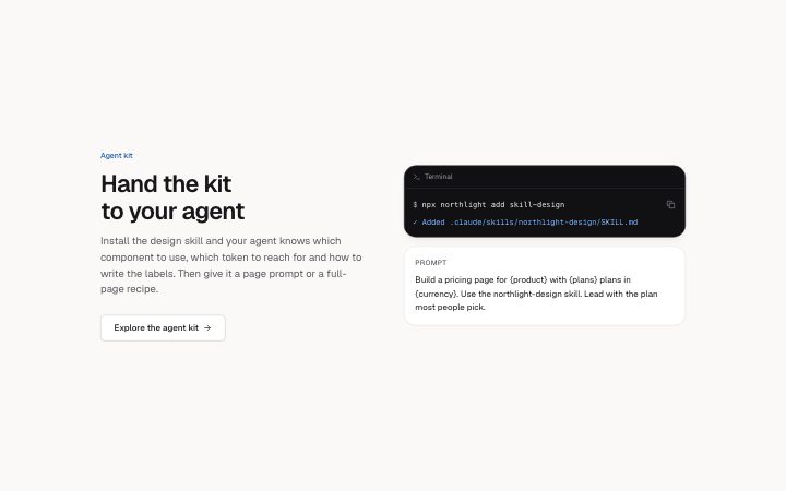
          "eyebrow": "Agent kit",
          "title": "Hand the kit to your agent",
          "description": "Install the design skill and your agent knows which component to use, which token to reach for and how to write the labels. Then give it a page prompt or a full-page recipe.",
          "link": {
            "label": "Explore the agent kit",
            "href": "#agent"
          },
          "terminal": {
            "command": "npx northlight add skill-design",
            "output": "✓ Added .claude/skills/northlight-design/SKILL.md"
          },
          "prompt": {
            "label": "Prompt",
            "text": "Build a pricing page for {product} with {plans} plans in {currency}. Use the northlight-design skill. Lead with the plan most people pick."
          }
        }} />
      </BlockSurface>
    </Theme>
  );
}
Install
Import
import Block from '@/components/klarhimmel/blocks/features-terminal';- features/terminal
- Category
- What it does, as a grid, a list, tabs or alternating rows.
Notes
When to use it
A features section built around a terminal panel with a command and its output, next to a prompt panel. For developer or agent products only; `features-grid` is the general choice.
Writing for it
- The terminal takes a command (120) and an output (160). Show a real command with a result that proves the feature. - The prompt has a label (20) and a text (400). The label names who is speaking, such as You, and the text is what they type. - The link field sits with the heading and is dropped when its label is empty, so it can be left out.
Watch out for
The title is an h2 here, because the page's h1 belongs to the hero. `hero-terminal` uses the same panels, so showing both on one page repeats the same picture.
Pairs well with
Usage
The block in a page, with its default content (long lists shortened). Every prop is in the table below.
import { Theme } from '@/components/klarhimmel/theme/style';
import { BlockSurface } from '@/components/klarhimmel/blocks/surface';
import FeaturesTerminal from '@/components/klarhimmel/blocks/features-terminal';

export default function Section() {
  return (
    <Theme theme="brand">
      <BlockSurface>
        <FeaturesTerminal props={{
          "eyebrow": "Agent kit",
          "title": "Hand the kit to your agent",
          "description": "Install the design skill and your agent knows which component to use, which token to reach for and how to write the labels. Then give it a page prompt or a full-page recipe.",
          "link": {
            "label": "Explore the agent kit",
            "href": "#agent"
          },
          "terminal": {
            "command": "npx northlight add skill-design",
            "output": "✓ Added .claude/skills/northlight-design/SKILL.md"
          },
          "prompt": {
            "label": "Prompt",
            "text": "Build a pricing page for {product} with {plans} plans in {currency}. Use the northlight-design skill. Lead with the plan most people pick."
          }
        }} />
      </BlockSurface>
    </Theme>
  );
}
Props
The type, default and text limit of every prop. On a real page, over-limit text is kept and checkSections flags it (Installation, Check a page before you ship); this live preview shows the default until it fits. The panel above edits all props.
| Prop | Type | Default | Description |
|---|---|---|---|
eyebrow | string | 'Agent kit' | Text, up to 60 characters. |
title | string | 'Hand the kit to your agent' | Text, up to 120 characters. |
description | string | 'Install the design skill and your a…' | Text, up to 300 characters. |
link | Link | {…} | See the type. |
terminal | { command, output } | {…} | Fields: command, output. |
prompt | { label, text } | {…} | Fields: label, text. |
headingLevel | '1' | '2' | - | One of '1', '2'. Optional; empty is not rendered. |