App dashboard
A signed-in app screen for a hotel back office (Exempelhotellet): a sidebar and top bar around the figures that matter today, a revenue chart and a sortable bookings table with filters and paging. Built only from App UI blocks in a two-column shell. Graphite and blue, compact.
npx shadcn add @klarhimmel/template-app-dashboard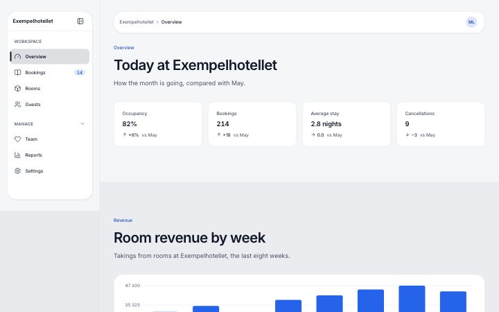
Install
npx shadcn add @klarhimmel/template-app-dashboardThe page
7 sections, in order
Each section is one block with this template's own copy. The anchor is the id in-page links point at.
| Anchor | Block | Content |
|---|---|---|
#sidebar | app/shell-sidebar | Exempelhotellet |
#topbar | app/shell-topbar | |
#overview | app/dashboard-stats | Today at Exempelhotellet |
#revenue | app/dashboard-chart | Room revenue by week |
#filters | app/data-filters | Filter bookings |
#bookings | app/data-table | Upcoming arrivals |
#pages | app/data-pagination | Pagination |
Install
CLI
npx shadcn add @klarhimmel/template-app-dashboardpnpm
pnpm dlx shadcn@latest add @klarhimmel/template-app-dashboard- Klarhimmel
- Geist / Geist
- radius 8
- Needs
- React 19, Tailwind CSS v4 and the theme import. The page and every block it uses land under components/klarhimmel/.
Before you ship
Wire these before shipping
The template is a finished page with placeholder wiring. These are yours to connect.
Links
`#section` links jump within the screen. Links to https://example.com/app/... are placeholders for your other screens.
Data
Every figure, the chart points and the table rows are fixture data in the page file. Replace them with your own, and pass state="loading", "empty" or "error" while you fetch.
Shell
The sidebar and the main column share one grid that stacks below 64rem of container width. The blocks have no h1: add one (the page title) when you build a real screen.
Style
Uses the default Klarhimmel palette, Geist fonts, radius and spacing. Import theme.css after Tailwind.