App, filter bar
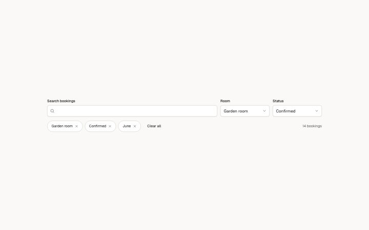
Install
npx shadcn add @klarhimmel/app-data-filtersUsage
import { Theme } from '@/components/klarhimmel/theme/style';
import { BlockSurface } from '@/components/klarhimmel/blocks/surface';
import AppDataFilters from '@/components/klarhimmel/blocks/app-data-filters';

export default function Section() {
  return (
    <Theme theme="brand">
      <BlockSurface>
        <AppDataFilters props={{
          "title": "Filter bookings",
          "searchLabel": "Search bookings",
          "sample": "",
          "selects": [
            {
              "label": "Room",
              "options": [
                "All rooms",
                "Seaside suite",
                "Garden room",
                "Attic double"
              ],
              "sample": "Garden room"
            },
            {
              "label": "Status",
              "options": [
                "Any status",
                "Confirmed",
                "Waiting",
                "Cancelled"
              ],
              "sample": "Confirmed"
            }
          ],
          "chips": [
            "Garden room",
            "Confirmed",
            "June"
          ],
          "removeLabel": "Remove filter",
          "clear": "Clear all",
          "results": [
            "14 bookings",
            "31 bookings",
            "88 bookings",
            "214 bookings"
          ]
        }} />
      </BlockSurface>
    </Theme>
  );
}
Install
Import
import Block from '@/components/klarhimmel/blocks/app-data-filters';- app/data-filters
- About
- A search box and select filters above a list, active filters as removable chips with a clear-all, and a result count read from a list (one entry per filter removed) and announced politely. Focus moves on when a chip goes.
- Category
- Interface sections for signed-in products.
Notes
When to use it
A search box and select filters above a list, with active filters as removable chips. For moving between pages of results use `app-data-pagination`; the table itself is `app-data-table`.
Writing for it
- `title` (60) is not shown. It names the search landmark for screen readers, so write what is being searched, such as Bookings. - Each select needs a `label` and 2 to 8 `options` of 30 characters, plus a `sample` for the value shown. Use up to 3 selects before the row gets crowded. - `results` is a list of count phrases, one per filter removed, such as 31 bookings. The block holds no data, so you write each number yourself.
Watch out for
The block filters nothing. Removing a chip only advances the count text, and removing more chips than there are `results` entries keeps the last one. Pass the host's list to the table separately.
Pairs well with
Usage
The block in a page, with its default content (long lists shortened). Every prop is in the table below.
import { Theme } from '@/components/klarhimmel/theme/style';
import { BlockSurface } from '@/components/klarhimmel/blocks/surface';
import AppDataFilters from '@/components/klarhimmel/blocks/app-data-filters';

export default function Section() {
  return (
    <Theme theme="brand">
      <BlockSurface>
        <AppDataFilters props={{
          "title": "Filter bookings",
          "searchLabel": "Search bookings",
          "sample": "",
          "selects": [
            {
              "label": "Room",
              "options": [
                "All rooms",
                "Seaside suite",
                "Garden room",
                "Attic double"
              ],
              "sample": "Garden room"
            },
            {
              "label": "Status",
              "options": [
                "Any status",
                "Confirmed",
                "Waiting",
                "Cancelled"
              ],
              "sample": "Confirmed"
            }
          ],
          "chips": [
            "Garden room",
            "Confirmed",
            "June"
          ],
          "removeLabel": "Remove filter",
          "clear": "Clear all",
          "results": [
            "14 bookings",
            "31 bookings",
            "88 bookings",
            "214 bookings"
          ]
        }} />
      </BlockSurface>
    </Theme>
  );
}
Props
The type, default and text limit of every prop. On a real page, over-limit text is kept and checkSections flags it (Installation, Check a page before you ship); this live preview shows the default until it fits. The panel above edits all props.
| Prop | Type | Default | Description |
|---|---|---|---|
title | string | 'Filter bookings' | Text, up to 60 characters. |
searchLabel | string | 'Search bookings' | Text, up to 40 characters. |
sample | string | '' | Text, up to 60 characters. |
selects | { label, options, sample }[] | 2 items | List of 1 to 3. Each item: label, options, sample. |
chips | string[] | 3 items | List of up to 5. |
removeLabel | string | 'Remove filter' | Text, up to 30 characters. |
clear | string | 'Clear all' | Text, up to 30 characters. |
results | string[] | 4 items | List of 1 to 6. |