Time-slot picker
Install
npx shadcn add @klarhimmel/app-scheduling-slotsUsage
import { Theme } from '@/components/klarhimmel/theme/style';
import { BlockSurface } from '@/components/klarhimmel/blocks/surface';
import AppSchedulingSlots from '@/components/klarhimmel/blocks/app-scheduling-slots';

export default function Section() {
  return (
    <Theme theme="brand">
      <BlockSurface>
        <AppSchedulingSlots props={{
          "eyebrow": "Spa at Exempelhotellet",
          "title": "Choose a time for your treatment",
          "description": "Sixty minutes. You can change it up to a day before.",
          "legend": "Available times",
          "help": "Arrow keys move between times. Space or Enter picks one.",
          "days": [
            {
              "label": "Mon 16 Nov",
              "unavailable": [
                "09:00",
                "10:00"
              ]
            },
            {
              "label": "Tue 17 Nov",
              "unavailable": []
            },
            {
              "label": "Wed 18 Nov",
              "unavailable": [
                "13:00",
                "14:00",
                "15:00"
              ]
            },
            {
              "label": "Thu 19 Nov",
              "unavailable": [
                "11:00"
              ]
            },
            {
              "label": "Fri 20 Nov",
              "unavailable": []
            }
          ],
          "times": [
            "09:00",
            "10:00",
            "11:00",
            "13:00",
            "14:00",
            "15:00"
          ],
          "selected": {
            "day": "Tue 17 Nov",
            "time": "10:00"
          },
          "scrollHint": "Scroll sideways for more days.",
          "fullLabel": "Full",
          "summary": "Selected",
          "none": "Nothing selected yet",
          "at": "at",
          "confirm": "Confirm booking",
          "change": "Change booking",
          "state": "idle",
          "messages": {
            "error": "Choose a time first.",
            "confirmed": "Booked. A confirmation is on its way to your email.",
            "empty": "No times are free this week. Try next week.",
            "taken": "That time is full. Choose another."
          }
        }} />
      </BlockSurface>
    </Theme>
  );
}
States
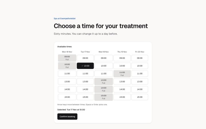
time-slot picker in 4 forms: idle, error, confirmed, empty.
state: idle
Spa at Exempelhotellet
Choose a time for your treatment
Sixty minutes. You can change it up to a day before.
Available times
Mon 16 Nov Tue 17 Nov Wed 18 Nov Thu 19 Nov Fri 20 Nov Arrow keys move between times. Space or Enter picks one.
Selected: Tue 17 Nov at 10:00
Full Selected Nothing selected yet atChoose a time first.
That time is full. Choose another.
Booked. A confirmation is on its way to your email.
No times are free this week. Try next week.
state: error
Spa at Exempelhotellet
Choose a time for your treatment
Sixty minutes. You can change it up to a day before.
Available times
Mon 16 Nov Tue 17 Nov Wed 18 Nov Thu 19 Nov Fri 20 Nov Arrow keys move between times. Space or Enter picks one.
Selected: Tue 17 Nov at 10:00
Full Selected Nothing selected yet atChoose a time first.
That time is full. Choose another.
Booked. A confirmation is on its way to your email.
No times are free this week. Try next week.
state: confirmed
Spa at Exempelhotellet
Choose a time for your treatment
Sixty minutes. You can change it up to a day before.
Available times
Mon 16 Nov Tue 17 Nov Wed 18 Nov Thu 19 Nov Fri 20 Nov Arrow keys move between times. Space or Enter picks one.
Selected: Tue 17 Nov at 10:00
Full Selected Nothing selected yet atChoose a time first.
That time is full. Choose another.
Booked. A confirmation is on its way to your email.
No times are free this week. Try next week.
state: empty
Spa at Exempelhotellet
Choose a time for your treatment
Sixty minutes. You can change it up to a day before.
Available times
Mon 16 Nov Tue 17 Nov Wed 18 Nov Thu 19 Nov Fri 20 Nov Arrow keys move between times. Space or Enter picks one.
Selected: Tue 17 Nov at 10:00
Full Selected Nothing selected yet atChoose a time first.
That time is full. Choose another.
Booked. A confirmation is on its way to your email.
No times are free this week. Try next week.
Notes
When to use it
A grid of days and times where the person picks one slot and confirms it. For a read-only overview of a month, use `app-scheduling-calendar` instead; this block exists for choosing, and it never submits anything itself.
Writing for it
- List the times once in times (2 to 8, 10 characters each) and mark the full ones per day in that day's unavailable list. A time you mention there must also exist in times. - selected starts the grid on a slot using the exact day label and time. Day labels hold 20 characters, so 'Tue 17 Nov' fits but a full date sentence does not. - The help line (160) is shown under the grid. Say what the keys do, and keep fullLabel to one word because a taken slot gets it in its accessible name.
Watch out for
With more than five days the grid gets wider and scrolls sideways, and scrollHint is only shown then. A selected slot that is marked unavailable is ignored, so the grid starts with nothing chosen.
Usage
The block in a page, with its default content (long lists shortened). Every prop is in the table below.
import { Theme } from '@/components/klarhimmel/theme/style';
import { BlockSurface } from '@/components/klarhimmel/blocks/surface';
import AppSchedulingSlots from '@/components/klarhimmel/blocks/app-scheduling-slots';

export default function Section() {
  return (
    <Theme theme="brand">
      <BlockSurface>
        <AppSchedulingSlots props={{
          "eyebrow": "Spa at Exempelhotellet",
          "title": "Choose a time for your treatment",
          "description": "Sixty minutes. You can change it up to a day before.",
          "legend": "Available times",
          "help": "Arrow keys move between times. Space or Enter picks one.",
          "days": [
            {
              "label": "Mon 16 Nov",
              "unavailable": [
                "09:00",
                "10:00"
              ]
            },
            {
              "label": "Tue 17 Nov",
              "unavailable": []
            }
          ],
          "times": [
            "09:00",
            "10:00"
          ],
          "selected": {
            "day": "Tue 17 Nov",
            "time": "10:00"
          },
          "scrollHint": "Scroll sideways for more days.",
          "fullLabel": "Full",
          "summary": "Selected",
          "none": "Nothing selected yet",
          "at": "at",
          "confirm": "Confirm booking",
          "change": "Change booking",
          "state": "idle",
          "messages": {
            "error": "Choose a time first.",
            "confirmed": "Booked. A confirmation is on its way to your email.",
            "empty": "No times are free this week. Try next week.",
            "taken": "That time is full. Choose another."
          }
        }} />
      </BlockSurface>
    </Theme>
  );
}
Props
Days (each with the times already taken) and times are the grid; selected is where it starts. The labels say what a taken slot is and what is chosen; state sets error, confirmed or empty.
| Prop | Type | Default | Description |
|---|---|---|---|
eyebrow | string | 'Spa at Exempelhotellet' | Text, up to 60 characters. Optional; empty is not rendered. |
title | string | 'Choose a time for your treatment' | Text, up to 120 characters. |
description | string | 'Sixty minutes. You can change it up…' | Text, up to 300 characters. Optional; empty is not rendered. |
legend | string | 'Available times' | Text, up to 60 characters. |
help | string | 'Arrow keys move between times. Spac…' | Text, up to 160 characters. |
days | { label, unavailable }[] | 5 items | List of 2 to 7. Each item: label, unavailable. |
times | string[] | 6 items | List of 2 to 8. |
selected | { day, time } | {…} | Fields: day, time. Optional; empty is not rendered. |
scrollHint | string | 'Scroll sideways for more days.' | Text, up to 60 characters. |
fullLabel | string | 'Full' | Text, up to 20 characters. |
summary | string | 'Selected' | Text, up to 40 characters. |
none | string | 'Nothing selected yet' | Text, up to 60 characters. |
at | string | 'at' | Text, up to 10 characters. |
confirm | string | 'Confirm booking' | Text, up to 30 characters. |
change | string | 'Change booking' | Text, up to 30 characters. |
state | 'idle' | 'error' | 'confirmed' | 'empty' | 'idle' | One of 'idle', 'error', 'confirmed', 'empty'. |
messages | { error, confirmed, empty, taken } | {…} | Fields: error, confirmed, empty, taken. |
headingLevel | '1' | '2' | - | One of '1', '2'. Optional; empty is not rendered. |
Install
Installs
app-scheduling-slots- Button
- About
- Pick a time: days across, times down, as a keyboard grid (arrow keys, Home and End, Space picks). A taken slot says so in words, the choice is repeated in a status line, and idle, error, confirmed and empty states. Never submits.
- States
- Idle, error, confirmed, empty. A keyboard grid: arrows, Home and End, Space. Taken slots say so in words.