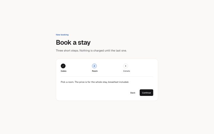
App, step wizard header
Install
npx shadcn add @klarhimmel/app-onboarding-stepsUsage
import { Theme } from '@/components/klarhimmel/theme/style';
import { BlockSurface } from '@/components/klarhimmel/blocks/surface';
import AppOnboardingSteps from '@/components/klarhimmel/blocks/app-onboarding-steps';

export default function Section() {
  return (
    <Theme theme="brand">
      <BlockSurface>
        <AppOnboardingSteps props={{
          "eyebrow": "New booking",
          "title": "Book a stay",
          "description": "Three short steps. Nothing is charged until the last one.",
          "stepsLabel": "Booking steps",
          "steps": [
            {
              "label": "Dates",
              "description": "Choose when you arrive and how many nights you stay."
            },
            {
              "label": "Room",
              "description": "Pick a room. The price is for the whole stay, breakfast included."
            },
            {
              "label": "Details",
              "description": "Tell us who is coming and when you expect to arrive."
            }
          ],
          "active": "Room",
          "status": {
            "done": "Done",
            "current": "Current step",
            "upcoming": "Not started"
          },
          "back": "Back",
          "next": "Continue",
          "finish": "Confirm booking"
        }} />
      </BlockSurface>
    </Theme>
  );
}
Install
Import
import Block from '@/components/klarhimmel/blocks/app-onboarding-steps';- app/onboarding-steps
- About
- A step indicator for a multi-step flow: numbered steps that are done, current or upcoming (aria-current="step", the state also said in words for screen readers), the current step's text, and Back and Continue buttons that move through the…
- Category
- Interface sections for signed-in products.
Notes
When to use it
A numbered step header for a short flow such as booking or setup, with Back and Continue moving through the steps in place. For a loose list of tasks people can do in any order, use `app-onboarding-checklist`.
Writing for it
- Step labels hold 30 characters and sit in a row, so use one or two words: Dates, Room, Details. The description (200) is what appears for the current step. - The active field must match one step label exactly, or no step is current. Copy the label, do not retype it. - finish (20) replaces the Continue text on the last step. Name the real outcome there, such as Confirm booking, instead of repeating Continue.
Watch out for
This is only the step header and its buttons. It does not hold the form fields of each step, so your app places those below it. It takes 3 to 6 steps, and a flow with two steps does not validate.
Pairs well with
Usage
The block in a page, with its default content (long lists shortened). Every prop is in the table below.
import { Theme } from '@/components/klarhimmel/theme/style';
import { BlockSurface } from '@/components/klarhimmel/blocks/surface';
import AppOnboardingSteps from '@/components/klarhimmel/blocks/app-onboarding-steps';

export default function Section() {
  return (
    <Theme theme="brand">
      <BlockSurface>
        <AppOnboardingSteps props={{
          "eyebrow": "New booking",
          "title": "Book a stay",
          "description": "Three short steps. Nothing is charged until the last one.",
          "stepsLabel": "Booking steps",
          "steps": [
            {
              "label": "Dates",
              "description": "Choose when you arrive and how many nights you stay."
            },
            {
              "label": "Room",
              "description": "Pick a room. The price is for the whole stay, breakfast included."
            },
            {
              "label": "Details",
              "description": "Tell us who is coming and when you expect to arrive."
            }
          ],
          "active": "Room",
          "status": {
            "done": "Done",
            "current": "Current step",
            "upcoming": "Not started"
          },
          "back": "Back",
          "next": "Continue",
          "finish": "Confirm booking"
        }} />
      </BlockSurface>
    </Theme>
  );
}
Props
The type, default and text limit of every prop. On a real page, over-limit text is kept and checkSections flags it (Installation, Check a page before you ship); this live preview shows the default until it fits. The panel above edits all props.
| Prop | Type | Default | Description |
|---|---|---|---|
eyebrow | string | 'New booking' | Text, up to 60 characters. Optional; empty is not rendered. |
title | string | 'Book a stay' | Text, up to 120 characters. |
description | string | 'Three short steps. Nothing is charg…' | Text, up to 300 characters. Optional; empty is not rendered. |
stepsLabel | string | 'Booking steps' | Text, up to 40 characters. |
steps | { label, description }[] | 3 items | List of 3 to 6. Each item: label, description. |
active | string | 'Room' | Text, up to 30 characters. |
status | { done, current, upcoming } | {…} | Fields: done, current, upcoming. |
back | string | 'Back' | Text, up to 20 characters. |
next | string | 'Continue' | Text, up to 20 characters. |
finish | string | 'Confirm booking' | Text, up to 20 characters. |
headingLevel | '1' | '2' | - | One of '1', '2'. Optional; empty is not rendered. |