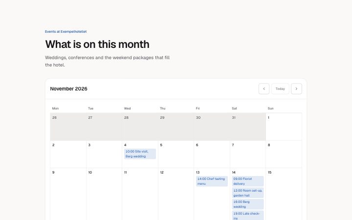
App, month calendar
Install
npx shadcn add @klarhimmel/app-scheduling-calendarUsage
import { Theme } from '@/components/klarhimmel/theme/style';
import { BlockSurface } from '@/components/klarhimmel/blocks/surface';
import AppSchedulingCalendar from '@/components/klarhimmel/blocks/app-scheduling-calendar';

export default function Section() {
  return (
    <Theme theme="brand">
      <BlockSurface>
        <AppSchedulingCalendar props={{
          "eyebrow": "Events at Exempelhotellet",
          "title": "What is on this month",
          "description": "Weddings, conferences and the weekend packages that fill the hotel.",
          "month": "2026-11",
          "today": "2026-11-16",
          "locale": "en",
          "firstDay": "mon",
          "weekdays": [
            "Mon",
            "Tue",
            "Wed",
            "Thu",
            "Fri",
            "Sat",
            "Sun"
          ],
          "events": [
            {
              "date": "2026-11-04",
              "time": "10:00",
              "title": "Site visit, Berg wedding"
            },
            {
              "date": "2026-11-13",
              "time": "14:00",
              "title": "Chef tasting menu"
            },
            {
              "date": "2026-11-14",
              "time": "16:00",
              "title": "Berg wedding"
            },
            {
              "date": "2026-11-14",
              "time": "09:00",
              "title": "Florist delivery"
            },
            {
              "date": "2026-11-14",
              "time": "12:00",
              "title": "Room set-up, garden hall"
            },
            {
              "date": "2026-11-14",
              "time": "19:00",
              "title": "Late check-ins"
            },
            {
              "date": "2026-11-18",
              "time": "09:30",
              "title": "Staff meeting"
            },
            {
              "date": "2026-11-25",
              "time": "13:00",
              "title": "Conference: Northlight Days"
            },
            {
              "date": "2026-11-26",
              "title": "Conference: Northlight Days"
            }
          ],
          "previous": "Previous month",
          "next": "Next month",
          "todayLabel": "Today",
          "at": "at",
          "state": "filled",
          "messages": {
            "empty": "Nothing is planned this month.",
            "loading": "Loading events…",
            "error": "We could not load the events.",
            "retry": "Try again",
            "invalid": "These dates could not be read, so they are not shown:"
          }
        }} />
      </BlockSurface>
    </Theme>
  );
}
Install
Import
import Block from '@/components/klarhimmel/blocks/app-scheduling-calendar';- app/scheduling-calendar
- About
- A month as a table with its events, today marked in words, previous, next and today buttons, and an agenda list in narrow containers instead of a cramped grid. Filled, empty, loading and error states.
- Category
- Interface sections for signed-in products.
Notes
When to use it
A month view with events, for showing what is planned and not for booking. To let someone choose a time, use `app-scheduling-slots`. In narrow containers the grid turns into an agenda list, so it also works in a side column.
Writing for it
- Dates are plain ISO text: month as 2026-11, today as 2026-11-16 and each event date as 2026-11-04. The block never reads the clock, so you must set today yourself. - weekdays needs exactly seven names starting from the day firstDay picks, and locale (10) sets the language of the month names. Change all three together for another language. - Event titles hold 60 characters and the time is optional at 12. An event without a time shows only its title in the cell.
Watch out for
A date that cannot be read, like 2026-13, is not dropped silently: it is listed under messages.invalid so you can fix it. Up to 40 events are allowed, and a month without events shows the empty message even when the state is filled.
Usage
The block in a page, with its default content (long lists shortened). Every prop is in the table below.
import { Theme } from '@/components/klarhimmel/theme/style';
import { BlockSurface } from '@/components/klarhimmel/blocks/surface';
import AppSchedulingCalendar from '@/components/klarhimmel/blocks/app-scheduling-calendar';

export default function Section() {
  return (
    <Theme theme="brand">
      <BlockSurface>
        <AppSchedulingCalendar props={{
          "eyebrow": "Events at Exempelhotellet",
          "title": "What is on this month",
          "description": "Weddings, conferences and the weekend packages that fill the hotel.",
          "month": "2026-11",
          "today": "2026-11-16",
          "locale": "en",
          "firstDay": "mon",
          "weekdays": [
            "Mon",
            "Tue",
            "Wed"
          ],
          "events": [
            {
              "date": "2026-11-04",
              "time": "10:00",
              "title": "Site visit, Berg wedding"
            },
            {
              "date": "2026-11-13",
              "time": "14:00",
              "title": "Chef tasting menu"
            },
            {
              "date": "2026-11-14",
              "time": "16:00",
              "title": "Berg wedding"
            }
          ],
          "previous": "Previous month",
          "next": "Next month",
          "todayLabel": "Today",
          "at": "at",
          "state": "filled",
          "messages": {
            "empty": "Nothing is planned this month.",
            "loading": "Loading events…",
            "error": "We could not load the events.",
            "retry": "Try again",
            "invalid": "These dates could not be read, so they are not shown:"
          }
        }} />
      </BlockSurface>
    </Theme>
  );
}
Props
The type, default and text limit of every prop. On a real page, over-limit text is kept and checkSections flags it (Installation, Check a page before you ship); this live preview shows the default until it fits. The panel above edits all props.
| Prop | Type | Default | Description |
|---|---|---|---|
eyebrow | string | 'Events at Exempelhotellet' | Text, up to 60 characters. Optional; empty is not rendered. |
title | string | 'What is on this month' | Text, up to 120 characters. |
description | string | 'Weddings, conferences and the weeke…' | Text, up to 300 characters. Optional; empty is not rendered. |
month | string | '2026-11' | Text, up to 7 characters. |
today | string | '2026-11-16' | Text, up to 10 characters. |
locale | string | 'en' | Text, up to 10 characters. |
firstDay | 'mon' | 'sun' | 'mon' | One of 'mon', 'sun'. |
weekdays | string[] | 7 items | List of 7 to 7. |
events | { date, time, title }[] | 9 items | List of up to 40. Each item: date, time (optional), title. |
previous | string | 'Previous month' | Text, up to 30 characters. |
next | string | 'Next month' | Text, up to 30 characters. |
todayLabel | string | 'Today' | Text, up to 20 characters. |
at | string | 'at' | Text, up to 10 characters. |
state | 'filled' | 'empty' | 'loading' | 'error' | 'filled' | One of 'filled', 'empty', 'loading', 'error'. |
messages | { empty, loading, error, retry, invalid } | {…} | Fields: empty, loading, error, retry, invalid. |
headingLevel | '1' | '2' | - | One of '1', '2'. Optional; empty is not rendered. |