Docs, customise panel
Install
npx shadcn add @klarhimmel/docs-customiseUsage
import { Theme } from '@/components/klarhimmel/theme/style';
import { BlockSurface } from '@/components/klarhimmel/blocks/surface';
import DocsCustomise from '@/components/klarhimmel/blocks/docs-customise';

export default function Section() {
  return (
    <Theme theme="brand">
      <BlockSurface>
        <DocsCustomise props={{
          "title": "Customise",
          "description": "Change the settings and the code follows.",
          "preview": {
            "src": "",
            "alt": "A Save changes button"
          },
          "demo": "button-primary",
          "filename": "button.tsx",
          "code": "<Button variant=\"primary\" size=\"md\">\n  Save changes\n</Button>",
          "reset": "Reset",
          "controls": [
            {
              "label": "Variant",
              "variant": "select",
              "value": "Primary",
              "options": [
                "Primary",
                "Secondary",
                "Ghost",
                "Accent"
              ]
            },
            {
              "label": "Size",
              "variant": "select",
              "value": "Medium",
              "options": [
                "Small",
                "Medium",
                "Large"
              ]
            },
            {
              "label": "Label",
              "variant": "text",
              "value": "Save changes",
              "options": []
            },
            {
              "label": "Full width",
              "variant": "toggle",
              "value": "off",
              "options": []
            },
            {
              "label": "Disabled",
              "variant": "toggle",
              "value": "off",
              "options": []
            }
          ]
        }} />
      </BlockSurface>
    </Theme>
  );
}
Install
Import
import Block from '@/components/klarhimmel/blocks/docs-customise';- docs/customise
- Category
- Documentation sections: headers, install panels, props tables, previews.
Notes
When to use it
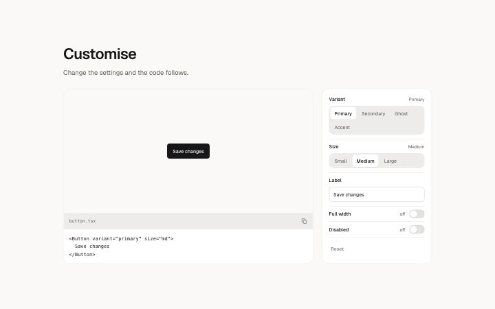
A component page panel where a stage and its code sit beside a column of controls, so a reader sees which settings exist. It is a static layout; for a plain stage with code and no controls use `docs-preview-frame`.
Writing for it
- Each control has a variant: select, toggle or text. A select needs its options (up to 6, 30 characters each) and its value must match one of them to be marked as current. - A toggle reads its value as on, true or yes to start switched on; anything else starts off. Write the value as the word the reader would expect beside the switch. - The code field holds 600 characters and the filename 60. Show the default state, because the controls are labels and the code does not change when they are used.
Watch out for
The block itself never rewrites the code or the stage; the site has to wire that. The reset button is drawn disabled and dimmed, so do not promise in the description that it works on the published page unless the host connects it.
Pairs well with
Usage
The block in a page, with its default content (long lists shortened). Every prop is in the table below.
import { Theme } from '@/components/klarhimmel/theme/style';
import { BlockSurface } from '@/components/klarhimmel/blocks/surface';
import DocsCustomise from '@/components/klarhimmel/blocks/docs-customise';

export default function Section() {
  return (
    <Theme theme="brand">
      <BlockSurface>
        <DocsCustomise props={{
          "title": "Customise",
          "description": "Change the settings and the code follows.",
          "preview": {
            "src": "",
            "alt": "A Save changes button"
          },
          "demo": "button-primary",
          "filename": "button.tsx",
          "code": "<Button variant=\"primary\" size=\"md\">\n  Save changes\n</Button>",
          "reset": "Reset",
          "controls": [
            {
              "label": "Variant",
              "variant": "select",
              "value": "Primary",
              "options": [
                "Primary",
                "Secondary",
                "Ghost",
                "Accent"
              ]
            },
            {
              "label": "Size",
              "variant": "select",
              "value": "Medium",
              "options": [
                "Small",
                "Medium",
                "Large"
              ]
            },
            {
              "label": "Label",
              "variant": "text",
              "value": "Save changes",
              "options": []
            },
            {
              "label": "Full width",
              "variant": "toggle",
              "value": "off",
              "options": []
            },
            {
              "label": "Disabled",
              "variant": "toggle",
              "value": "off",
              "options": []
            }
          ]
        }} />
      </BlockSurface>
    </Theme>
  );
}
Props
The type, default and text limit of every prop. On a real page, over-limit text is kept and checkSections flags it (Installation, Check a page before you ship); this live preview shows the default until it fits. The panel above edits all props.
| Prop | Type | Default | Description |
|---|---|---|---|
title | string | 'Customise' | Text, up to 60 characters. |
description | string | 'Change the settings and the code fo…' | Text, up to 200 characters. |
preview | Media | {…} | Optional; empty is not rendered. |
demo | string | 'button-primary' | Text, up to 80 characters. Optional; empty is not rendered. |
filename | string | 'button.tsx' | Text, up to 60 characters. |
code | string | '<Button variant="primary" size="md"…' | Text, up to 600 characters. |
reset | string | 'Reset' | Text, up to 20 characters. |
controls | { label, variant, value, options }[] | 5 items | List of up to 8. Each item: label, variant ('select' | 'toggle' | 'text'), value, options. |
headingLevel | '1' | '2' | - | One of '1', '2'. Optional; empty is not rendered. |