Docs, table
Install
npx shadcn add @klarhimmel/docs-tableUsage
import { Theme } from '@/components/klarhimmel/theme/style';
import { BlockSurface } from '@/components/klarhimmel/blocks/surface';
import DocsTable from '@/components/klarhimmel/blocks/docs-table';

export default function Section() {
  return (
    <Theme theme="brand">
      <BlockSurface>
        <DocsTable props={{
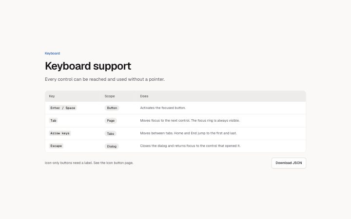
          "eyebrow": "Keyboard",
          "title": "Keyboard support",
          "description": "Every control can be reached and used without a pointer.",
          "columns": [
            {
              "label": "Key",
              "variant": "mono"
            },
            {
              "label": "Scope",
              "variant": "badge"
            },
            {
              "label": "Does",
              "variant": "text"
            }
          ],
          "rows": [
            {
              "cells": [
                "Enter / Space",
                "Button",
                "Activates the focused button."
              ]
            },
            {
              "cells": [
                "Tab",
                "Page",
                "Moves focus to the next control. The focus ring is always visible."
              ]
            },
            {
              "cells": [
                "Arrow keys",
                "Tabs",
                "Moves between tabs. Home and End jump to the first and last."
              ]
            },
            {
              "cells": [
                "Escape",
                "Dialog",
                "Closes the dialog and returns focus to the control that opened it."
              ]
            }
          ],
          "action": {
            "label": "Download JSON",
            "href": "#tokens.json"
          },
          "note": "Icon-only buttons need a label. See the Icon button page."
        }} />
      </BlockSurface>
    </Theme>
  );
}
Install
Import
import Block from '@/components/klarhimmel/blocks/docs-table';- docs/table
- Category
- Documentation sections: headers, install panels, props tables, previews.
Notes
When to use it
A titled table with columns you define, such as keyboard keys, tokens, variables or a changelog. For component props use `docs-props-table`, which has the fixed columns.
Writing for it
- Choose 2 to 6 columns and give each a variant: text for prose, mono for code, badge for short labels. The first column becomes the row header. - Cells hold 160 characters and a row has up to 6 cells. Put the identifier in the first column, since it labels the whole row. - Add a note of 200 characters or an action link under the table for the thing a reader will ask next. The eyebrow holds 60.
Watch out for
A row with fewer cells than columns gets empty cells, and an empty badge cell is not drawn. The table scrolls sideways under 34rem, and mono cells never wrap.
Pairs well with
Usage
The block in a page, with its default content (long lists shortened). Every prop is in the table below.
import { Theme } from '@/components/klarhimmel/theme/style';
import { BlockSurface } from '@/components/klarhimmel/blocks/surface';
import DocsTable from '@/components/klarhimmel/blocks/docs-table';

export default function Section() {
  return (
    <Theme theme="brand">
      <BlockSurface>
        <DocsTable props={{
          "eyebrow": "Keyboard",
          "title": "Keyboard support",
          "description": "Every control can be reached and used without a pointer.",
          "columns": [
            {
              "label": "Key",
              "variant": "mono"
            },
            {
              "label": "Scope",
              "variant": "badge"
            },
            {
              "label": "Does",
              "variant": "text"
            }
          ],
          "rows": [
            {
              "cells": [
                "Enter / Space",
                "Button",
                "Activates the focused button."
              ]
            },
            {
              "cells": [
                "Tab",
                "Page",
                "Moves focus to the next control. The focus ring is always visible."
              ]
            },
            {
              "cells": [
                "Arrow keys",
                "Tabs",
                "Moves between tabs. Home and End jump to the first and last."
              ]
            },
            {
              "cells": [
                "Escape",
                "Dialog",
                "Closes the dialog and returns focus to the control that opened it."
              ]
            }
          ],
          "action": {
            "label": "Download JSON",
            "href": "#tokens.json"
          },
          "note": "Icon-only buttons need a label. See the Icon button page."
        }} />
      </BlockSurface>
    </Theme>
  );
}
Props
The type, default and text limit of every prop. On a real page, over-limit text is kept and checkSections flags it (Installation, Check a page before you ship); this live preview shows the default until it fits. The panel above edits all props.
| Prop | Type | Default | Description |
|---|---|---|---|
eyebrow | string | 'Keyboard' | Text, up to 60 characters. |
title | string | 'Keyboard support' | Text, up to 80 characters. |
description | string | 'Every control can be reached and us…' | Text, up to 300 characters. |
columns | { label, variant }[] | 3 items | List of 2 to 6. Each item: label, variant ('text' | 'mono' | 'badge'). |
rows | { cells }[] | 4 items | List of 1 to 40. Each item: cells. |
action | Link | {…} | See the type. |
note | string | 'Icon-only buttons need a label. See…' | Text, up to 200 characters. |
headingLevel | '1' | '2' | - | One of '1', '2'. Optional; empty is not rendered. |