Docs, install panel
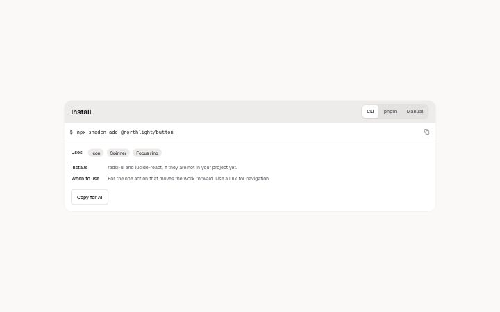
Install
npx shadcn add @klarhimmel/docs-installUsage
import { Theme } from '@/components/klarhimmel/theme/style';
import { BlockSurface } from '@/components/klarhimmel/blocks/surface';
import DocsInstall from '@/components/klarhimmel/blocks/docs-install';

export default function Section() {
  return (
    <Theme theme="brand">
      <BlockSurface>
        <DocsInstall props={{
          "title": "Install",
          "tabs": [
            {
              "label": "CLI",
              "code": "npx shadcn add @northlight/button"
            },
            {
              "label": "pnpm",
              "code": "pnpm dlx shadcn add @northlight/button"
            },
            {
              "label": "Manual",
              "code": "curl -O https://northlight.example/r/button.json"
            }
          ],
          "usesLabel": "Uses",
          "uses": [
            "Icon",
            "Spinner",
            "Focus ring"
          ],
          "facts": [
            {
              "label": "Installs",
              "text": "radix-ui and lucide-react, if they are not in your project yet."
            },
            {
              "label": "When to use",
              "text": "For the one action that moves the work forward. Use a link for navigation."
            }
          ],
          "actions": [
            {
              "label": "Copy for AI",
              "href": "#copy"
            }
          ]
        }} />
      </BlockSurface>
    </Theme>
  );
}
Install
Import
import Block from '@/components/klarhimmel/blocks/docs-install';- docs/install
- Category
- Documentation sections: headers, install panels, props tables, previews.
Notes
When to use it
A tabbed install panel with copyable commands, a row of things the component uses, and a few labelled facts. Use `docs-header` for a single command and `docs-prompt` when the thing to copy is text for an AI.
Writing for it
- Tab labels hold 20 characters and each tab holds 400 characters of code, so one command per tab, such as CLI, pnpm or Manual. - Facts take a label of 30 characters and text of 240. Use them for what the install adds to the project and when to reach for the component. - The uses row holds up to 8 chips of 40 characters; name the dependencies a reader would otherwise have to find in the source.
Watch out for
A tab with no code is left out of the published block, and with no script running every remaining tab is shown stacked with its label. The Uses label is only drawn if there are chips, so an empty chip list hides it.
Pairs well with
Usage
The block in a page, with its default content (long lists shortened). Every prop is in the table below.
import { Theme } from '@/components/klarhimmel/theme/style';
import { BlockSurface } from '@/components/klarhimmel/blocks/surface';
import DocsInstall from '@/components/klarhimmel/blocks/docs-install';

export default function Section() {
  return (
    <Theme theme="brand">
      <BlockSurface>
        <DocsInstall props={{
          "title": "Install",
          "tabs": [
            {
              "label": "CLI",
              "code": "npx shadcn add @northlight/button"
            },
            {
              "label": "pnpm",
              "code": "pnpm dlx shadcn add @northlight/button"
            },
            {
              "label": "Manual",
              "code": "curl -O https://northlight.example/r/button.json"
            }
          ],
          "usesLabel": "Uses",
          "uses": [
            "Icon",
            "Spinner",
            "Focus ring"
          ],
          "facts": [
            {
              "label": "Installs",
              "text": "radix-ui and lucide-react, if they are not in your project yet."
            },
            {
              "label": "When to use",
              "text": "For the one action that moves the work forward. Use a link for navigation."
            }
          ],
          "actions": [
            {
              "label": "Copy for AI",
              "href": "#copy"
            }
          ]
        }} />
      </BlockSurface>
    </Theme>
  );
}
Props
The type, default and text limit of every prop. On a real page, over-limit text is kept and checkSections flags it (Installation, Check a page before you ship); this live preview shows the default until it fits. The panel above edits all props.
| Prop | Type | Default | Description |
|---|---|---|---|
title | string | 'Install' | Text, up to 60 characters. |
tabs | { label, code }[] | 3 items | List of 1 to 4. Each item: label, code. |
usesLabel | string | 'Uses' | Text, up to 20 characters. |
uses | string[] | 3 items | List of up to 8. |
facts | { label, text }[] | 2 items | List of up to 3. Each item: label, text. |
actions | Link[] | 1 item | List of up to 3. |
headingLevel | '1' | '2' | - | One of '1', '2'. Optional; empty is not rendered. |