Error, with links
Install
npx shadcn add @klarhimmel/error-linksUsage
import { Theme } from '@/components/klarhimmel/theme/style';
import { BlockSurface } from '@/components/klarhimmel/blocks/surface';
import ErrorLinks from '@/components/klarhimmel/blocks/error-links';

export default function Section() {
  return (
    <Theme theme="brand">
      <BlockSurface>
        <ErrorLinks props={{
          "code": "404",
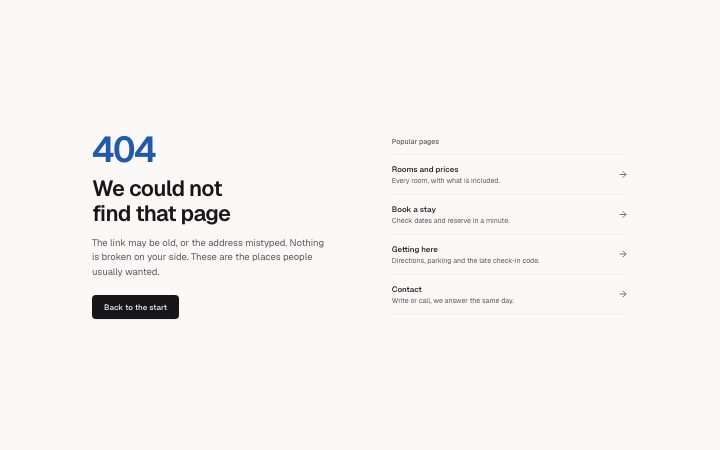
          "title": "We could not find that page",
          "description": "The link may be old, or the address mistyped. Nothing is broken on your side. These are the places people usually wanted.",
          "primary": {
            "label": "Back to the start",
            "href": "/"
          },
          "linksTitle": "Popular pages",
          "links": [
            {
              "label": "Rooms and prices",
              "description": "Every room, with what is included.",
              "href": "/rooms"
            },
            {
              "label": "Book a stay",
              "description": "Check dates and reserve in a minute.",
              "href": "/book"
            },
            {
              "label": "Getting here",
              "description": "Directions, parking and the late check-in code.",
              "href": "/directions"
            },
            {
              "label": "Contact",
              "description": "Write or call, we answer the same day.",
              "href": "/contact"
            }
          ]
        }} />
      </BlockSurface>
    </Theme>
  );
}
Install
Import
import Block from '@/components/klarhimmel/blocks/error-links';- error/links
- About
- A not-found or error page that does not leave people stranded: code, plain explanation, one primary action, and a short list of described places to go next. Left-aligned, two columns when wide.
- Category
- Not found, server error and maintenance pages.
Notes
When to use it
A not-found page that offers a primary action and a described list of places to go next. When two buttons are enough use `error-page`.
Writing for it
- The code holds 20 characters and prints large, so 404 works well. The title is the page h1 at 100 characters. - Links need 1 to 5 entries with a label of 60 characters and a description of 120. Describe what the reader gets at the target, not just its name. - The links title holds 60 characters and the description 300. Say what likely went wrong, without blaming the reader.
Watch out for
The page title is an h1 and the link list title is an h2, so do not also place an h1 in the navbar of the same page. Each link row is a single clickable area and long labels wrap.
Pairs well with
Usage
The block in a page, with its default content (long lists shortened). Every prop is in the table below.
import { Theme } from '@/components/klarhimmel/theme/style';
import { BlockSurface } from '@/components/klarhimmel/blocks/surface';
import ErrorLinks from '@/components/klarhimmel/blocks/error-links';

export default function Section() {
  return (
    <Theme theme="brand">
      <BlockSurface>
        <ErrorLinks props={{
          "code": "404",
          "title": "We could not find that page",
          "description": "The link may be old, or the address mistyped. Nothing is broken on your side. These are the places people usually wanted.",
          "primary": {
            "label": "Back to the start",
            "href": "/"
          },
          "linksTitle": "Popular pages",
          "links": [
            {
              "label": "Rooms and prices",
              "description": "Every room, with what is included.",
              "href": "/rooms"
            },
            {
              "label": "Book a stay",
              "description": "Check dates and reserve in a minute.",
              "href": "/book"
            },
            {
              "label": "Getting here",
              "description": "Directions, parking and the late check-in code.",
              "href": "/directions"
            },
            {
              "label": "Contact",
              "description": "Write or call, we answer the same day.",
              "href": "/contact"
            }
          ]
        }} />
      </BlockSurface>
    </Theme>
  );
}
Props
The type, default and text limit of every prop. On a real page, over-limit text is kept and checkSections flags it (Installation, Check a page before you ship); this live preview shows the default until it fits. The panel above edits all props.
| Prop | Type | Default | Description |
|---|---|---|---|
code | string | '404' | Text, up to 20 characters. |
title | string | 'We could not find that page' | Text, up to 100 characters. |
description | string | 'The link may be old, or the address…' | Text, up to 300 characters. |
primary | Link | {…} | See the type. |
linksTitle | string | 'Popular pages' | Text, up to 60 characters. |
links | { label, description, href }[] | 4 items | List of 1 to 5. Each item: label, description, href. |
headingLevel | '1' | '2' | - | One of '1', '2'. Optional; empty is not rendered. |