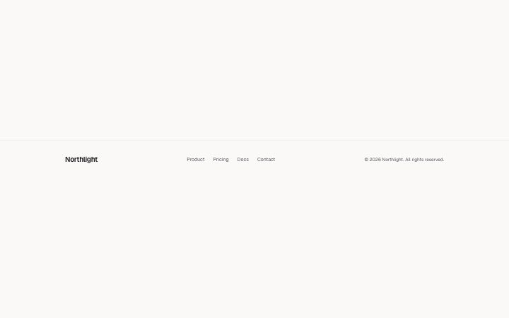
Footer, simple
Install
npx shadcn add @klarhimmel/footer-simpleUsage
import { Theme } from '@/components/klarhimmel/theme/style';
import { BlockSurface } from '@/components/klarhimmel/blocks/surface';
import FooterSimple from '@/components/klarhimmel/blocks/footer-simple';

export default function Section() {
  return (
    <Theme theme="brand">
      <BlockSurface>
        <FooterSimple props={{
          "brand": "Northlight",
          "links": [
            {
              "label": "Product",
              "href": "#product"
            },
            {
              "label": "Pricing",
              "href": "#pricing"
            },
            {
              "label": "Docs",
              "href": "#docs"
            },
            {
              "label": "Contact",
              "href": "#contact"
            }
          ],
          "legal": "© 2026 Northlight. All rights reserved."
        }} />
      </BlockSurface>
    </Theme>
  );
}
Install
Import
import Block from '@/components/klarhimmel/blocks/footer-simple';- footer/simple
- Category
- The end of every page: links, legal, an optional sign-up.
Notes
When to use it
One quiet row: brand with an optional logo mark, a few links and a legal line. Right for a landing page or small site; use `footer-columns` when there are more than six pages.
Writing for it
- Give it at most six links. They sit in the middle on wide containers and wrap under the brand on narrow ones. - The legal field holds 120 characters. Year and company name are enough, with the privacy link as one of the links. - Add the logo field only if the navbar uses the same mark. It is shown before the brand text, so the footer matches the header.
Watch out for
The brand holds 40 characters but shares one row with links and the legal line, so a long brand wraps onto a second line. Links with an empty label are removed, which means clearing every label leaves only brand and legal.
Usage
The block in a page, with its default content (long lists shortened). Every prop is in the table below.
import { Theme } from '@/components/klarhimmel/theme/style';
import { BlockSurface } from '@/components/klarhimmel/blocks/surface';
import FooterSimple from '@/components/klarhimmel/blocks/footer-simple';

export default function Section() {
  return (
    <Theme theme="brand">
      <BlockSurface>
        <FooterSimple props={{
          "brand": "Northlight",
          "links": [
            {
              "label": "Product",
              "href": "#product"
            },
            {
              "label": "Pricing",
              "href": "#pricing"
            },
            {
              "label": "Docs",
              "href": "#docs"
            },
            {
              "label": "Contact",
              "href": "#contact"
            }
          ],
          "legal": "© 2026 Northlight. All rights reserved."
        }} />
      </BlockSurface>
    </Theme>
  );
}
Props
The type, default and text limit of every prop. On a real page, over-limit text is kept and checkSections flags it (Installation, Check a page before you ship); this live preview shows the default until it fits. The panel above edits all props.
| Prop | Type | Default | Description |
|---|---|---|---|
brand | string | 'Northlight' | Text, up to 40 characters. |
mark | { paths, viewBox, src } | - | Fields: paths (optional), viewBox (optional), src (optional). Optional; empty is not rendered. |
logo | Media | - | Optional; empty is not rendered. |
links | Link[] | 4 items | List of up to 6. |
legal | string | '© 2026 Northlight. All rights reser…' | Text, up to 120 characters. |