Error page
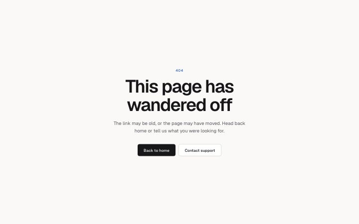
Install
npx shadcn add @klarhimmel/error-pageUsage
import { Theme } from '@/components/klarhimmel/theme/style';
import { BlockSurface } from '@/components/klarhimmel/blocks/surface';
import ErrorPage from '@/components/klarhimmel/blocks/error-page';

export default function Section() {
  return (
    <Theme theme="brand">
      <BlockSurface>
        <ErrorPage props={{
          "code": "404",
          "title": "This page has wandered off",
          "description": "The link may be old, or the page may have moved. Head back home or tell us what you were looking for.",
          "primary": {
            "label": "Back to home",
            "href": "/"
          },
          "secondary": {
            "label": "Contact support",
            "href": "#contact"
          }
        }} />
      </BlockSurface>
    </Theme>
  );
}
Install
Import
import Block from '@/components/klarhimmel/blocks/error-page';- error/page
- Category
- Not found, server error and maintenance pages.
Notes
When to use it
A plain 404 or 500 page: a code, a headline, an explanation and two buttons. For a list of places to go use `error-links`, and for a fault with a support reference use `error-status`.
Writing for it
- The code holds 12 characters and the title 100. The title is the page h1 in display size, so a short sentence works better than a paragraph. - The description holds 240 characters. Say what happened in one sentence and what to do in the second. - Both buttons are required: the primary is solid and the secondary is outlined. Send the primary home and the secondary to contact or search.
Watch out for
The heading is an h1 at the largest text size and is centred in a narrow column, so a long title wraps over many lines. The code is a plain paragraph, not a heading.
Pairs well with
Usage
The block in a page, with its default content (long lists shortened). Every prop is in the table below.
import { Theme } from '@/components/klarhimmel/theme/style';
import { BlockSurface } from '@/components/klarhimmel/blocks/surface';
import ErrorPage from '@/components/klarhimmel/blocks/error-page';

export default function Section() {
  return (
    <Theme theme="brand">
      <BlockSurface>
        <ErrorPage props={{
          "code": "404",
          "title": "This page has wandered off",
          "description": "The link may be old, or the page may have moved. Head back home or tell us what you were looking for.",
          "primary": {
            "label": "Back to home",
            "href": "/"
          },
          "secondary": {
            "label": "Contact support",
            "href": "#contact"
          }
        }} />
      </BlockSurface>
    </Theme>
  );
}
Props
The type, default and text limit of every prop. On a real page, over-limit text is kept and checkSections flags it (Installation, Check a page before you ship); this live preview shows the default until it fits. The panel above edits all props.
| Prop | Type | Default | Description |
|---|---|---|---|
code | string | '404' | Text, up to 12 characters. |
title | string | 'This page has wandered off' | Text, up to 100 characters. |
description | string | 'The link may be old, or the page ma…' | Text, up to 240 characters. |
primary | Link | {…} | See the type. |
secondary | Link | {…} | See the type. |
headingLevel | '1' | '2' | - | One of '1', '2'. Optional; empty is not rendered. |