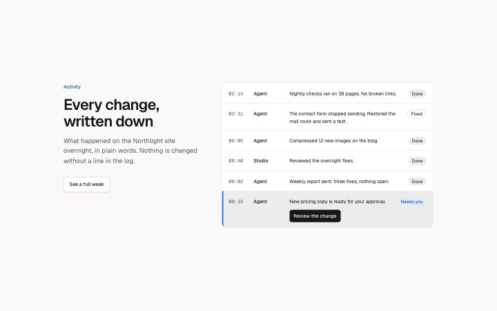
A heading beside a timed log of work: time, actor, one-line event and a status badge per row, with an optional highlighted row that needs the reader and one…
Light · Dark
A heading beside a timed log of work: time, actor, one-line event and a status badge per row, with an optional highlighted row that needs the reader and one…
Light · Dark
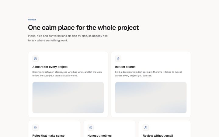
A mixed-size tile grid of up to seven features. Medium and large tiles carry an image, small tiles stay text-only. Pair a large tile with a small one.
Light · Dark
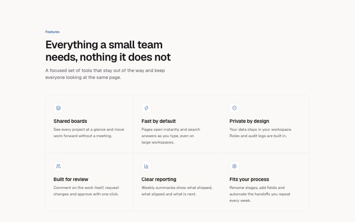
Optional section heading and a grid of up to nine features, each with an optional icon, a title and a short description. Two to four columns.
Light · Dark
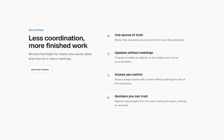
Heading and a link on the left, a vertical list of up to six features with icon, title and description on the right.
Light · Dark
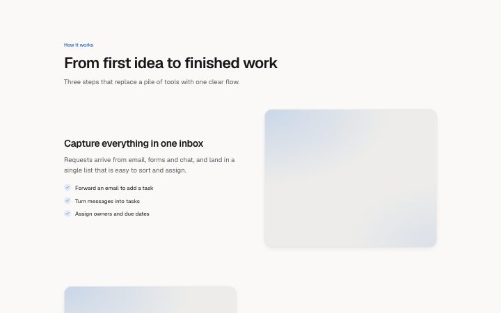
Feature rows with copy beside an image, alternating sides. Each row has a title, description and up to four points.
Light · Dark
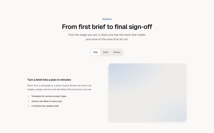
Two to five tabs, each with a title, description, a short list of points and an image. All panels show while editing.
Light · Dark
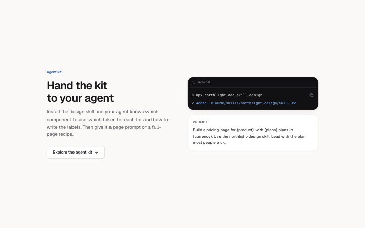
Section heading and a link beside a terminal command and a prompt box. The section version of hero-terminal (h2).
Light · Dark