Features, list
Install
npx shadcn add @klarhimmel/features-listUsage
import { Theme } from '@/components/klarhimmel/theme/style';
import { BlockSurface } from '@/components/klarhimmel/blocks/surface';
import FeaturesList from '@/components/klarhimmel/blocks/features-list';

export default function Section() {
  return (
    <Theme theme="brand">
      <BlockSurface>
        <FeaturesList props={{
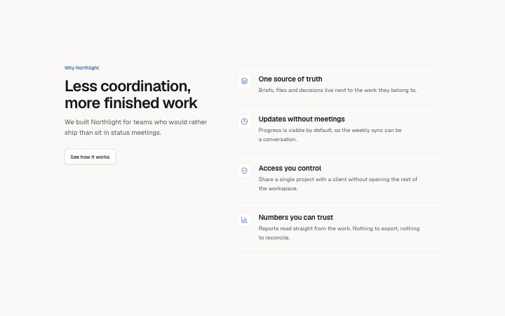
          "eyebrow": "Why Northlight",
          "title": "Less coordination, more finished work",
          "description": "We built Northlight for teams who would rather ship than sit in status meetings.",
          "link": {
            "label": "See how it works",
            "href": "#how-it-works"
          },
          "items": [
            {
              "icon": "layers",
              "title": "One source of truth",
              "description": "Briefs, files and decisions live next to the work they belong to."
            },
            {
              "icon": "clock",
              "title": "Updates without meetings",
              "description": "Progress is visible by default, so the weekly sync can be a conversation."
            },
            {
              "icon": "shield",
              "title": "Access you control",
              "description": "Share a single project with a client without opening the rest of the workspace."
            },
            {
              "icon": "chart",
              "title": "Numbers you can trust",
              "description": "Reports read straight from the work. Nothing to export, nothing to reconcile."
            }
          ]
        }} />
      </BlockSurface>
    </Theme>
  );
}
Install
Import
import Block from '@/components/klarhimmel/blocks/features-list';- features/list
- Category
- What it does, as a grid, a list, tabs or alternating rows.
Notes
When to use it
A short stacked list of features, with an icon and a longer explanation each, plus a link to learn more. For many features at once use `features-grid`.
Writing for it
- Items take one to six, and each requires an icon, a title (60) and a description (200). Write the description as one concrete example. - The link field sits beside the intro, so use it to point to the full features page or docs. - The intro is split from the list. Put the claim in the title (120) and keep the description (300) to one sentence on who the list is for.
Watch out for
The icon is required on every item here, unlike in `features-grid`, so every row in the list needs an icon picked before it is finished.
Pairs well with
Usage
The block in a page, with its default content (long lists shortened). Every prop is in the table below.
import { Theme } from '@/components/klarhimmel/theme/style';
import { BlockSurface } from '@/components/klarhimmel/blocks/surface';
import FeaturesList from '@/components/klarhimmel/blocks/features-list';

export default function Section() {
  return (
    <Theme theme="brand">
      <BlockSurface>
        <FeaturesList props={{
          "eyebrow": "Why Northlight",
          "title": "Less coordination, more finished work",
          "description": "We built Northlight for teams who would rather ship than sit in status meetings.",
          "link": {
            "label": "See how it works",
            "href": "#how-it-works"
          },
          "items": [
            {
              "icon": "layers",
              "title": "One source of truth",
              "description": "Briefs, files and decisions live next to the work they belong to."
            },
            {
              "icon": "clock",
              "title": "Updates without meetings",
              "description": "Progress is visible by default, so the weekly sync can be a conversation."
            },
            {
              "icon": "shield",
              "title": "Access you control",
              "description": "Share a single project with a client without opening the rest of the workspace."
            },
            {
              "icon": "chart",
              "title": "Numbers you can trust",
              "description": "Reports read straight from the work. Nothing to export, nothing to reconcile."
            }
          ]
        }} />
      </BlockSurface>
    </Theme>
  );
}
Props
The type, default and text limit of every prop. On a real page, over-limit text is kept and checkSections flags it (Installation, Check a page before you ship); this live preview shows the default until it fits. The panel above edits all props.
| Prop | Type | Default | Description |
|---|---|---|---|
eyebrow | string | 'Why Northlight' | Text, up to 60 characters. |
title | string | 'Less coordination, more finished wo…' | Text, up to 120 characters. |
description | string | 'We built Northlight for teams who w…' | Text, up to 300 characters. |
link | Link | {…} | See the type. |
items | { icon, title, description }[] | 4 items | List of 1 to 6. Each item: icon ('zap' | 'shield' | 'layers' | 'globe' | 'sparkles' | 'clock' | 'code' | 'palette' | 'lock' | 'chart' | 'users' | 'mail' | 'heart' | 'rocket' | 'search' | 'settings' | 'check' | 'star' | 'book' | 'box' | 'cloud' | 'compass' | 'leaf' | 'gauge'), title, description. |
headingLevel | '1' | '2' | - | One of '1', '2'. Optional; empty is not rendered. |