Features, alternating
Install
npx shadcn add @klarhimmel/features-splitUsage
import { Theme } from '@/components/klarhimmel/theme/style';
import { BlockSurface } from '@/components/klarhimmel/blocks/surface';
import FeaturesSplit from '@/components/klarhimmel/blocks/features-split';

export default function Section() {
  return (
    <Theme theme="brand">
      <BlockSurface>
        <FeaturesSplit props={{
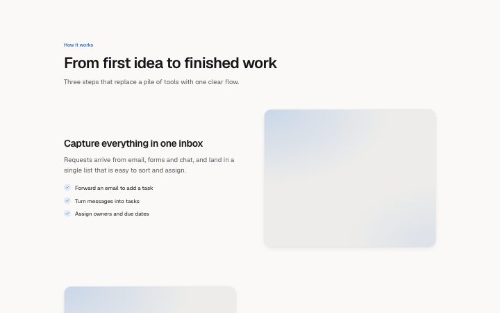
          "eyebrow": "How it works",
          "title": "From first idea to finished work",
          "description": "Three steps that replace a pile of tools with one clear flow.",
          "items": [
            {
              "title": "Capture everything in one inbox",
              "description": "Requests arrive from email, forms and chat, and land in a single list that is easy to sort and assign.",
              "points": [
                "Forward an email to add a task",
                "Turn messages into tasks",
                "Assign owners and due dates"
              ],
              "media": {
                "src": "",
                "alt": "The inbox with new requests"
              }
            },
            {
              "title": "Plan the week together",
              "description": "Drag work onto a shared calendar and see at once who has room and who is stretched thin.",
              "points": [
                "Workload view per person",
                "Drag to reschedule",
                "Automatic conflict warnings"
              ],
              "media": {
                "src": "",
                "alt": "The weekly planning calendar"
              }
            },
            {
              "title": "Review and ship with confidence",
              "description": "Reviewers comment on the work itself and approve in one click. Nothing goes out unseen.",
              "points": [
                "Inline comments",
                "Version history",
                "One-click approval"
              ],
              "media": {
                "src": "",
                "alt": "A review thread on a document"
              }
            }
          ]
        }} />
      </BlockSurface>
    </Theme>
  );
}
Install
Import
import Block from '@/components/klarhimmel/blocks/features-split';- features/alternating
- Category
- What it does, as a grid, a list, tabs or alternating rows.
Notes
When to use it
Alternating rows of text and image, each row covering one feature in depth with a few bullet points. Use it for a walk through the three or four things that matter; `features-tabs` does the same in less height.
Writing for it
- Each item has a title (80), a description (300), up to four points of 80 characters, and a media image. The points should be facts, not repeats of the description. - One to four items are allowed. Each row title is its own h3, so keep it to a short phrase. - Keep image proportions the same across rows, because the rows are placed side by side and uneven pictures show.
Watch out for
The points array can be empty, but the media slot still draws. An item with no points and no image is a block of text next to a blank frame.
Pairs well with
Usage
The block in a page, with its default content (long lists shortened). Every prop is in the table below.
import { Theme } from '@/components/klarhimmel/theme/style';
import { BlockSurface } from '@/components/klarhimmel/blocks/surface';
import FeaturesSplit from '@/components/klarhimmel/blocks/features-split';

export default function Section() {
  return (
    <Theme theme="brand">
      <BlockSurface>
        <FeaturesSplit props={{
          "eyebrow": "How it works",
          "title": "From first idea to finished work",
          "description": "Three steps that replace a pile of tools with one clear flow.",
          "items": [
            {
              "title": "Capture everything in one inbox",
              "description": "Requests arrive from email, forms and chat, and land in a single list that is easy to sort and assign.",
              "points": [
                "Forward an email to add a task",
                "Turn messages into tasks"
              ],
              "media": {
                "src": "",
                "alt": "The inbox with new requests"
              }
            },
            {
              "title": "Plan the week together",
              "description": "Drag work onto a shared calendar and see at once who has room and who is stretched thin.",
              "points": [
                "Workload view per person",
                "Drag to reschedule"
              ],
              "media": {
                "src": "",
                "alt": "The weekly planning calendar"
              }
            }
          ]
        }} />
      </BlockSurface>
    </Theme>
  );
}
Props
The type, default and text limit of every prop. On a real page, over-limit text is kept and checkSections flags it (Installation, Check a page before you ship); this live preview shows the default until it fits. The panel above edits all props.
| Prop | Type | Default | Description |
|---|---|---|---|
eyebrow | string | 'How it works' | Text, up to 60 characters. |
title | string | 'From first idea to finished work' | Text, up to 120 characters. |
description | string | 'Three steps that replace a pile of …' | Text, up to 300 characters. |
items | { title, description, points, media }[] | 3 items | List of 1 to 4. Each item: title, description, points, media. |
headingLevel | '1' | '2' | - | One of '1', '2'. Optional; empty is not rendered. |