Features, bento
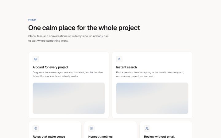
Install
npx shadcn add @klarhimmel/features-bentoUsage
import { Theme } from '@/components/klarhimmel/theme/style';
import { BlockSurface } from '@/components/klarhimmel/blocks/surface';
import FeaturesBento from '@/components/klarhimmel/blocks/features-bento';

export default function Section() {
  return (
    <Theme theme="brand">
      <BlockSurface>
        <FeaturesBento props={{
          "eyebrow": "Product",
          "title": "One calm place for the whole project",
          "description": "Plans, files and conversations sit side by side, so nobody has to ask where something went.",
          "tiles": [
            {
              "layout": "md",
              "icon": "layers",
              "title": "A board for every project",
              "description": "Drag work between stages, see who has what, and let the view follow the way your team actually works.",
              "media": {
                "src": "",
                "alt": "A board for every project illustration"
              }
            },
            {
              "layout": "md",
              "icon": "zap",
              "title": "Instant search",
              "description": "Find a decision from last spring in the time it takes to type it, across every project you can see.",
              "media": {
                "src": "",
                "alt": "Instant search illustration"
              }
            },
            {
              "layout": "sm",
              "icon": "shield",
              "title": "Roles that make sense",
              "description": "Clients see their work. Contractors see their tasks.",
              "media": {
                "src": "",
                "alt": "Roles that make sense illustration"
              }
            },
            {
              "layout": "sm",
              "icon": "clock",
              "title": "Honest timelines",
              "description": "Dates move when the work moves, and everyone can see why.",
              "media": {
                "src": "",
                "alt": "Honest timelines illustration"
              }
            },
            {
              "layout": "sm",
              "icon": "users",
              "title": "Review without email",
              "description": "Comment on the thing itself and approve in one step.",
              "media": {
                "src": "",
                "alt": "Review without email illustration"
              }
            },
            {
              "layout": "md",
              "icon": "chart",
              "title": "Weekly summaries, written for you",
              "description": "Every Friday: what shipped, what slipped, what is next. Ready to forward.",
              "media": {
                "src": "",
                "alt": "Weekly summaries, written for you illustration"
              }
            },
            {
              "layout": "md",
              "icon": "settings",
              "title": "Automations you can read",
              "description": "Plain-language rules for the handoffs you repeat. Turn any of them off without a call.",
              "media": {
                "src": "",
                "alt": "Automations you can read illustration"
              }
            }
          ]
        }} />
      </BlockSurface>
    </Theme>
  );
}
Install
Import
import Block from '@/components/klarhimmel/blocks/features-bento';- features/bento
- Category
- What it does, as a grid, a list, tabs or alternating rows.
Notes
When to use it
An uneven grid of feature tiles, some larger than others, each with an icon, text and an image. Use it when features differ in importance; `features-grid` fits when they are equal.
Writing for it
- Each tile takes a layout of sm, md or lg, meaning a third, half or two thirds of a row. Mix them so each row adds up to a full width. - Tile titles hold 60 characters and descriptions 200. Large tiles also show their media, so save the strongest feature for lg. - Two to seven tiles are allowed. Fewer than four leaves the bento shape unclear, so use `features-list` instead.
Watch out for
Each tile needs an icon and a media object in the schema, and an image slot shows for large tiles even when empty. Fill the media or the tile shows a blank panel.
Pairs well with
Usage
The block in a page, with its default content (long lists shortened). Every prop is in the table below.
import { Theme } from '@/components/klarhimmel/theme/style';
import { BlockSurface } from '@/components/klarhimmel/blocks/surface';
import FeaturesBento from '@/components/klarhimmel/blocks/features-bento';

export default function Section() {
  return (
    <Theme theme="brand">
      <BlockSurface>
        <FeaturesBento props={{
          "eyebrow": "Product",
          "title": "One calm place for the whole project",
          "description": "Plans, files and conversations sit side by side, so nobody has to ask where something went.",
          "tiles": [
            {
              "layout": "md",
              "icon": "layers",
              "title": "A board for every project",
              "description": "Drag work between stages, see who has what, and let the view follow the way your team actually works.",
              "media": {
                "src": "",
                "alt": "A board for every project illustration"
              }
            },
            {
              "layout": "md",
              "icon": "zap",
              "title": "Instant search",
              "description": "Find a decision from last spring in the time it takes to type it, across every project you can see.",
              "media": {
                "src": "",
                "alt": "Instant search illustration"
              }
            },
            {
              "layout": "sm",
              "icon": "shield",
              "title": "Roles that make sense",
              "description": "Clients see their work. Contractors see their tasks.",
              "media": {
                "src": "",
                "alt": "Roles that make sense illustration"
              }
            }
          ]
        }} />
      </BlockSurface>
    </Theme>
  );
}
Props
The type, default and text limit of every prop. On a real page, over-limit text is kept and checkSections flags it (Installation, Check a page before you ship); this live preview shows the default until it fits. The panel above edits all props.
| Prop | Type | Default | Description |
|---|---|---|---|
eyebrow | string | 'Product' | Text, up to 60 characters. |
title | string | 'One calm place for the whole project' | Text, up to 120 characters. |
description | string | 'Plans, files and conversations sit …' | Text, up to 300 characters. |
tiles | { layout, icon, title, description, media }[] | 7 items | List of 2 to 7. Each item: layout ('sm' | 'md' | 'lg'), icon ('zap' | 'shield' | 'layers' | 'globe' | 'sparkles' | 'clock' | 'code' | 'palette' | 'lock' | 'chart' | 'users' | 'mail' | 'heart' | 'rocket' | 'search' | 'settings' | 'check' | 'star' | 'book' | 'box' | 'cloud' | 'compass' | 'leaf' | 'gauge'), title, description, media. |
headingLevel | '1' | '2' | - | One of '1', '2'. Optional; empty is not rendered. |