Gallery, grid
Install
npx shadcn add @klarhimmel/gallery-gridUsage
import { Theme } from '@/components/klarhimmel/theme/style';
import { BlockSurface } from '@/components/klarhimmel/blocks/surface';
import GalleryGrid from '@/components/klarhimmel/blocks/gallery-grid';

export default function Section() {
  return (
    <Theme theme="brand">
      <BlockSurface>
        <GalleryGrid props={{
          "eyebrow": "Gallery",
          "title": "Life at the studio",
          "description": "A few frames from our desks, our walls and our Friday demos.",
          "items": [
            {
              "media": {
                "src": "",
                "alt": "A long wooden desk with laptops and coffee cups"
              },
              "caption": "Monday planning"
            },
            {
              "media": {
                "src": "",
                "alt": "A wall covered in printed wireframes"
              },
              "caption": "The wireframe wall"
            },
            {
              "media": {
                "src": "",
                "alt": "Two people reviewing a prototype on a tablet"
              },
              "caption": "Prototype review"
            },
            {
              "media": {
                "src": "",
                "alt": "A shelf with plants and design books"
              },
              "caption": "The reading shelf"
            },
            {
              "media": {
                "src": "",
                "alt": "A whiteboard with a half-finished sitemap"
              },
              "caption": "Sitemap in progress"
            },
            {
              "media": {
                "src": "",
                "alt": "A team around a table at a Friday demo"
              },
              "caption": "Friday demo"
            }
          ]
        }} />
      </BlockSurface>
    </Theme>
  );
}
Install
Import
import Block from '@/components/klarhimmel/blocks/gallery-grid';- gallery/grid
- Category
- A grid of images with captions.
Notes
When to use it
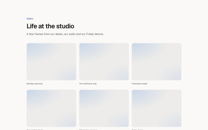
Even grid of equally cropped images with captions under a heading. Use it for a set of similar frames; when the pictures vary in shape, `gallery-masonry` avoids cropping them all to one ratio.
Writing for it
- You can add one to twelve items. Six or nine fill the three-column layout without a ragged last row. - Captions are 120 characters. A few words naming the thing shown work better than a sentence repeating the alt text. - Use alt text to describe the picture and the caption to say why it is here, so the two do not duplicate each other.
Watch out for
Every image is forced to 4 by 3, which crops portrait photos. Captions are hidden when empty, so mix captioned and uncaptioned items and the rows will have different heights.
Pairs well with
Usage
The block in a page, with its default content (long lists shortened). Every prop is in the table below.
import { Theme } from '@/components/klarhimmel/theme/style';
import { BlockSurface } from '@/components/klarhimmel/blocks/surface';
import GalleryGrid from '@/components/klarhimmel/blocks/gallery-grid';

export default function Section() {
  return (
    <Theme theme="brand">
      <BlockSurface>
        <GalleryGrid props={{
          "eyebrow": "Gallery",
          "title": "Life at the studio",
          "description": "A few frames from our desks, our walls and our Friday demos.",
          "items": [
            {
              "media": {
                "src": "",
                "alt": "A long wooden desk with laptops and coffee cups"
              },
              "caption": "Monday planning"
            },
            {
              "media": {
                "src": "",
                "alt": "A wall covered in printed wireframes"
              },
              "caption": "The wireframe wall"
            },
            {
              "media": {
                "src": "",
                "alt": "Two people reviewing a prototype on a tablet"
              },
              "caption": "Prototype review"
            },
            {
              "media": {
                "src": "",
                "alt": "A shelf with plants and design books"
              },
              "caption": "The reading shelf"
            },
            {
              "media": {
                "src": "",
                "alt": "A whiteboard with a half-finished sitemap"
              },
              "caption": "Sitemap in progress"
            },
            {
              "media": {
                "src": "",
                "alt": "A team around a table at a Friday demo"
              },
              "caption": "Friday demo"
            }
          ]
        }} />
      </BlockSurface>
    </Theme>
  );
}
Props
The type, default and text limit of every prop. On a real page, over-limit text is kept and checkSections flags it (Installation, Check a page before you ship); this live preview shows the default until it fits. The panel above edits all props.
| Prop | Type | Default | Description |
|---|---|---|---|
eyebrow | string | 'Gallery' | Text, up to 60 characters. |
title | string | 'Life at the studio' | Text, up to 120 characters. |
description | string | 'A few frames from our desks, our wa…' | Text, up to 300 characters. |
items | { media, caption }[] | 6 items | List of 1 to 12. Each item: media, caption. |
headingLevel | '1' | '2' | - | One of '1', '2'. Optional; empty is not rendered. |