Gallery, scroll strip
Install
npx shadcn add @klarhimmel/gallery-stripUsage
import { Theme } from '@/components/klarhimmel/theme/style';
import { BlockSurface } from '@/components/klarhimmel/blocks/surface';
import GalleryStrip from '@/components/klarhimmel/blocks/gallery-strip';

export default function Section() {
  return (
    <Theme theme="brand">
      <BlockSurface>
        <GalleryStrip props={{
          "eyebrow": "Around the corner",
          "title": "What there is to do nearby",
          "description": "All within a fifteen-minute walk.",
          "stripLabel": "Photos of the neighbourhood, scroll sideways",
          "items": [
            {
              "media": {
                "src": "",
                "alt": "The harbour at low tide"
              },
              "caption": "The harbour, five minutes down the hill"
            },
            {
              "media": {
                "src": "",
                "alt": "A bakery window"
              },
              "caption": "Bakery on Torggatan"
            },
            {
              "media": {
                "src": "",
                "alt": "A footpath through trees"
              },
              "caption": "The coastal path"
            },
            {
              "media": {
                "src": "",
                "alt": "A small museum entrance"
              },
              "caption": "Maritime museum"
            },
            {
              "media": {
                "src": "",
                "alt": "A market square on Saturday"
              },
              "caption": "Saturday market"
            },
            {
              "media": {
                "src": "",
                "alt": "A viewpoint over the water"
              },
              "caption": "Kvarnberget viewpoint"
            }
          ]
        }} />
      </BlockSurface>
    </Theme>
  );
}
Install
Import
import Block from '@/components/klarhimmel/blocks/gallery-strip';- gallery/strip
- About
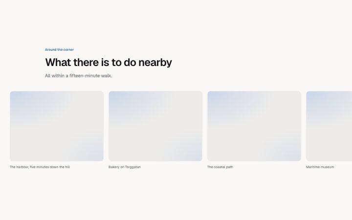
- A single row of same-height images that scrolls sideways with snap points and keyboard focus. Takes little height, so it fits between sections. The label names the region for screen readers.
- Category
- A grid of images with captions.
Notes
When to use it
A single row of same-height images that scrolls sideways with snap points, so it takes little vertical space between sections. When every image should be visible without scrolling, use `gallery-grid`.
Writing for it
- Add three to ten items. Fewer than three are not allowed, since a strip needs something to scroll past. - Write stripLabel (60 characters) as a sentence that names the photos and says to scroll sideways, for example 'Photos of the neighbourhood, scroll sideways'. - Captions hold 100 characters and sit under each 4 by 3 image, so keep them to a place name or a few words.
Watch out for
The strip label is hidden from sight on the live page and only read by screen readers, but it is shown in the editor. The scroll region takes keyboard focus, so a page with several strips adds several tab stops.
Pairs well with
Usage
The block in a page, with its default content (long lists shortened). Every prop is in the table below.
import { Theme } from '@/components/klarhimmel/theme/style';
import { BlockSurface } from '@/components/klarhimmel/blocks/surface';
import GalleryStrip from '@/components/klarhimmel/blocks/gallery-strip';

export default function Section() {
  return (
    <Theme theme="brand">
      <BlockSurface>
        <GalleryStrip props={{
          "eyebrow": "Around the corner",
          "title": "What there is to do nearby",
          "description": "All within a fifteen-minute walk.",
          "stripLabel": "Photos of the neighbourhood, scroll sideways",
          "items": [
            {
              "media": {
                "src": "",
                "alt": "The harbour at low tide"
              },
              "caption": "The harbour, five minutes down the hill"
            },
            {
              "media": {
                "src": "",
                "alt": "A bakery window"
              },
              "caption": "Bakery on Torggatan"
            },
            {
              "media": {
                "src": "",
                "alt": "A footpath through trees"
              },
              "caption": "The coastal path"
            },
            {
              "media": {
                "src": "",
                "alt": "A small museum entrance"
              },
              "caption": "Maritime museum"
            },
            {
              "media": {
                "src": "",
                "alt": "A market square on Saturday"
              },
              "caption": "Saturday market"
            },
            {
              "media": {
                "src": "",
                "alt": "A viewpoint over the water"
              },
              "caption": "Kvarnberget viewpoint"
            }
          ]
        }} />
      </BlockSurface>
    </Theme>
  );
}
Props
The type, default and text limit of every prop. On a real page, over-limit text is kept and checkSections flags it (Installation, Check a page before you ship); this live preview shows the default until it fits. The panel above edits all props.
| Prop | Type | Default | Description |
|---|---|---|---|
eyebrow | string | 'Around the corner' | Text, up to 60 characters. |
title | string | 'What there is to do nearby' | Text, up to 120 characters. |
description | string | 'All within a fifteen-minute walk.' | Text, up to 300 characters. |
stripLabel | string | 'Photos of the neighbourhood, scroll…' | Text, up to 60 characters. |
items | { media, caption }[] | 6 items | List of 3 to 10. Each item: media, caption. |
headingLevel | '1' | '2' | - | One of '1', '2'. Optional; empty is not rendered. |