Gallery, featured
Install
npx shadcn add @klarhimmel/gallery-featuredUsage
import { Theme } from '@/components/klarhimmel/theme/style';
import { BlockSurface } from '@/components/klarhimmel/blocks/surface';
import GalleryFeatured from '@/components/klarhimmel/blocks/gallery-featured';

export default function Section() {
  return (
    <Theme theme="brand">
      <BlockSurface>
        <GalleryFeatured props={{
          "eyebrow": "The house",
          "title": "Start with the view",
          "description": "Seven rooms, one garden and a roof that looks out over the harbour.",
          "featured": {
            "media": {
              "src": "",
              "alt": "Rooftop terrace at dusk, harbour behind"
            },
            "caption": "The roof terrace, ten minutes before sunset"
          },
          "thumbs": [
            {
              "media": {
                "src": "",
                "alt": "Breakfast table in the garden"
              },
              "caption": "Breakfast, weather permitting"
            },
            {
              "media": {
                "src": "",
                "alt": "A corner room with a double bed"
              },
              "caption": "Room 6, the corner"
            },
            {
              "media": {
                "src": "",
                "alt": "Reading nook by a window"
              },
              "caption": "The reading nook"
            }
          ]
        }} />
      </BlockSurface>
    </Theme>
  );
}
Install
Import
import Block from '@/components/klarhimmel/blocks/gallery-featured';- gallery/featured
- Category
- A grid of images with captions.
Notes
When to use it
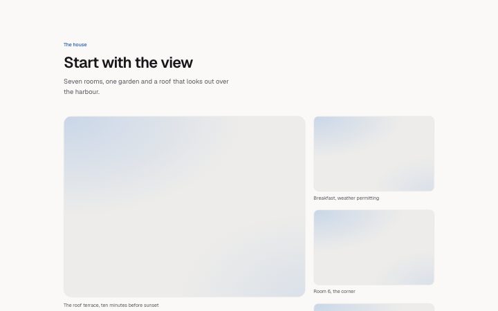
One large lead image with two or three smaller ones stacked beside it, each with a caption. It guides the eye: look here first, then at these. For an even set of images use `gallery-grid`.
Writing for it
- The featured caption allows 120 characters. Name the moment or place, because the lead image is the one people actually read about. - Choose exactly two or three thumbs. With three, the last one fills the full row at medium widths, so put the strongest of the small images last. - Write alt text for every image, since the captions are optional and an empty caption hides its line.
Watch out for
The lead is cropped to 4 by 3 and the thumbs to 16 by 10, so a portrait photo will be cut hard at the top and bottom. Below the wide breakpoint the thumbs fall into a single row or two columns.
Usage
The block in a page, with its default content (long lists shortened). Every prop is in the table below.
import { Theme } from '@/components/klarhimmel/theme/style';
import { BlockSurface } from '@/components/klarhimmel/blocks/surface';
import GalleryFeatured from '@/components/klarhimmel/blocks/gallery-featured';

export default function Section() {
  return (
    <Theme theme="brand">
      <BlockSurface>
        <GalleryFeatured props={{
          "eyebrow": "The house",
          "title": "Start with the view",
          "description": "Seven rooms, one garden and a roof that looks out over the harbour.",
          "featured": {
            "media": {
              "src": "",
              "alt": "Rooftop terrace at dusk, harbour behind"
            },
            "caption": "The roof terrace, ten minutes before sunset"
          },
          "thumbs": [
            {
              "media": {
                "src": "",
                "alt": "Breakfast table in the garden"
              },
              "caption": "Breakfast, weather permitting"
            },
            {
              "media": {
                "src": "",
                "alt": "A corner room with a double bed"
              },
              "caption": "Room 6, the corner"
            },
            {
              "media": {
                "src": "",
                "alt": "Reading nook by a window"
              },
              "caption": "The reading nook"
            }
          ]
        }} />
      </BlockSurface>
    </Theme>
  );
}
Props
The type, default and text limit of every prop. On a real page, over-limit text is kept and checkSections flags it (Installation, Check a page before you ship); this live preview shows the default until it fits. The panel above edits all props.
| Prop | Type | Default | Description |
|---|---|---|---|
eyebrow | string | 'The house' | Text, up to 60 characters. |
title | string | 'Start with the view' | Text, up to 120 characters. |
description | string | 'Seven rooms, one garden and a roof …' | Text, up to 300 characters. |
featured | { media, caption } | {…} | Fields: media, caption. |
thumbs | { media, caption }[] | 3 items | List of 2 to 3. Each item: media, caption. |
headingLevel | '1' | '2' | - | One of '1', '2'. Optional; empty is not rendered. |