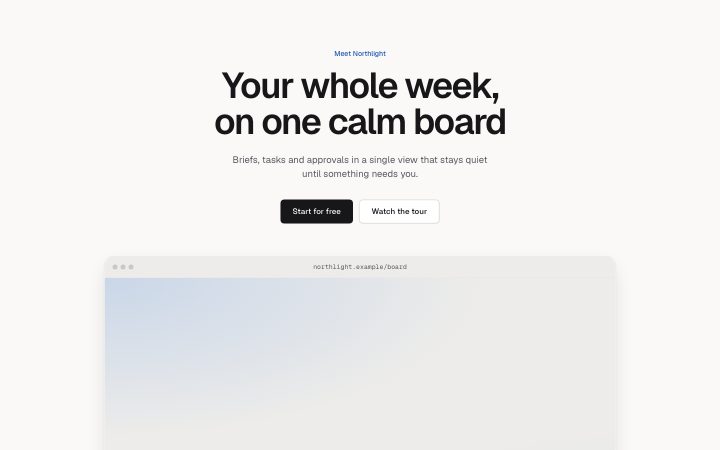
Hero, framed screenshot
Install
npx shadcn add @klarhimmel/hero-frameUsage
import { Theme } from '@/components/klarhimmel/theme/style';
import { BlockSurface } from '@/components/klarhimmel/blocks/surface';
import HeroFrame from '@/components/klarhimmel/blocks/hero-frame';

export default function Section() {
  return (
    <Theme theme="brand">
      <BlockSurface>
        <HeroFrame props={{
          "eyebrow": "Meet Northlight",
          "title": "Your whole week, on one calm board",
          "description": "Briefs, tasks and approvals in a single view that stays quiet until something needs you.",
          "primary": {
            "label": "Start for free",
            "href": "#start"
          },
          "secondary": {
            "label": "Watch the tour",
            "href": "#tour"
          },
          "frameTitle": "northlight.example/board",
          "media": {
            "src": "",
            "alt": "The Northlight board with this week's tasks in three columns"
          }
        }} />
      </BlockSurface>
    </Theme>
  );
}
Install
Import
import Block from '@/components/klarhimmel/blocks/hero-frame';- hero/frame
- Category
- The first screen: what it is, who it is for, what to do next.
Notes
When to use it
A centred opener where the image is a product screenshot placed inside a window frame that bleeds off the bottom edge. Use `hero-centered` for a plain framed image, or `hero-terminal` for a command line product.
Writing for it
- The frameTitle holds 60 characters and appears in the window bar like a page title or file name. It is optional and shows a placeholder only while editing. - Media is shown at 16 to 9, so crop the screenshot to that ratio before uploading; a taller image will be cut. - The title holds 120 characters. With a large screenshot below, a shorter title of about six words reads better.
Watch out for
The frame has no bottom border and the section has no bottom padding, so the next block starts right against the screenshot. Follow it with a block that has its own top spacing.
Pairs well with
Usage
The block in a page, with its default content (long lists shortened). Every prop is in the table below.
import { Theme } from '@/components/klarhimmel/theme/style';
import { BlockSurface } from '@/components/klarhimmel/blocks/surface';
import HeroFrame from '@/components/klarhimmel/blocks/hero-frame';

export default function Section() {
  return (
    <Theme theme="brand">
      <BlockSurface>
        <HeroFrame props={{
          "eyebrow": "Meet Northlight",
          "title": "Your whole week, on one calm board",
          "description": "Briefs, tasks and approvals in a single view that stays quiet until something needs you.",
          "primary": {
            "label": "Start for free",
            "href": "#start"
          },
          "secondary": {
            "label": "Watch the tour",
            "href": "#tour"
          },
          "frameTitle": "northlight.example/board",
          "media": {
            "src": "",
            "alt": "The Northlight board with this week's tasks in three columns"
          }
        }} />
      </BlockSurface>
    </Theme>
  );
}
Props
The type, default and text limit of every prop. On a real page, over-limit text is kept and checkSections flags it (Installation, Check a page before you ship); this live preview shows the default until it fits. The panel above edits all props.
| Prop | Type | Default | Description |
|---|---|---|---|
eyebrow | string | 'Meet Northlight' | Text, up to 60 characters. |
title | string | 'Your whole week, on one calm board' | Text, up to 120 characters. |
description | string | 'Briefs, tasks and approvals in a si…' | Text, up to 300 characters. |
primary | Link | {…} | See the type. |
secondary | Link | {…} | See the type. |
frameTitle | string | 'northlight.example/board' | Text, up to 60 characters. |
media | Media | {…} | See the type. |
headingLevel | '1' | '2' | - | One of '1', '2'. Optional; empty is not rendered. |