Logos, grid
Install
npx shadcn add @klarhimmel/logos-gridUsage
import { Theme } from '@/components/klarhimmel/theme/style';
import { BlockSurface } from '@/components/klarhimmel/blocks/surface';
import LogosGrid from '@/components/klarhimmel/blocks/logos-grid';

export default function Section() {
  return (
    <Theme theme="brand">
      <BlockSurface>
        <LogosGrid props={{
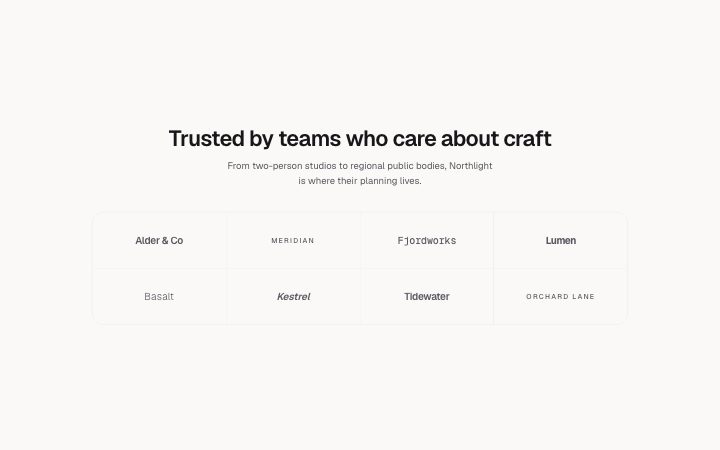
          "title": "Trusted by teams who care about craft",
          "description": "From two-person studios to regional public bodies, Northlight is where their planning lives.",
          "logos": [
            {
              "name": "Alder & Co",
              "media": {
                "src": "",
                "alt": "Alder & Co logo"
              }
            },
            {
              "name": "Meridian",
              "media": {
                "src": "",
                "alt": "Meridian logo"
              }
            },
            {
              "name": "Fjordworks",
              "media": {
                "src": "",
                "alt": "Fjordworks logo"
              }
            },
            {
              "name": "Lumen",
              "media": {
                "src": "",
                "alt": "Lumen logo"
              }
            },
            {
              "name": "Basalt",
              "media": {
                "src": "",
                "alt": "Basalt logo"
              }
            },
            {
              "name": "Kestrel",
              "media": {
                "src": "",
                "alt": "Kestrel logo"
              }
            },
            {
              "name": "Tidewater",
              "media": {
                "src": "",
                "alt": "Tidewater logo"
              }
            },
            {
              "name": "Orchard Lane",
              "media": {
                "src": "",
                "alt": "Orchard Lane logo"
              }
            }
          ]
        }} />
      </BlockSurface>
    </Theme>
  );
}
Install
Import
import Block from '@/components/klarhimmel/blocks/logos-grid';- logo-cloud/grid
- Category
- Who already uses it, as a quiet row or grid of logos.
Notes
When to use it
A hairline grid of logos for a long customer or partner list, up to twelve cells. For a single row of names use `logos-strip`, and for logos split into categories use `logos-grouped`.
Writing for it
- Logos take two to twelve entries, and the grid reads best when the count fills whole rows, so ten or twelve looks more finished than eleven. - Each logo needs a name (40) even with an image, since it becomes the accessible text. Use the company's own spelling. - The title holds 80 characters and the description 300; a short claim such as the number of teams using the product is enough above the grid.
Watch out for
A cell without an image shows the name as a typeset wordmark, with a different typeface per position. A grid of only wordmarks reads as a list of names, not as proof.
Pairs well with
Usage
The block in a page, with its default content (long lists shortened). Every prop is in the table below.
import { Theme } from '@/components/klarhimmel/theme/style';
import { BlockSurface } from '@/components/klarhimmel/blocks/surface';
import LogosGrid from '@/components/klarhimmel/blocks/logos-grid';

export default function Section() {
  return (
    <Theme theme="brand">
      <BlockSurface>
        <LogosGrid props={{
          "title": "Trusted by teams who care about craft",
          "description": "From two-person studios to regional public bodies, Northlight is where their planning lives.",
          "logos": [
            {
              "name": "Alder & Co",
              "media": {
                "src": "",
                "alt": "Alder & Co logo"
              }
            },
            {
              "name": "Meridian",
              "media": {
                "src": "",
                "alt": "Meridian logo"
              }
            },
            {
              "name": "Fjordworks",
              "media": {
                "src": "",
                "alt": "Fjordworks logo"
              }
            }
          ]
        }} />
      </BlockSurface>
    </Theme>
  );
}
Props
The type, default and text limit of every prop. On a real page, over-limit text is kept and checkSections flags it (Installation, Check a page before you ship); this live preview shows the default until it fits. The panel above edits all props.
| Prop | Type | Default | Description |
|---|---|---|---|
title | string | 'Trusted by teams who care about cra…' | Text, up to 80 characters. |
description | string | 'From two-person studios to regional…' | Text, up to 300 characters. |
logos | { name, media }[] | 8 items | List of 2 to 12. Each item: name, media. |
headingLevel | '1' | '2' | - | One of '1', '2'. Optional; empty is not rendered. |