Logos, as seen in
Install
npx shadcn add @klarhimmel/logos-pressUsage
import { Theme } from '@/components/klarhimmel/theme/style';
import { BlockSurface } from '@/components/klarhimmel/blocks/surface';
import LogosPress from '@/components/klarhimmel/blocks/logos-press';

export default function Section() {
  return (
    <Theme theme="brand">
      <BlockSurface>
        <LogosPress props={{
          "eyebrow": "In the press",
          "title": "What others write about us",
          "items": [
            {
              "outlet": "Göteborgs Matblad",
              "headline": "The booking tool that finally understands a small hotel",
              "year": "2026",
              "href": "#press-1"
            },
            {
              "outlet": "Hotellvärlden",
              "headline": "Why 41 owners dropped their channel manager",
              "year": "2026",
              "href": "#press-2"
            },
            {
              "outlet": "Nordic Travel Weekly",
              "headline": "Direct bookings are back, and the tools are small",
              "year": "2025",
              "href": "#press-3"
            },
            {
              "outlet": "Småföretagaren",
              "headline": "Three founders, 2,400 hotels, no sales team",
              "year": "2025",
              "href": "#press-4"
            }
          ]
        }} />
      </BlockSurface>
    </Theme>
  );
}
Install
Import
import Block from '@/components/klarhimmel/blocks/logos-press';- logo-cloud/press
- About
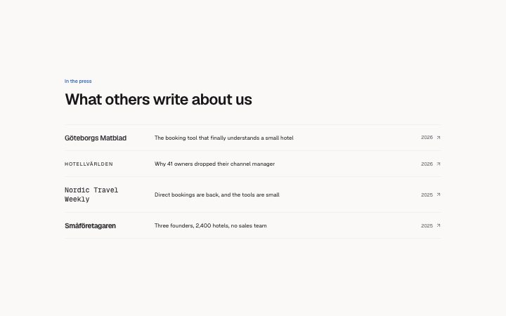
- Press coverage as rows: the outlet as a wordmark on the left, the headline as a link to the article, the year at the right. Proof from third parties, with the receipts one click away.
- Category
- Who already uses it, as a quiet row or grid of logos.
Notes
When to use it
A list of press mentions where each row links to the article, with the outlet, the headline and the year. For logos without links or headlines use `logos-strip`.
Writing for it
- Each item needs an outlet (40) and a headline (140). Quote the real headline from the article rather than rewording it. - Year holds 8 characters and is optional, and href (300) is where the whole row links to. Fill both so the row is verifiable. - Use two to six items, and put the best-known outlet first, as the outlet names are set in different typefaces down the list.
Watch out for
Every row is a link, including those with an empty href, which then links to just the # fragment. Fill href for every item or the row looks clickable and does nothing.
Pairs well with
Usage
The block in a page, with its default content (long lists shortened). Every prop is in the table below.
import { Theme } from '@/components/klarhimmel/theme/style';
import { BlockSurface } from '@/components/klarhimmel/blocks/surface';
import LogosPress from '@/components/klarhimmel/blocks/logos-press';

export default function Section() {
  return (
    <Theme theme="brand">
      <BlockSurface>
        <LogosPress props={{
          "eyebrow": "In the press",
          "title": "What others write about us",
          "items": [
            {
              "outlet": "Göteborgs Matblad",
              "headline": "The booking tool that finally understands a small hotel",
              "year": "2026",
              "href": "#press-1"
            },
            {
              "outlet": "Hotellvärlden",
              "headline": "Why 41 owners dropped their channel manager",
              "year": "2026",
              "href": "#press-2"
            },
            {
              "outlet": "Nordic Travel Weekly",
              "headline": "Direct bookings are back, and the tools are small",
              "year": "2025",
              "href": "#press-3"
            },
            {
              "outlet": "Småföretagaren",
              "headline": "Three founders, 2,400 hotels, no sales team",
              "year": "2025",
              "href": "#press-4"
            }
          ]
        }} />
      </BlockSurface>
    </Theme>
  );
}
Props
The type, default and text limit of every prop. On a real page, over-limit text is kept and checkSections flags it (Installation, Check a page before you ship); this live preview shows the default until it fits. The panel above edits all props.
| Prop | Type | Default | Description |
|---|---|---|---|
eyebrow | string | 'In the press' | Text, up to 60 characters. |
title | string | 'What others write about us' | Text, up to 120 characters. |
items | { outlet, headline, year, href }[] | 4 items | List of 2 to 6. Each item: outlet, headline, year, href. |
headingLevel | '1' | '2' | - | One of '1', '2'. Optional; empty is not rendered. |