Newsletter, split
Install
npx shadcn add @klarhimmel/newsletter-splitUsage
import { Theme } from '@/components/klarhimmel/theme/style';
import { BlockSurface } from '@/components/klarhimmel/blocks/surface';
import NewsletterSplit from '@/components/klarhimmel/blocks/newsletter-split';

export default function Section() {
  return (
    <Theme theme="brand">
      <BlockSurface>
        <NewsletterSplit props={{
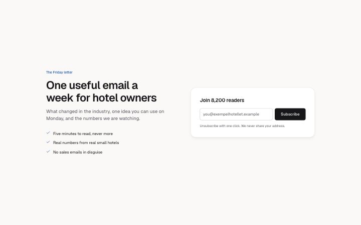
          "eyebrow": "The Friday letter",
          "title": "One useful email a week for hotel owners",
          "description": "What changed in the industry, one idea you can use on Monday, and the numbers we are watching.",
          "benefits": [
            "Five minutes to read, never more",
            "Real numbers from real small hotels",
            "No sales emails in disguise"
          ],
          "formTitle": "Join 8,200 readers",
          "placeholder": "you@exempelhotellet.example",
          "submit": "Subscribe",
          "consent": "Unsubscribe with one click. We never share your address."
        }} />
      </BlockSurface>
    </Theme>
  );
}
Install
Import
import Block from '@/components/klarhimmel/blocks/newsletter-split';- newsletter/split
- Category
- An email sign-up, inline or as a card.
Notes
When to use it
Copy and a benefit list on the left, a raised sign-up panel on the right, for a newsletter that has to earn the subscription. A bare field with no pitch is better served by `newsletter-inline`.
Writing for it
- Benefits are check items of up to 80 characters, with a maximum of four. Write what a reader gets in each issue, not adjectives about quality. - The formTitle (60) is a small heading inside the panel, such as 'Get the next issue'. It can be left empty and is then simply absent. - Placeholder (60) and submit (24) are required, and the consent line (160) is optional and is not drawn when empty.
Watch out for
The panel is the form, and a form without a placeholder text draws no email field. Benefits can be an empty list, which removes the whole list outside the editor and leaves a plain headline on the left.
Pairs well with
Usage
The block in a page, with its default content (long lists shortened). Every prop is in the table below.
import { Theme } from '@/components/klarhimmel/theme/style';
import { BlockSurface } from '@/components/klarhimmel/blocks/surface';
import NewsletterSplit from '@/components/klarhimmel/blocks/newsletter-split';

export default function Section() {
  return (
    <Theme theme="brand">
      <BlockSurface>
        <NewsletterSplit props={{
          "eyebrow": "The Friday letter",
          "title": "One useful email a week for hotel owners",
          "description": "What changed in the industry, one idea you can use on Monday, and the numbers we are watching.",
          "benefits": [
            "Five minutes to read, never more",
            "Real numbers from real small hotels",
            "No sales emails in disguise"
          ],
          "formTitle": "Join 8,200 readers",
          "placeholder": "you@exempelhotellet.example",
          "submit": "Subscribe",
          "consent": "Unsubscribe with one click. We never share your address."
        }} />
      </BlockSurface>
    </Theme>
  );
}
Props
The type, default and text limit of every prop. On a real page, over-limit text is kept and checkSections flags it (Installation, Check a page before you ship); this live preview shows the default until it fits. The panel above edits all props.
| Prop | Type | Default | Description |
|---|---|---|---|
eyebrow | string | 'The Friday letter' | Text, up to 60 characters. |
title | string | 'One useful email a week for hotel o…' | Text, up to 100 characters. |
description | string | 'What changed in the industry, one i…' | Text, up to 240 characters. |
benefits | string[] | 3 items | List of up to 4. |
formTitle | string | 'Join 8,200 readers' | Text, up to 60 characters. |
placeholder | string | 'you@exempelhotellet.example' | Text, up to 60 characters. |
submit | string | 'Subscribe' | Text, up to 24 characters. |
consent | string | 'Unsubscribe with one click. We neve…' | Text, up to 160 characters. |
action | string | - | Text, up to 300 characters. Optional; empty is not rendered. |
method | 'post' | 'get' | - | One of 'post', 'get'. Optional; empty is not rendered. |
hidden | { } | - | Optional; empty is not rendered. |
captcha | boolean | - | Optional; empty is not rendered. |
captchaSitekey | string | - | Text, up to 100 characters. Optional; empty is not rendered. |
headingLevel | '1' | '2' | - | One of '1', '2'. Optional; empty is not rendered. |