Newsletter, choose topics
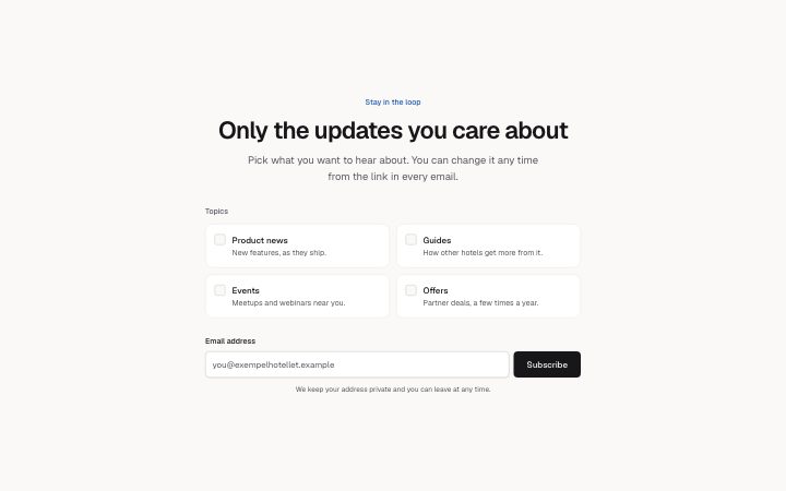
Install
npx shadcn add @klarhimmel/newsletter-topicsUsage
import { Theme } from '@/components/klarhimmel/theme/style';
import { BlockSurface } from '@/components/klarhimmel/blocks/surface';
import NewsletterTopics from '@/components/klarhimmel/blocks/newsletter-topics';

export default function Section() {
  return (
    <Theme theme="brand">
      <BlockSurface>
        <NewsletterTopics props={{
          "eyebrow": "Stay in the loop",
          "title": "Only the updates you care about",
          "description": "Pick what you want to hear about. You can change it any time from the link in every email.",
          "topicsLabel": "Topics",
          "topics": [
            {
              "label": "Product news",
              "description": "New features, as they ship."
            },
            {
              "label": "Guides",
              "description": "How other hotels get more from it."
            },
            {
              "label": "Events",
              "description": "Meetups and webinars near you."
            },
            {
              "label": "Offers",
              "description": "Partner deals, a few times a year."
            }
          ],
          "emailLabel": "Email address",
          "placeholder": "you@exempelhotellet.example",
          "submit": "Subscribe",
          "consent": "We keep your address private and you can leave at any time."
        }} />
      </BlockSurface>
    </Theme>
  );
}
Install
Import
import Block from '@/components/klarhimmel/blocks/newsletter-topics';- newsletter/topics
- Category
- An email sign-up, inline or as a card.
Notes
When to use it
A sign-up where readers tick the topics they want before giving an address, which means fewer unsubscribes later. For a simple list with one stream, `newsletter-card` or `newsletter-inline` is enough.
Writing for it
- Topics need two to six entries, each with a label (40, required) and a description (100). The label is also the submitted value, so keep it stable once the backend relies on it. - Use topicsLabel (60) as the instruction above the boxes, for instance 'Pick what you want to hear about'. - Leave checked unset on every topic. The spec says a pre-ticked box is not consent, so only set it when the reader has already chosen.
Watch out for
The email label (40) is required and the whole email row, input and button included, disappears when it is empty outside the editor. The placeholder is only shown as a field of its own while editing.
Pairs well with
Usage
The block in a page, with its default content (long lists shortened). Every prop is in the table below.
import { Theme } from '@/components/klarhimmel/theme/style';
import { BlockSurface } from '@/components/klarhimmel/blocks/surface';
import NewsletterTopics from '@/components/klarhimmel/blocks/newsletter-topics';

export default function Section() {
  return (
    <Theme theme="brand">
      <BlockSurface>
        <NewsletterTopics props={{
          "eyebrow": "Stay in the loop",
          "title": "Only the updates you care about",
          "description": "Pick what you want to hear about. You can change it any time from the link in every email.",
          "topicsLabel": "Topics",
          "topics": [
            {
              "label": "Product news",
              "description": "New features, as they ship."
            },
            {
              "label": "Guides",
              "description": "How other hotels get more from it."
            },
            {
              "label": "Events",
              "description": "Meetups and webinars near you."
            },
            {
              "label": "Offers",
              "description": "Partner deals, a few times a year."
            }
          ],
          "emailLabel": "Email address",
          "placeholder": "you@exempelhotellet.example",
          "submit": "Subscribe",
          "consent": "We keep your address private and you can leave at any time."
        }} />
      </BlockSurface>
    </Theme>
  );
}
Props
The type, default and text limit of every prop. On a real page, over-limit text is kept and checkSections flags it (Installation, Check a page before you ship); this live preview shows the default until it fits. The panel above edits all props.
| Prop | Type | Default | Description |
|---|---|---|---|
eyebrow | string | 'Stay in the loop' | Text, up to 60 characters. |
title | string | 'Only the updates you care about' | Text, up to 100 characters. |
description | string | 'Pick what you want to hear about. Y…' | Text, up to 240 characters. |
topicsLabel | string | 'Topics' | Text, up to 60 characters. |
topics | { label, description, checked }[] | 4 items | List of 2 to 6. Each item: label, description, checked (optional). |
emailLabel | string | 'Email address' | Text, up to 40 characters. |
placeholder | string | 'you@exempelhotellet.example' | Text, up to 60 characters. |
submit | string | 'Subscribe' | Text, up to 24 characters. |
consent | string | 'We keep your address private and yo…' | Text, up to 160 characters. |
action | string | - | Text, up to 300 characters. Optional; empty is not rendered. |
method | 'post' | 'get' | - | One of 'post', 'get'. Optional; empty is not rendered. |
hidden | { } | - | Optional; empty is not rendered. |
captcha | boolean | - | Optional; empty is not rendered. |
captchaSitekey | string | - | Text, up to 100 characters. Optional; empty is not rendered. |
headingLevel | '1' | '2' | - | One of '1', '2'. Optional; empty is not rendered. |