Newsletter, card
Install
npx shadcn add @klarhimmel/newsletter-cardUsage
import { Theme } from '@/components/klarhimmel/theme/style';
import { BlockSurface } from '@/components/klarhimmel/blocks/surface';
import NewsletterCard from '@/components/klarhimmel/blocks/newsletter-card';

export default function Section() {
  return (
    <Theme theme="brand">
      <BlockSurface>
        <NewsletterCard props={{
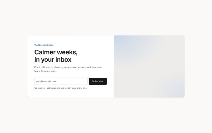
          "eyebrow": "The Northlight letter",
          "title": "Calmer weeks, in your inbox",
          "description": "Practical ideas on planning, reviews and working well in a small team. Once a month.",
          "placeholder": "you@example.com",
          "submit": "Subscribe",
          "consent": "We keep your address private and you can leave at any time.",
          "media": {
            "src": "",
            "alt": "A desk with a notebook and a coffee cup"
          }
        }} />
      </BlockSurface>
    </Theme>
  );
}
Install
Import
import Block from '@/components/klarhimmel/blocks/newsletter-card';- newsletter/card
- Category
- An email sign-up, inline or as a card.
Notes
When to use it
A card with an image beside the headline and an email capture form. Use it when the picture sells the newsletter; for a one-line sign-up in a page margin, `newsletter-inline` is lighter.
Writing for it
- The title holds 100 characters. Say what arrives and how often, for example 'One field note, every second Friday'. - The placeholder (60) is required because it doubles as the field's name for screen readers, and submit (24) is the button text. Keep it a verb like 'Subscribe'. - The consent line (160) sits under the form; state the unsubscribe promise there in one sentence.
Watch out for
The email field is not drawn at all when the placeholder is empty, outside the editor, leaving a card with no form. Without an action on the block the submit is cancelled, so a host must wire it.
Pairs well with
Usage
The block in a page, with its default content (long lists shortened). Every prop is in the table below.
import { Theme } from '@/components/klarhimmel/theme/style';
import { BlockSurface } from '@/components/klarhimmel/blocks/surface';
import NewsletterCard from '@/components/klarhimmel/blocks/newsletter-card';

export default function Section() {
  return (
    <Theme theme="brand">
      <BlockSurface>
        <NewsletterCard props={{
          "eyebrow": "The Northlight letter",
          "title": "Calmer weeks, in your inbox",
          "description": "Practical ideas on planning, reviews and working well in a small team. Once a month.",
          "placeholder": "you@example.com",
          "submit": "Subscribe",
          "consent": "We keep your address private and you can leave at any time.",
          "media": {
            "src": "",
            "alt": "A desk with a notebook and a coffee cup"
          }
        }} />
      </BlockSurface>
    </Theme>
  );
}
Props
The type, default and text limit of every prop. On a real page, over-limit text is kept and checkSections flags it (Installation, Check a page before you ship); this live preview shows the default until it fits. The panel above edits all props.
| Prop | Type | Default | Description |
|---|---|---|---|
eyebrow | string | 'The Northlight letter' | Text, up to 60 characters. |
title | string | 'Calmer weeks, in your inbox' | Text, up to 100 characters. |
description | string | 'Practical ideas on planning, review…' | Text, up to 240 characters. |
placeholder | string | 'you@example.com' | Text, up to 60 characters. |
submit | string | 'Subscribe' | Text, up to 24 characters. |
consent | string | 'We keep your address private and yo…' | Text, up to 160 characters. |
media | Media | {…} | See the type. |
action | string | - | Text, up to 300 characters. Optional; empty is not rendered. |
method | 'post' | 'get' | - | One of 'post', 'get'. Optional; empty is not rendered. |
hidden | { } | - | Optional; empty is not rendered. |
captcha | boolean | - | Optional; empty is not rendered. |
captchaSitekey | string | - | Text, up to 100 characters. Optional; empty is not rendered. |
headingLevel | '1' | '2' | - | One of '1', '2'. Optional; empty is not rendered. |