Stats, accent band
Install
npx shadcn add @klarhimmel/stats-bandUsage
import { Theme } from '@/components/klarhimmel/theme/style';
import { BlockSurface } from '@/components/klarhimmel/blocks/surface';
import StatsBand from '@/components/klarhimmel/blocks/stats-band';

export default function Section() {
  return (
    <Theme theme="brand">
      <BlockSurface>
        <StatsBand props={{
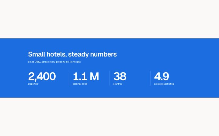
          "title": "Small hotels, steady numbers",
          "description": "Since 2019, across every property on Northlight.",
          "items": [
            {
              "value": "2,400",
              "label": "properties"
            },
            {
              "value": "1.1 M",
              "label": "bookings taken"
            },
            {
              "value": "38",
              "label": "countries"
            },
            {
              "value": "4.9",
              "label": "average guest rating"
            }
          ]
        }} />
      </BlockSurface>
    </Theme>
  );
}
Install
Import
import Block from '@/components/klarhimmel/blocks/stats-band';- stats/band
- About
- An edge-to-edge band in the accent colour: a short statement on the left and three or four big figures divided by hairlines on the right. Loud and brief; use it once, between two quiet sections.
- Category
- A few numbers that prove the point.
Notes
When to use it
An edge-to-edge accent-colour band with a short statement and three or four large figures, to be used once between two quiet sections. For a calm row of figures `stats-row` is the better fit.
Writing for it
- The title is required and holds 100 characters; make it a sentence that the numbers prove, such as what the company has done so far. - Values are limited to 20 characters and drawn at display size, so '12 000' or '99.9%' works and '12 000 customers' does not. - Every item needs both a value and a label, up to 60 characters, because empty ones are dropped when the page is published.
Watch out for
The whole band is the accent colour, so a page with other filled accent areas close by will look crowded. It also has only three or four slots, and adding a second band on the same page loses the point of using one.
Pairs well with
Usage
The block in a page, with its default content (long lists shortened). Every prop is in the table below.
import { Theme } from '@/components/klarhimmel/theme/style';
import { BlockSurface } from '@/components/klarhimmel/blocks/surface';
import StatsBand from '@/components/klarhimmel/blocks/stats-band';

export default function Section() {
  return (
    <Theme theme="brand">
      <BlockSurface>
        <StatsBand props={{
          "title": "Small hotels, steady numbers",
          "description": "Since 2019, across every property on Northlight.",
          "items": [
            {
              "value": "2,400",
              "label": "properties"
            },
            {
              "value": "1.1 M",
              "label": "bookings taken"
            },
            {
              "value": "38",
              "label": "countries"
            },
            {
              "value": "4.9",
              "label": "average guest rating"
            }
          ]
        }} />
      </BlockSurface>
    </Theme>
  );
}
Props
The type, default and text limit of every prop. On a real page, over-limit text is kept and checkSections flags it (Installation, Check a page before you ship); this live preview shows the default until it fits. The panel above edits all props.
| Prop | Type | Default | Description |
|---|---|---|---|
title | string | 'Small hotels, steady numbers' | Text, up to 100 characters. |
description | string | 'Since 2019, across every property o…' | Text, up to 200 characters. |
items | { value, label }[] | 4 items | List of 3 to 4. Each item: value, label. |
headingLevel | '1' | '2' | - | One of '1', '2'. Optional; empty is not rendered. |